


If two product teams use the same component, can they explain which decisions are shared, which belong to their product and how they would review a change?
A design system brings reusable interface resources together with the standards and practices for maintaining them. Components matter, but so do their purpose, content, implementation, ownership and actual use in a product.
The useful result is a maintained way of making and applying decisions. A large library can still produce an incorrect experience when a component receives the wrong message or sends someone to the wrong task.
This guide explains the whole method, with three public systems as supporting references. An original executed teaching example follows one shared notice into two fictional product contexts, including deliberately incorrect compositions and a change applied through the shared component.
Share the decision that recurs. Keep the product facts where they belong.
Design task
Decide what the system needs to solve
Begin with an actual recurring problem. Perhaps several teams implement the same information structure differently, or a shared visual change requires searching through many separate product files.
Describe the affected products, people and tasks before proposing a new library. Keep examples of the inconsistency and explain why it matters. A difference can be intentional: an internal reporting tool and a public application service may need different patterns.
Ask what would justify a shared decision. Repetition is one signal; common meaning and behaviour are more useful than resemblance alone. Two rectangular panels do not necessarily perform the same job.
NN/g's design-system introduction connects reusable standards with both a repository and the people maintaining it. That distinction helps frame the investment: somebody must support the resources and keep them relevant after the first release.
Separate the system from its individual resources
Use clear names for the layers so that a team does not mistake a design file for a complete operating practice.
| Layer | What it provides | What still needs deciding |
|---|---|---|
| Principles | Reasons for recurring decisions | How those reasons apply to this task |
| Foundations | Typography, colour, spacing and related conventions | Meaning, supported contexts and exceptions |
| Components | Reusable interface units with documented contracts | Appropriate use and product-specific content |
| Patterns | Ways of combining units for a recurring problem | The actual workflow and business rules |
| Maintenance practice | Ownership, contribution and delivery | Who approves a particular change and checks its effects |
A style guide focuses on standards such as visual and content expression. A component library supplies reusable units. A design system connects resources to their use and maintenance; these labels should not obscure what the team actually has.
The published UI kits and component libraries guide supports the narrower selection decision. Here, the question is how the selected resources become a coherent practice in the team's products.
Start with a bounded product slice
Choose a representative workflow whose details are available for review. Identify its audience, environment, important states and existing implementation.
Inventory what it already uses: messages, fields, actions, navigation and content rules. Include the exceptions and local decisions. A neat catalogue that excludes difficult states gives the system an artificially simple starting point.
Write down what the initial slice will establish and what remains outside it. One maintained notice can teach a shared anatomy and consumption route; it cannot establish that an organisation has a complete design system.
When that slice begins as a proposed screen, the published free wireframe tools guide supports the earlier structure decision. Keep the proposal separate from the implemented component and the product review that follows.
Resource kit
Use public systems to investigate decisions
Study a reference with a specific question. How does it connect foundations to components? Where does it explain intended use? What evidence is required before a contribution becomes part of the system?
Three public references are useful for different parts of that investigation. Their documentation is source material, not a ranking or a set of components operated by Upslide.
Atlassian: connect foundations and implementation needs
The Atlassian overview describes guidelines, foundations, tools and components. Its principles also include documentation, support and maintenance in the system's responsibility.

Credit: Atlassian. Actual public overview captured on 4 November 2026; documentation context, not an installed library or a completed product implementation.
Use the reference to ask whether your own foundations, components and guidance tell a consistent story. A product-specific component name or brand choice should not be copied simply because the reference is well organised.
Carbon: distinguish common foundations from product extensions
Carbon's current overview distinguishes its Core resources from product-focused layers. It provides an example of a system whose shared base can support more specialised needs.

Credit: IBM Carbon Design System. Actual public overview captured on 4 November 2026. Provider descriptions are not our implementation or evidence of outcomes in another product.
That distinction is useful when deciding whether a request belongs in a shared component or a local pattern. Review the selected package, release, framework and terms before adopting implementation material. An overview alone does not establish compatibility, reuse rights or accessibility in your product.
GOV.UK: distinguish a proposal from publication
The GOV.UK contribution criteria separate a useful, distinct proposal from an implementation ready for publication. The latter includes usability, consistency and versatility, with appropriate evidence and review.

Credit: GOV.UK Design System team / Crown copyright. Actual contribution-guidance capture from 4 November 2026, not a submitted proposal, approved contribution or notification demo.
Use that distinction to question your own process. A completed request form does not establish that the proposed component works. The criteria belong to GOV.UK's system; another team must define responsibilities and evidence appropriate to its own products.
How the pieces work together
Turn a principle into a reviewable decision
A principle should help resolve a real choice. “Be consistent” is too vague if it never explains when two products should differ.
For the original example below, the authored principle is to keep an actionable message with its relevant next step while leaving product facts and policy with the consuming product. It gives reviewers something concrete to inspect: the shared anatomy and the local content boundary.
Explain the reason and the limits. A team should be able to disagree with the proposed rule using a relevant product example. Treat principles as maintained guidance rather than slogans placed above a component gallery.
Define foundations by meaning and context
Document the typography, spacing and colour decisions needed for the initial slice. Explain their roles and supported contexts before expanding the number of options.
Semantic tokens can connect a decision such as a notice border to its implementation value. A meaningful name does not, however, prove the value is appropriate or that every consumer uses it.
Keep the relationship understandable from the design reference to the delivered interface. When the two differ, investigate the actual files, release and implementation. Similar names are useful clues, not proof of synchronisation.
Write the component contract before multiplying variants
Describe what the component is for, when it should not be used, which parts it contains and which states it supports. Include content constraints, actions, relevant interaction requirements and examples of misuse.
For a notice, ask whether the message is persistent information, feedback after an action or something requiring interruption. Those choices affect implementation and evaluation; a coloured box alone does not answer them.
Public guidance also differs by context. Carbon's notification guidance describes several variants and their distinct requirements. The GOV.UK banner guidance limits when that component should be used, including separating it from validation errors.
Our teaching notice does not implement either provider's component. It is a small authored HTML example for examining composition and ownership, without tested focus, announcement or dismissal behaviour.
Keep business policy outside a general component
The shared component can own a heading, message and action structure. The product should supply facts such as what changed, who can act and where the relevant task lives.
If a workshop product has a seat-holding policy, that policy does not automatically belong in every notice. Moving it into the shared component could expose workshop information in an unrelated reporting product.
Document the boundary alongside the component. A generic property name is insufficient if consumers do not understand which decisions they are responsible for supplying and reviewing.
Connect the reference to actual consumers
Maintain a path from the documented decision to the implementation and its product uses. Record the relevant version or source state and the contexts checked.
Inspect a representative consumer after a shared change. Correct component output in isolation does not establish that the containing page has the right message, action or destination.
Keep the actual review method visible. Comparing generated HTML can check selected output relationships; browser rendering, keyboard behaviour and assistive-technology operation require their own observations. Neither a code example nor a screenshot establishes all of those results.
Make contribution and maintenance part of delivery
Give a request a problem statement, affected contexts and a proposed ownership boundary. Decide whether it should reuse an existing component, extend shared guidance or remain a local product pattern.
Separate review readiness, approval and delivery. Identify who makes the decision, why it was made, how affected consumers will receive it and what should be checked afterward.
Amy Thibodeau's first-person account of building Polaris connects system work with inventory, collaboration and useful documentation. It is a historical case, not current Polaris API guidance or evidence that another team should copy its organisational structure.
Keep a place for feedback, corrections and retirement. A system is harder to trust when users cannot discover whether guidance still applies or who can answer a question about it.
Limitations and alternatives
Choose adopt, adapt or create around constraints
An existing implementation may be appropriate when its supported platform, behaviour and maintenance fit the product. Adaptation may be necessary when documented gaps justify the additional responsibility. A custom approach still needs ownership after the initial build.
Compare those routes using real constraints: technology, product context, accessibility requirements, content needs, release practices and reuse terms. Avoid choosing solely by the number of available components.
Figma's design-system introduction also treats scope and ongoing resources as part of the decision. A short-lived prototype and a maintained family of products can justify different levels of investment.
Consistent appearance is an incomplete result
A product can display the shared colours and still send someone to the wrong task. It can use a standard component while supplying misleading content or omitting an important state.
Evaluate the actual composition as well as the reusable unit. Preserve product responsibility instead of treating library adoption as evidence that the workflow has been validated.
No delivery-speed, support-cost, conversion or accessibility benefit is measured by this guide. Those outcomes need their own evidence and appropriate comparison.
Worked example
Declare two fictional consumers
Upslide authored a workshop-booking page and a report workspace. Each uses the same notice function and shared CSS, with local content supplied from a separate consumer file.
The workshop notice says that a saved request still needs date review. Its action is “Review workshop date” and points to the page's workshop-date section. A local note describes the fictional seat-holding policy.
The report notice says that the source changed while the saved report still uses the earlier source. Its “Review report source” action points to the report-source section. Its local note concerns a workspace reviewer, not workshop seats.
These are constructed tasks and assumptions. No participant, live account, customer data or provider library was used.
Retain the actual generated outputs
A JavaScript builder generated eight complete HTML consumer files: two baseline pages, two pages with a deliberately cross-wired action scenario, two with deliberate policy leakage and two with a shared anatomy change. It also retained an unrelated saved-view card specimen.
A separate Python inspector reopened those files and parsed their actual HTML. It checked the declared headings, messages, action text and destinations, local notes and selected structural relationships.
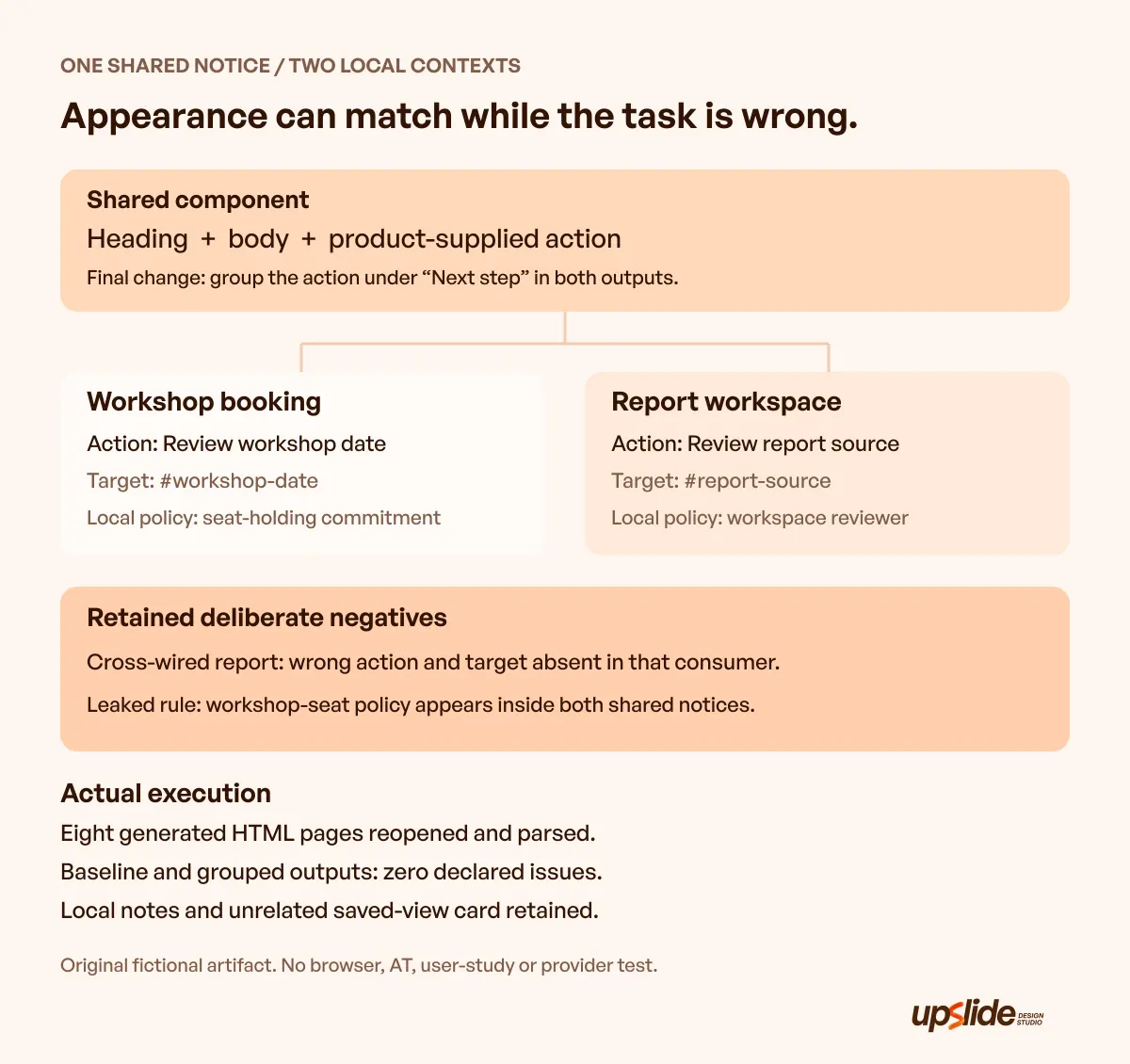
Original Upslide component, fictional consumers and executed HTML inspection. This explanatory graphic is not a browser capture, a provider implementation or a user study.
Inspect the deliberately wrong compositions
The cross-wired report page receives the workshop action. It still uses the shared notice, but its action does not match the report task and its target is absent from that consumer.
The inspector reports those two manifestations of one composition error. A common visual structure did not prevent the wrong product action from entering the page.
In the leakage scenario, the shared notice inserts “Workshop seats are held for 24 hours.” Both consumers receive it, including the unrelated report workspace. The inspector identifies the policy inside the shared notice in both outputs.
Repairing that boundary means keeping the product policy local. The baseline pages already demonstrate the correct separation; a check passing does not establish that the fictional policies themselves are good product decisions.
Apply one shared anatomy change
The final pair uses the same component with a labelled “Next step” group around the action. The inspector finds that group in both actual outputs while the declared local messages, actions and notes remain correct.
The unrelated saved-view card remains structurally identical across all eight pages. The generated shared CSS is also unchanged between the baseline and grouped outputs; this isolates the authored anatomy change from a simultaneous styling change.
Baseline and grouped pages produce no issues under the declared checks. The negatives remain retained for inspection. These checks do not cover every content mistake, HTML requirement or possible consumer.
No browser-fit, keyboard, assistive-technology, performance or comprehension result follows from this execution. Adding a group is an authored design choice, not a demonstrated improvement in how people understand the message.
Use the slice to plan the next review
For a real system, choose a relevant product context and replace the fictional policies with verified requirements. Review the shared decision, the local content and the resulting interface through suitable methods.
Use Resource Box to investigate current references and implementation routes. Use Daily Inspire for credited visual examples, keeping a captured interface separate from its hidden implementation and decision history.
Frequently asked questions
What is a design system?
It connects reusable interface resources with the standards and practices needed to use and maintain them. Its value depends on how those decisions reach actual products, not only on the size of its component library.
Is a component library enough?
A library supplies reusable units. A maintained system also needs purpose, usage guidance, ownership and a way to review changes. Start by describing which of those responsibilities already exist and which are missing.
Should every team build its own system?
Choose around the product's constraints and the work that recurs. Existing resources, a bounded adaptation or a small maintained slice may fit better than building everything. Include continuing ownership in the decision.
What should a component document?
Explain purpose, appropriate use, anatomy, supported states, content and relevant implementation requirements. Show where product-specific responsibility begins. Examples of incorrect use can make that boundary easier to review.
Should business rules live in shared components?
Only share a rule when its meaning and responsibility genuinely belong to the shared scope. The fictional workshop-seat policy did not belong in the report workspace. Keeping appearance shared does not require making every product fact global.
Does using a public system guarantee accessibility?
The product implementation, content and interaction still need appropriate evaluation. Review current provider guidance and the actual supported implementation. This article's generated-HTML checks did not test accessibility or assistive technology.
How should a shared change be reviewed?
Record the reason, affected contexts and who decides. Inspect the relevant consumers using methods appropriate to the change. Preserve what was checked and what remains unknown instead of treating approval or delivery as a universal pass.
What did the original example establish?
It generated two fictional consumers through one shared component and inspected declared output relationships. The retained negatives expose a wrong product action and leaked product policy. It did not measure user understanding, provider quality, performance or organisation-wide adoption.
Key takeaways
- Define the recurring problem and the scope before expanding the library.
- Connect principles, foundations, components and product-specific responsibilities.
- Study public systems for relevant decisions, then verify the selected implementation and terms.
- Inspect actual consumers as well as isolated components.
- Maintain ownership, change rationale and explicit limits on what each review establishes.
If recurring interface decisions need a clearer product context, discuss the design work with Upslide.


