
Do you need a better wireframe tool, or a clearer way to explain what the product should do?
A founder can spend an afternoon moving rectangles and still leave the important decisions unresolved: who owns a record, what happens after a failed save, or how a first-time user gets started. A designer can produce a convincing screen while the team quietly imagines three different workflows.
The useful starting point is a tool that makes those differences visible. This guide compares six free-entry options across sketching, flow mapping and interface design, then works through a small SaaS task that can be reused in a review.
The shortlist uses official product and plan information checked on November 1, 2026. The recommendations describe workflow fit; they aren't a timed product benchmark. Preview images show the public websites, while the customer-flow graphic is an original illustrative design exercise.
A useful wireframe makes a product decision easier to explain, challenge and change.
Design task
Decide what the wireframe needs to answer
A wireframe is a working model of content, structure and behaviour. The right level of detail depends on the uncertainty the team needs to resolve.
For an unfamiliar workflow, a sketch and arrows may be enough. For a form with dependent fields, the review needs realistic labels, validation and a clear result. For a layout that will become a design system, reusable components matter earlier.
Write a one-sentence task before opening an editor: “A support manager adds a customer, corrects an invalid email address, and finds the saved customer in the list.” That sentence supplies a starting condition, an action and an observable result.
- Flow uncertainty: Where does the user start, and what happens next?
- Content uncertainty: Which information is needed to make the decision?
- Interaction uncertainty: What changes after a click, an error or a successful action?
- Team uncertainty: Who needs to edit, comment, approve and recover the work later?
The exercise should answer one of those questions clearly. A visually finished screen that leaves all four unresolved hasn't earned its extra detail.
Resource collection
Compare the six options at a glance
| Resource | Suitable starting point | Free access checked | Constraint to examine |
|---|---|---|---|
| Excalidraw | Rough screens, flows and discussions | Free open-source editor | Keep an intentional export and recovery routine |
| Penpot | Reusable interface layouts and prototypes | Professional cloud plan at $0/user/month | Storage, history and governance still need review |
| Figma | Wireframes that will become detailed UI | Free Starter plan, unlimited drafts | Team collaboration and product access depend on the plan |
| Whimsical | A small flow with a few wireframes | Free plan | 50 board objects/month, watermarked exports, seven-day history |
| Miro | Workshops that combine flows, notes and screens | Free plan | Three editable boards; team access needs attention |
| tldraw | Quick visual thinking on a shared canvas | Free public whiteboard | Confirm persistence, sharing and export for important work |
These options cover different jobs. A flow-mapping canvas and a structured interface editor should be compared against the team's task, rather than forced into one universal ranking.
1. Excalidraw — make the flow discussable
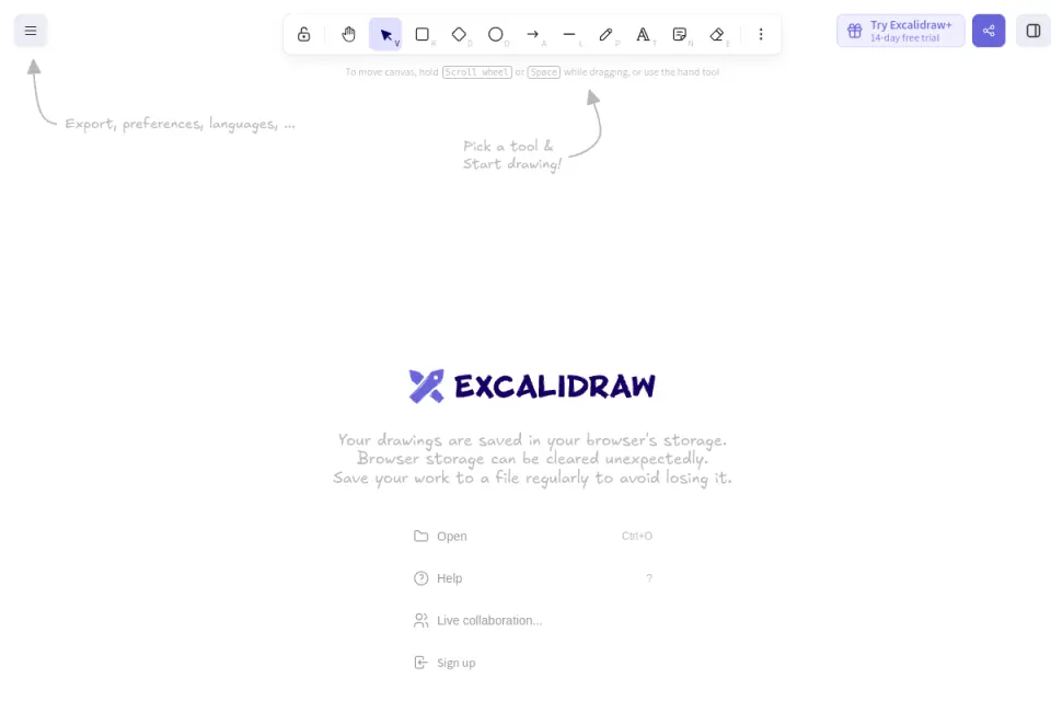
Excalidraw's official repository describes a free, open-source whiteboard with a hand-drawn style, collaboration and local-first browser storage. The deliberately rough visual language suits a discussion where the screen order matters more than the spacing system.
For the customer task, start with three boxes: an empty list, an add-customer form and a populated list. Add an error branch beside the form before anyone starts debating colours.
- Useful when: A founder, designer and engineer need to agree on a sequence during a short discussion.
- Bring into the review: Labels for the decision, the failure path and the result; arrows alone leave too much to interpretation.
- Watch for: A shared drawing becoming the only surviving specification. Export the working file and keep the decisions somewhere the team can recover.
The sketch should expose missing states. Once the conversation turns to repeated layouts or precise interaction behaviour, moving into a structured design environment may be the sensible next step.
Find Excalidraw in the Resource Box.
2. Penpot — give the layout a reusable structure
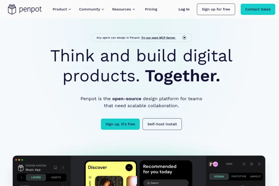
Penpot's pricing page lists its Professional cloud plan at $0 per user per month. Core design and prototyping features are included, while other plans address additional storage, history and organisational needs.
Penpot fits the stage where an exploratory screen starts to become a family of related screens. The useful question is whether the team can reuse the same form row, action area and feedback pattern as the flow grows.
- Useful when: The wireframe will develop into an editable interface system.
- Bring into the review: A reusable field pattern, consistent names, and examples of default, error and successful states.
- Watch for: Treating open source as a complete operating-cost calculation. Self-hosting introduces infrastructure, updates and ownership work.
For the customer task, define the field and action components once, then use their states to explain the workflow. That makes a change to a shared pattern easier to reason about than six individually drawn variants.
Find Penpot in the Resource Box.
3. Figma — keep continuity into detailed UI
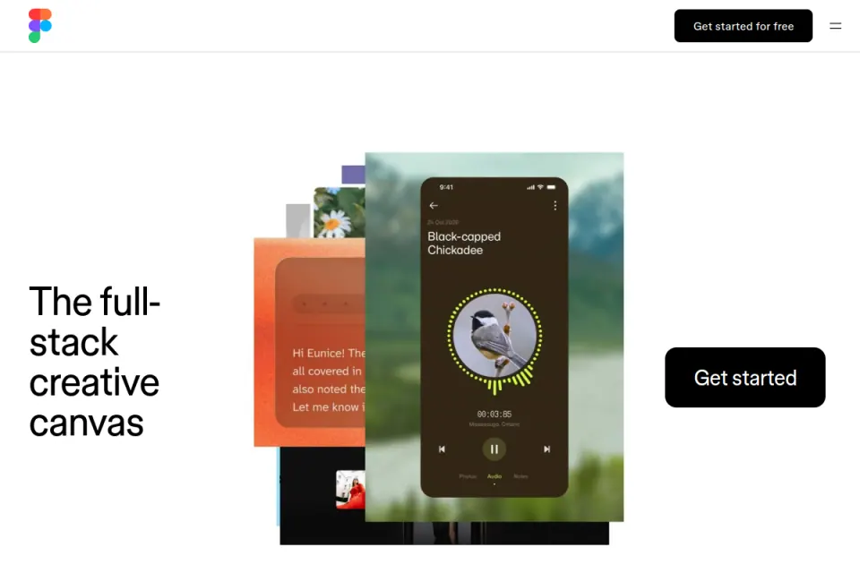
Figma's pricing page lists a free Starter plan with unlimited drafts and limited access to its product suite. A free draft space shouldn't be assumed to include every collaboration, handoff or publishing capability the team will eventually need.
Figma is a practical candidate when the designers already work there and the wireframe will become a detailed interface. The value is continuity: the same content, component vocabulary and decisions can travel into the next stage.
- Useful when: The team needs a direct path from a plain wireframe into detailed design.
- Bring into the review: Real field labels, a restrained component set and a clearly marked review question.
- Watch for: A polished template encouraging premature decisions about appearance. Keep visual detail low until the task is understandable.
For the customer exercise, a click-through prototype can connect the empty list, form and saved record. The review should test whether those transitions make sense, rather than whether the prototype resembles a finished product.
Find Figma in the Resource Box.
4. Whimsical — keep a small exercise small
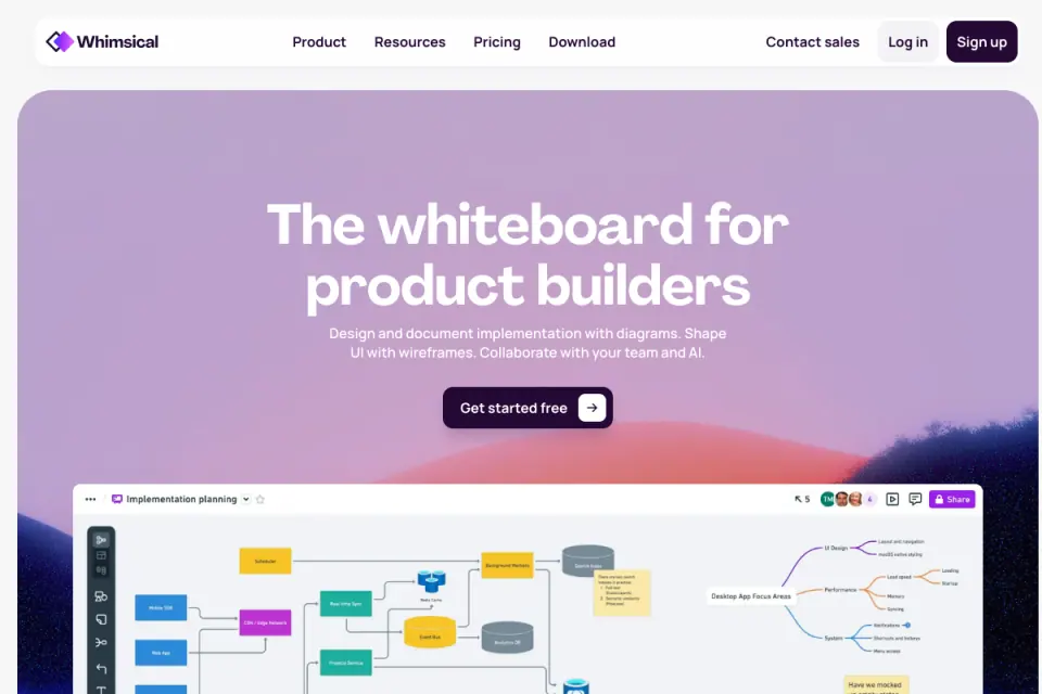
Whimsical's published free plan allows up to 50 board objects and 50 document blocks created per month, with watermarked exports and seven-day version history. Those limits matter when a simple flow grows into multiple screens and annotations.
Its boards combine diagrams and wireframes, which makes it relevant to a narrowly scoped design discussion. Before committing to a large review, count the likely screens and the objects each screen requires.
- Useful when: A small team needs to connect a flow and a few low-fidelity screens in one discussion.
- Bring into the review: One complete task, a small set of decisions and an agreed place for the final record.
- Watch for: Assuming a free evaluation allowance is a permanent workspace for an expanding product.
For the customer task, the important output is a complete path through an error and recovery. If the allowance forces the team to omit that path, reduce the exercise or choose another starting point.
Find Whimsical in the Resource Box.
5. Miro — put the wireframe beside the context
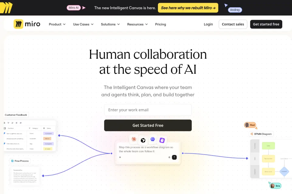
Miro's free plan includes three editable boards. Its pricing information also states that free-plan boards are accessible to team members by default; selecting more granular access belongs in the plan review.
Miro is relevant when a wireframe needs to sit beside a journey, workshop notes or a process map. The canvas can preserve the relationship between a screen and the operational question that produced it.
- Useful when: Several stakeholders need to compare the flow, supporting context and open questions together.
- Bring into the review: A defined area for evidence, a defined area for screens and a visible decision log.
- Watch for: A large board becoming difficult to navigate, or sensitive material being shared more widely than intended.
Keep the customer flow in a bounded frame, and attach each unresolved question to its relevant screen. The reviewer should be able to follow the task without touring the whole workshop board.
Find Miro in the Resource Box.
6. tldraw — sketch before building a system
tldraw's public site provides a free whiteboard for visual thinking. This recommendation concerns that public drawing experience, rather than the separate developer SDK or the commercial terms for embedding it in a product.
A lightweight canvas is useful when the first question is spatial: which screens exist, which information belongs together, and where the branches appear. It can keep a first discussion moving without requiring a component library.
- Useful when: A small group wants to sketch a task before choosing a structured interface tool.
- Bring into the review: Screen labels, clear connectors and a saved output that preserves the discussion.
- Watch for: Assuming that a browser session, a share link and a durable project record are the same thing.
Check how the actual working file can be reopened and exported before relying on it for an important review. The customer exercise should remain understandable after the person who drew it leaves the conversation.
Find tldraw in the Resource Box.
Fit and limitations
Work through the same customer task
Comparing unrelated templates tells little about workflow fit. A more useful evaluation gives the shortlisted options the same content and the same task.
The following graphic is an original illustrative wireframe, not a screenshot of any featured tool. It shows the three states that a simple customer-management flow needs to discuss.
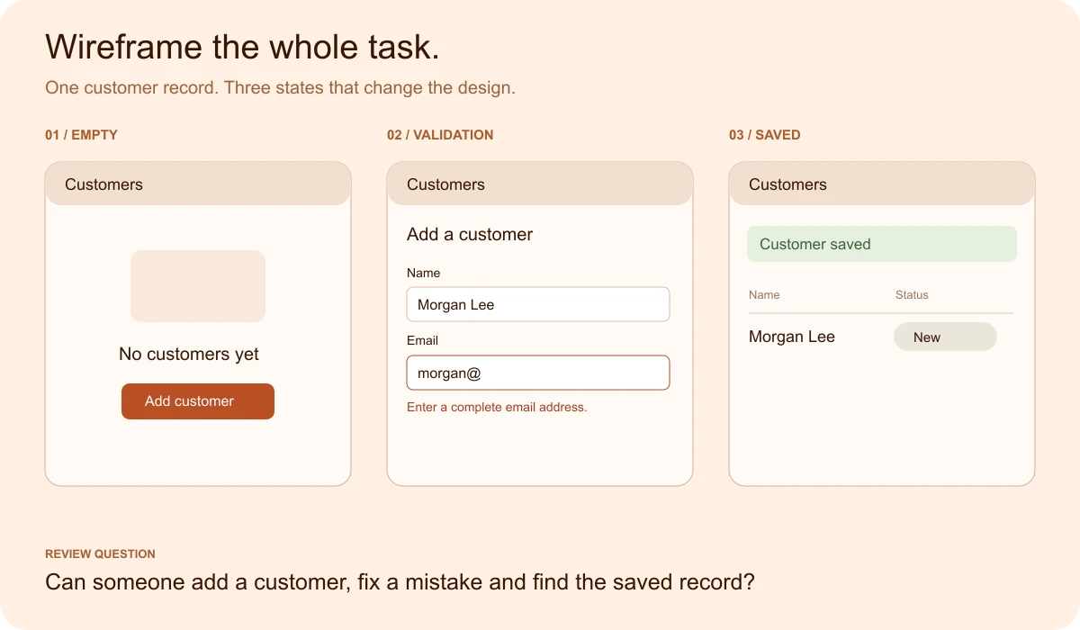
- Empty list: Explain what belongs here and provide a clear first action. An empty table without an explanation leaves the user to infer whether the product is working.
- Validation: Keep entered information visible, identify the field that needs attention and explain a useful correction. A generic failure message doesn't support recovery.
- Saved record: Show the result where the user expects to find it. The success message and the updated list should tell a consistent story.
A fuller product may also need permission restrictions, duplicate detection, a saving state and a failed network request. Add those when they affect the task; don't decorate an exercise with every possible edge case.
The reviewer can then follow the flow without narration. Record where they hesitate, which labels they interpret differently and what information they expect after each action.
Free access is only one part of the decision
The practical limits are often discovered after the first screen: an engineer can't comment, a founder can't find the latest file, or the export omits information needed for the review.
Check four things before expanding the work:
- Collaboration: Can the people doing the review access the work with the intended permissions?
- Continuity: Can the next design stage reuse the content and decisions?
- Recovery: Can the team reopen an earlier version or recover a working file?
- Portability: Can important work leave the tool in a useful format?
A free tier can be entirely adequate for a small exercise. It becomes a poor fit when a restriction prevents the team from resolving its actual design question.
How to choose
Make a shortlist by workflow
For a founder exploring an unfamiliar task, start with a sketching canvas and keep the exercise deliberately rough. For a designer extending a product system, prioritise reusable interface structure and continuity into detailed work.
For a cross-functional workshop, place the wireframe beside its context and keep the board navigable. For a small flow-and-screen discussion, check that the free allowance can hold the complete task.
The decision record can be one short table:
| Review question | Evidence to keep |
|---|---|
| Could a reviewer follow the task? | The point where an explanation was needed |
| Were important states visible? | Missing empty, error or successful states |
| Could the team participate? | Actual access, comment and edit constraints |
| Could the work survive the exercise? | Export, reopening and version-recovery result |
This is a proposed evaluation method, not a scorecard claiming one tool is objectively best. Stop comparing when an option supports the task and the remaining tradeoffs are understood.
If the next obstacle is learning the design fundamentals, Upslide Design School's free 14-day UI/UX course covers Figma, prototyping and design systems. The customer-management exercise can serve as a concrete practice brief alongside those lessons.
Bring a reference into the wireframe
A useful next step is to find one reference for a specific problem: a clear empty state, a well-explained form or a product page that makes a workflow understandable. Save the reason for the reference alongside the image.
The SaaS website examples guide shows how to extract a design decision from a reference. The Inspire archive provides more visual material to examine without narrowing the exercise to one product's style.
Frequently asked questions
What should a SaaS wireframe include?
Start with the task, the information needed to complete it and the next action. Include the starting state, a realistic error and the successful result. For the customer-management example in this guide, that means an empty list, a form with email validation and the saved customer record.
Which free wireframe tool should a beginner start with?
Choose by the first task rather than a universal ranking. A sketching canvas can suit a conversation about screen order; a structured interface editor can suit work that will become detailed UI.
Shortlist two options, use the same small task in each and check their current sharing and export restrictions.
Can a founder create useful wireframes without design experience?
A founder can begin by describing a real user task, sketching the necessary screens and using realistic labels. The first review should expose unanswered questions rather than demonstrate visual polish. Ask someone else to explain the flow without narration, then record where the screen needs clearer information or feedback.
What is the difference between a wireframe and a prototype?
A wireframe describes the structure and content of an interface. A prototype demonstrates enough behaviour to explore how a task works, such as moving from a list to a form and back after saving. A prototype can use low-fidelity wireframes; detailed styling is not a prerequisite for testing the sequence.
Do early wireframes need error and empty states?
Include them when they affect the task being discussed. An empty list needs to explain what belongs there and how to begin. A validation error needs to identify the problem and support a correction. Leaving those states out can make the happy path appear complete while hiding important design decisions.
What should a team check before relying on a free plan?
Check whether the people involved can view, comment and edit with the intended permissions. Confirm that the allowance fits the whole exercise, then try reopening and exporting the work. Review current official plan terms before expanding the project; a free starting point may have limits that matter later.
When should a wireframe become a high-fidelity design?
Increase visual detail when the task, content hierarchy and important states are clear enough to justify it. Keep unresolved workflow questions visible rather than hiding them behind polished components. The next stage should refine an understood interaction and its visual system, with further validation where uncertainty remains.
Key takeaways
- Choose the design question before choosing the software.
- Compare several workflow types without pretending they serve the same purpose.
- Include the empty, error and saved states that make a task understandable.
- Check collaboration, recovery and exports alongside the free-plan allowance.
- Keep a decision record so the wireframe remains useful after the meeting.
We help SaaS teams turn unclear workflows into practical interface designs. If the team needs help moving from a wireframe to a product improvement, explore Upslide's focused UX redesign service. For a self-directed next step, the Resource Box's prototyping collection keeps the resources close to the task.