
Have you checked a button's colours, only to notice that its label becomes difficult to read when you hover over it? A passing default combination doesn't establish that the rest of the component works.
A useful contrast review follows the actual text, control and surrounding surface through the states people encounter. The colour checker supplies a measurement; the reviewer still needs to choose the right pair and interpret the relevant requirement.
This guide combines four resources with an original, calculated example for a fictional SaaS form. It covers colour-pair checks and the surrounding review process, rather than claiming that one ratio certifies an entire page.
Design task
Identify what needs to remain visible
The starting question is what the person must read or recognise. A button label, a required field boundary and a focus indicator may appear together while needing separate checks.
For each component, record:
- The text or visual cue being evaluated.
- The state in which it appears.
- The actual adjacent colour or background.
- The relevant contrast criterion.
- Any additional information needed to interpret the state.
This turns a general instruction such as “check the orange” into a specific task. The team can then evaluate a label against its button fill without confusing that measurement with the button's boundary against the page.
A contrast result belongs to a particular pair, state and criterion.
Establish the standard before reading the result
For WCAG 2.2 Level AA text contrast, W3C's Contrast Minimum explanation gives a 4.5:1 minimum for ordinary text and 3:1 for qualifying large text. Large text is at least 18 points, or at least 14 points when bold; a prominent position alone doesn't make a label large.
Non-text Contrast addresses visual information needed to identify controls, their states and meaningful graphics, with a 3:1 requirement against adjacent colours and specified exceptions. It doesn't require every decorative edge to become a high-contrast border.
Choose the relevant check before interpreting a tool's badge. A label and a required input boundary aren't interchangeable test subjects.
Include the states that change the pair
Make a small inventory of default, hover, pressed, focused, selected, validation and unavailable conditions where relevant. Also record combinations, such as keyboard focus on an already selected control.
The purpose isn't to invent states for every element. It is to identify where the implementation changes text, fill, border, opacity or adjacent content and therefore needs a fresh review.
A hover change may leave text readable while a selected state introduces a new label or background. Each should be reviewed in its actual context.
Resource kit
Use a checker that matches the evidence
| Resource | Documented role | Useful place in the workflow | Limitation to retain |
|---|---|---|---|
| WebAIM Contrast Checker | Foreground/background checks with text and non-text result categories | Verify a known pair and retain a shareable input | It doesn't discover every state or decide which pair matters |
| Accessible Colors | Text/background review with size, weight and lightness-based alternatives | Explore a correction to a text combination | Suggested colours still need review in the complete component |
| Stark | Contrast selection and suggestions in design and browser workflows | Inspect colour relationships near the actual design or implementation | Feature access and detected backgrounds need confirmation |
| Colour Contrast Analyser | Desktop colour sampling and copyable results | Check screen-based material and retain an assessment record | Sampling and criterion selection remain review responsibilities |
These resources are complementary options. A team doesn't need to adopt all four before performing a useful review.
WebAIM: verify the selected pair
WebAIM's checker accepts foreground and background values and displays separate outcomes for ordinary text, large text and graphical or interface content. It also supports foreground transparency and a permalink for the chosen pair.
This is useful when the team already knows the values being compared. Keep the component and state beside the result so a later reviewer can understand why that pair was entered.
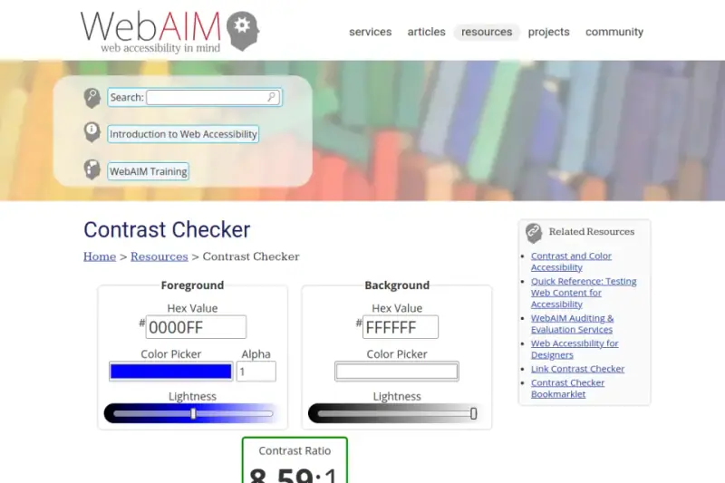
Existing public-page capture, visually inspected. Credit: WebAIM. Any values visible in this older preview belong to that capture, not the worked example below.
Accessible Colors: explore a text-pair correction
Accessible Colors exposes text colour, background, size, weight and AA/AAA choices. Its explanation describes finding alternatives by changing lightness while retaining the original direction as far as possible.
The live interface was inspected for this guide. It is useful for generating a correction candidate, but a candidate still needs to fit other uses of the same token.
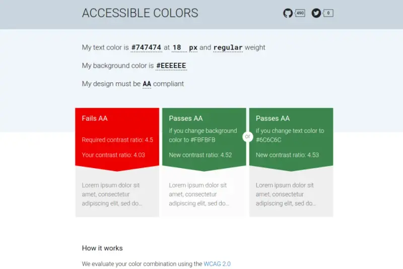
Existing public-tool capture, visually inspected. Credit: Accessible Colors. A generated suggestion isn't evidence that every use of that colour in a product has passed.
Stark: inspect the colour relationship in context
Stark's official contrast instructions describe selecting layers or browser elements, checking detected colours and applying suggestions. They also explain choosing different colours when automatic selection doesn't identify the intended pair.
That distinction matters on layered interfaces. The reviewer should confirm what the tool actually sampled before accepting a result.
Its current plans distinguish feature access. No particular subscription, complete scan coverage or automatic remediation outcome is assumed here.
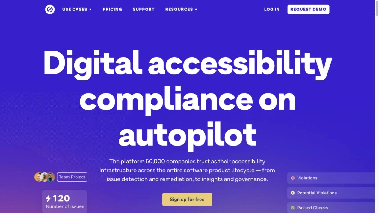
Actual public-page capture from November 2, 2026, visually inspected. Credit: Stark. This introduction isn't a completed audit or proof of access to a specific feature.
Colour Contrast Analyser: retain a screen-based record
The official Colour Contrast Analyser page describes a free desktop tool with colour sampling, foreground alpha support and copyable test results. It links Windows and Mac downloads.
This resource was added to Resource Box after verification. No application was installed or run for this article; the tool's documented capabilities support the shortlist, while the numerical exercise uses independent calculations and WebAIM cross-checks.
How the pieces work together
Capture the actual state before measuring
Begin with the screen and content that reproduce the condition. Note the component, state, theme and the surrounding surface.
For a browser implementation, inspect the effective styles rather than relying on a token name remembered from the design file. Cascading rules, opacity and inherited styles can change the pair that reaches the screen.
WebAIM's DevTools article explains inspecting computed colours and forcing hover or focus for review. Its interface instructions are older, so the exact browser controls should be checked in the current version.
Separate three kinds of evidence
Keep these checks in different rows of the review record:
- Text pair: The label or message against the surface behind it.
- Required visual cue: The boundary, selected marker or other information needed to recognise the control or state.
- Interaction: Whether the state actually appears and remains usable during the intended input sequence.
A colour calculator can help with the first two. It doesn't prove that a focus indicator is clipped, hidden or shown at the right time; those questions require inspecting the component in use.
Correct the relationship, then review the token
A local correction might darken the background, change the foreground or replace the component's treatment. Choose the option that keeps the message readable and the hierarchy coherent.
Before changing a shared token, inspect its other uses. A darker fill that helps white button text might become unsuitable when the same colour appears as text on a dark surface.
Record whether the decision changes a shared rule or creates a narrowly justified exception. The next feature should be able to use the same reasoning.
Worked example
Review an invitation form across two states
Consider a fictional SaaS invitation form with an “Invite teammate” button and an email field on a cream surface. The exercise uses opaque sRGB values and ordinary-sized text, with no image, gradient or transparency behind the measured pairs.
The default button has white text on a dark orange fill. Its hover treatment changes the fill to a much lighter orange while retaining white text.
The table records independently calculated contrast ratios, rounded to one decimal for display. Calculations retained full precision for classification, and WebAIM's documented checker API independently confirmed the corresponding outcomes.
| Item and state | Foreground | Background | Approximate ratio | Review outcome for this exercise |
|---|---|---|---|---|
| Button label, default | #FFFFFF | #A44115 | 6.3:1 | Meets the ordinary-text AA threshold |
| Button label, original hover | #FFFFFF | #EA9A59 | 2.3:1 | Fails the ordinary-text AA threshold |
| Button label, revised hover | #FFFFFF | #8D330D | 8.0:1 | Meets the ordinary-text AA threshold |
| Required field boundary, original | #D1B8A3 | #FFF6F0 | 1.8:1 | Fails the applicable 3:1 boundary check |
| Required field boundary, revised | #A44115 | #FFF6F0 | 5.9:1 | Meets that boundary contrast threshold |
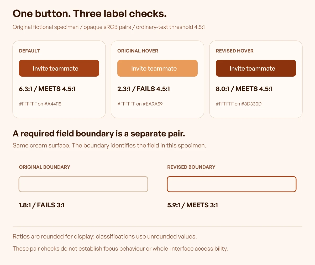
Original instructional specimen by Upslide. Ratios describe only the declared opaque colour pairs; they aren't measurements of a client product or certification of a complete interface.
Explain what the correction establishes
The original hover treatment fails because the label no longer has sufficient contrast against its own fill. The default result remains correct, but it doesn't cover that different pair.
Darkening the hover fill in this example restores the label's contrast. Another valid design might retain the lighter fill and use a darker foreground, provided the complete component and its other states are reviewed.
The input boundary has a different purpose. In this exercise it is explicitly required to identify the field on a same-coloured surface, so its contrast against the cream is evaluated as meaningful visual information.
This is not a rule that every decorative border on every button must pass a separate measurement. The record needs to explain what the visual cue is doing.
Reproduce the pair checks
Open WebAIM and enter each foreground/background pair from the table, preserving their roles. The checker displays categories for different content types; use the one relevant to the row being reviewed.
The original hover pair and revised hover pair provide reproducible starting points. A browser may display more decimal places or truncate differently from this table; a borderline result must be assessed without rounding it up to a passing threshold.
Then inspect the implemented state. The entered values are only useful if they match the actual foreground and surface in that state.
Record the checks the numbers don't answer
The invitation form also needs a visible keyboard focus indicator and a clear error message if the address can't be used. Those requirements aren't established by the button-label ratio.
W3C Focus Visible requires a visible keyboard-focus indicator. The separate Focus Appearance criterion is Level AAA; its additional area and focused/unfocused contrast conditions shouldn't be described as an identical AA requirement.
The review record should therefore retain the actual keyboard sequence, indicator appearance and applicable checks. Passing one contrast row doesn't close those other tasks.
Limitations and alternatives
Gradients, images and transparency need the actual background
The worked example intentionally uses flat opaque colours. A headline over a changing image or a translucent button over several surfaces introduces different pair relationships.
Inspect the background behind the information that must be read. An average for the whole photograph can conceal a locally difficult area behind a word.
A consistent opaque panel or a carefully controlled background can sometimes simplify the design and its review. If transparency remains important, record the underlying surface and the resulting composite rather than measuring only the uncomposited colour token.
Disabled controls have an exception, not a complete usability solution
W3C's text and non-text contrast criteria include exceptions for inactive controls. That doesn't make faint explanatory copy outside the control exempt, and it doesn't explain why the action is unavailable.
Keep the relevant instruction readable and clarify the prerequisite. The reviewer should distinguish an inactive control from an active action that merely looks subdued.
Contrast and colour-independent meaning are separate
A status can have strong contrast while still depending entirely on red versus green for meaning. W3C Use of Color addresses information that is conveyed only through colour.
Use clear wording and appropriate additional cues for important states. Upslide's colour-context guide discusses interpretation; this workflow focuses on measuring the visual relationships.
Continue in Resource Box and Inspire
Keep the review close to the source
Use Resource Box to open the checkers and original documentation. Retain the component/state record beside the result so another designer or developer can reproduce the decision.
For choosing or generating the underlying palette, continue with the colour palette tools guide. Its discovery task is separate from validating the pairs used by an implemented state.
Use inspiration as a reference, then test the implementation
Daily Inspire can help identify a presentation approach worth studying. Open and credit the original website when retaining the reference.
A screenshot doesn't establish keyboard behaviour, every theme or every state. Use it to describe what is visible, then perform the relevant checks in the actual implementation.
Frequently asked questions
Which colour contrast checker should a small team start with?
For known foreground/background values, a direct pair checker such as WebAIM is a practical starting point. Choose an in-context or desktop option when the task requires sampling or review near the working design, and retain the state and criterion with the result.
Does a passing default button cover its hover state?
No. If either colour changes, the pair needs review in that state. The worked example has a passing default label and a failing original hover label despite belonging to the same component.
Do the default and hover fills need 3:1 against each other?
Non-text Contrast doesn't generally require sequential state colours to contrast 3:1 with each other merely because they change. Evaluate the meaningful visual information against its adjacent colours in each state, and consider any separate focus-appearance requirement that applies.
Should a team round 4.499:1 up to 4.5:1?
No. W3C treats the thresholds as minimums, so rounding a lower value upward doesn't make it pass. Display rounding is acceptable for a summary, but the underlying classification must retain sufficient precision.
Do disabled controls need the same minimum contrast?
The cited criteria include inactive-control exceptions. Keep the explanation of the unavailable action readable and don't extend that exception to ordinary help text or an action that remains active.
Can a photograph's average contrast prove that overlaid text is readable?
No. The area behind the actual lettering needs evaluation, including difficult local regions. A single favourable average can hide a poor relationship where an important word appears.
Is an accessible-looking colour suggestion a finished fix?
It is a candidate correction. Review the actual component, relevant states, other token uses and implementation before accepting the change.
Does this workflow establish that a website is fully accessible?
No. It addresses specific contrast relationships and related visual-state checks. Keyboard operation, accessible names, content, structure and other requirements still need their own evidence.
Key takeaways
- Record the component, state, pair and relevant criterion before measuring.
- Recheck changed relationships instead of extending a default-state result.
- Keep label, required visual cue and interaction evidence separate.
- Use full precision for threshold decisions and retain reproducible inputs.
- Confirm corrections in the implementation and review other uses of shared tokens.
- Treat contrast as one part of the product review, with explicit exceptions and limits.
We help SaaS teams turn component inconsistencies into clearer design and implementation decisions. For a wider interface review, discuss the design work with Upslide.