
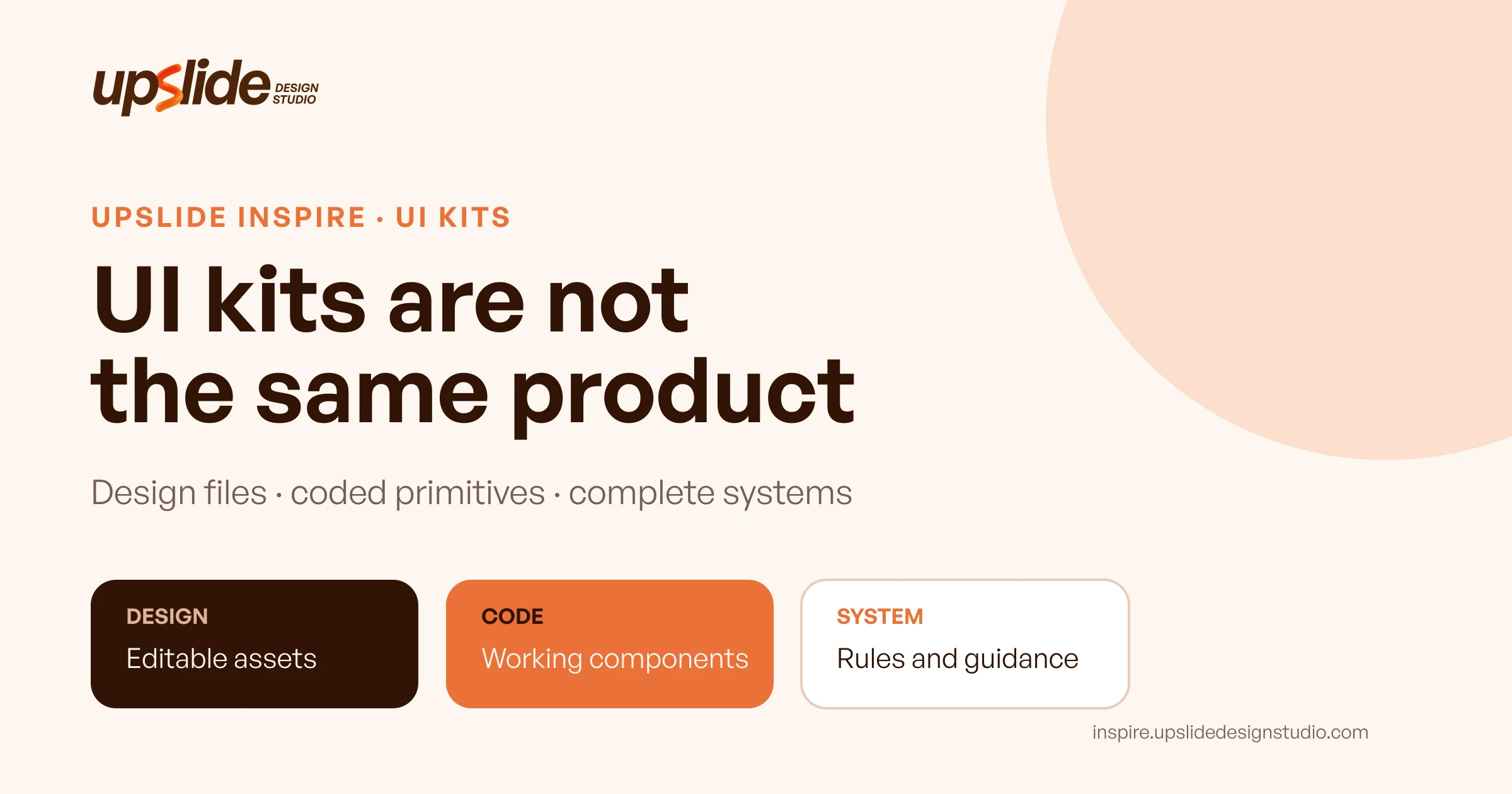
Does a product team need a UI kit, a coded component library, or a complete design system?
Those labels are often mixed together, yet they describe different starting points. One resource may provide editable Figma components. Another may deliver unstyled behaviour in code. A third may combine principles, tokens, accessibility guidance, design assets and production libraries. Calling all three “UI kits” makes the shortlist look simpler while hiding the work that remains.
This guide reviews six resources already listed in the Upslide Inspire Resource Box: Untitled UI, shadcn/ui, Radix Primitives, Material Design, Carbon Design System and Ant Design. Their stored public website previews were visually inspected on November 2, 2026, and current official documentation was checked for the claims made nearby.
The collection is not a ranking and the resources are not direct substitutes. The useful question is which missing layer will help a specific product task without creating an avoidable mismatch between design and development.
Design task
Define the prototype before choosing its kit
Assume a small SaaS team needs to prototype a customer-support workspace. The first release contains a ticket list, ticket detail, search, status changes, assignment, an empty state, validation, loading and a failed-request recovery. The team uses Figma for design and React for implementation.
That brief exposes several kinds of work:
- Visual design: layout, hierarchy, density, typography, colour and responsive behaviour.
- Interaction design: focus order, keyboard use, overlays, selection, validation and feedback.
- Design assets: reusable components, variants, variables and example screens in the design file.
- Production code: component APIs, state management, styling, testing and application integration.
- System governance: naming, tokens, contribution rules, documentation, ownership and updates.
A resource can cover one or several layers, but none removes the team's responsibility for the product-specific task. A polished table component does not decide which ticket fields matter. An accessible primitive does not choose the correct label. A Figma kit does not automatically become production code.
Separate the selection criteria
Before browsing, turn “find a good UI kit” into verifiable questions:
1. Does the team need editable design assets, production code or both? 2. Which framework, platform and browser targets must the implementation support? 3. Are default visual styles helpful, or will the product require a distinct brand system? 4. Which components, states and accessibility behaviours are essential to the task? 5. How will design and code stay aligned after the first prototype? 6. What licence, maintenance and update responsibilities will the team accept?
Those questions prevent catalogue size from becoming a substitute for fit.
Resource collection
Compare the six resources by the layer they supply
| Resource | Primary layer | Useful strength | Work the team still owns |
|---|---|---|---|
| Untitled UI | Editable Figma kit, with related React offerings | Structured styles, basic components and examples in a free design-file version | Product-specific flows, deeper variants, implementation and governance |
| shadcn/ui | Open component code and distribution model | The component source enters the project and can be changed | Design-file alignment, product decisions, testing and ongoing ownership |
| Radix Primitives | Unstyled React primitives | Behaviour foundations, focus management and keyboard patterns for common controls | Visual system, composition, content, application logic and validation |
| Material Design | Design system with guidance, kits and implementations | Cross-platform principles, components, foundations and resources | Brand adaptation, product-specific workflows and platform choices |
| Carbon Design System | Open system with design tools, guidance and code | Enterprise-oriented components, patterns, tokens and accessibility guidance | Fit beyond IBM-flavoured defaults, product rules and implementation ownership |
| Ant Design | Opinionated React UI library and design language | Broad enterprise component coverage and established interaction patterns | Brand differentiation, design-file workflow, accessibility verification and product logic |
This table compares starting layers, not abstract quality. A team that needs a Figma prototype has a different gap from a team that already has designs and needs reliable dialog behaviour in React.
1. Untitled UI — begin with a structured design file
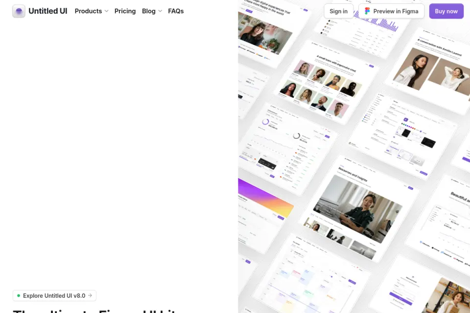
Untitled UI's FAQ states that a free Figma version is available. The current page describes it as a slimmed-down kit with global styles, basic components and a few page examples; newer variables and some advanced component features belong to paid versions. It also says the free kit can be used in personal and commercial projects.
That makes Untitled UI a useful candidate when the immediate gap is an editable design-file foundation. A designer can begin with named components and examples instead of drawing every common control from scratch.
The limitation is equally important: a design file is not production code, and a prebuilt page is not a validated product flow. The support workspace still needs realistic content, density decisions, responsive behaviour, error states and a handoff that the development team can implement.
- Useful when: The team needs a fast, structured Figma starting point and is comfortable adapting a recognisable visual system.
- Check next: Exact free-version contents, Figma feature requirements, licence scope and how the chosen components map to code.
- Do not assume: A large component count means the ticket workflow, permissions or edge cases are solved.
2. shadcn/ui — own the component code
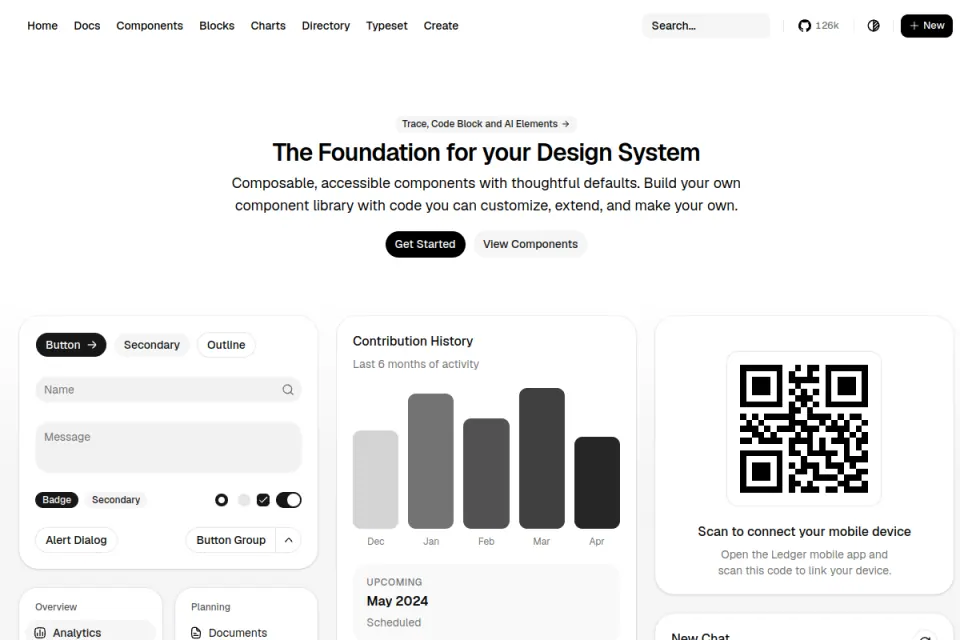
shadcn/ui's official introduction describes open code rather than a traditional package-only component library. The project distributes component source into the application so the team can inspect, customise and extend it. Its Figma documentation points to community-maintained resources rather than presenting one canonical design file.
For the support workspace, that model is useful when the React team wants direct control over the top layer of component code. A dialog, table or form can be brought into the project and changed to fit the product.
Ownership is the tradeoff. Once the code is inside the product, the team is responsible for its composition, styling, testing, updates and design alignment. “Open code” is an invitation to maintain the result, not an automatic handoff solution.
- Useful when: A React team values editable source, composable defaults and a project-local component layer.
- Check next: Framework setup, component dependencies, licence, update strategy and the exact Figma companion used by designers.
- Do not assume: Community Figma files share identical maintenance, completeness or parity with the installed code.
3. Radix Primitives — behaviour without a finished visual system
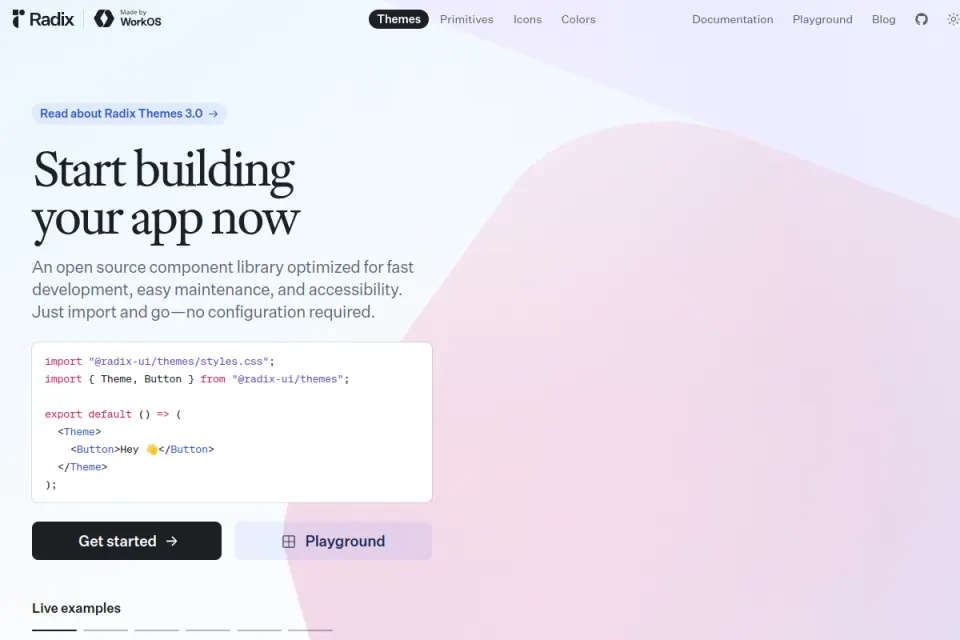
Radix Primitives describes a low-level, open-source component library focused on accessibility, customisation and developer experience. Its accessibility documentation discusses WAI-ARIA patterns, focus management and keyboard navigation for supported controls.
Radix is relevant when the missing layer is reliable behaviour beneath a custom visual system. The support workspace can use primitives for dialogs, dropdowns, tabs or tooltips while the team defines its own appearance and composition.
The resource does not choose the product's density, content or workflow. Accessibility also remains a system responsibility: labels, content, contrast, error recovery and product-specific combinations must still be designed and tested.
- Useful when: Developers need unstyled interaction foundations and designers want strong visual control.
- Check next: Supported components, browser and assistive-technology expectations, styling approach, licence and testing plan.
- Do not assume: An accessible primitive guarantees an accessible product after custom composition.
4. Material Design — a broad system with platform guidance
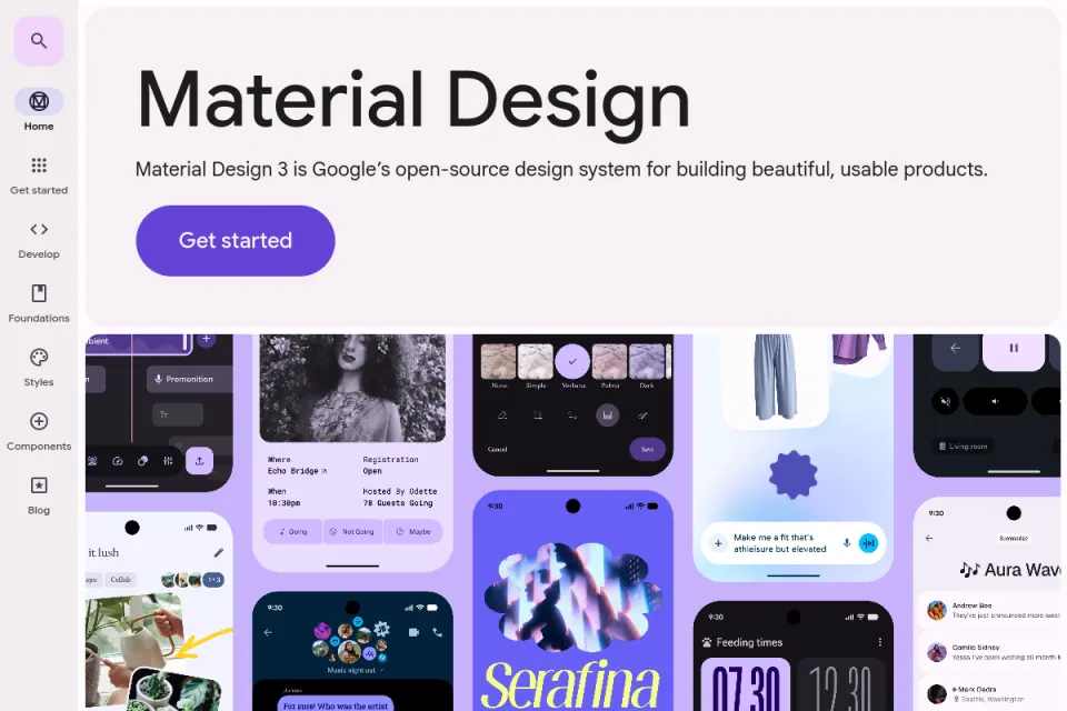
Material Design 3 is Google's design system. Its official introduction connects foundations, styles, components, design kits and implementation resources across Android, Flutter and the web. It also identifies licensing for its content and resources.
Material is a useful candidate when a team needs more than isolated components. Its guidance can help designers reason about tokens, adaptive layouts, states and platform patterns while developers use compatible implementation resources.
Breadth creates a different risk: the team can adopt the visible style without understanding the platform or product assumptions behind it. For a B2B support workspace, the designers still need to decide information density, table behaviour, bulk actions and desktop workflows rather than treating mobile-oriented examples as universal.
- Useful when: A team wants a mature cross-platform system, documented foundations and implementation paths.
- Check next: Target platform, current component availability, design-kit version, implementation maturity and brand adaptation.
- Do not assume: Applying Material styling automatically produces the correct workflow or a distinctive brand.
5. Carbon Design System — an enterprise foundation with explicit guidance
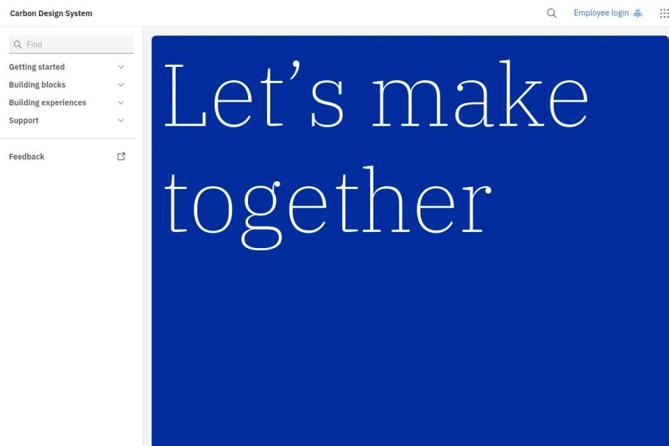
Carbon describes itself as IBM's open-source design system for products and digital experiences. It includes working code, design tools, foundations, components, patterns and guidance. Its accessibility overview explains that Carbon components follow IBM's checklist based on standards including WCAG AA.
Carbon's enterprise context makes it especially relevant to dense software. The documentation can help a team think about repeated components, data presentation, consistency and accessibility as a connected system rather than a folder of screens.
That context also means the visual and organisational defaults may carry IBM-specific assumptions. A non-IBM SaaS team should evaluate whether it wants the whole system, selected patterns or only the lessons. Brand adaptation and product-specific research remain necessary.
- Useful when: The team needs an enterprise-oriented system with code, design resources and substantial guidance.
- Check next: Framework packages, design assets, extension approach, accessibility responsibilities and brand fit.
- Do not assume: A system created for one large organisation transfers unchanged to every product.
6. Ant Design — broad enterprise React coverage
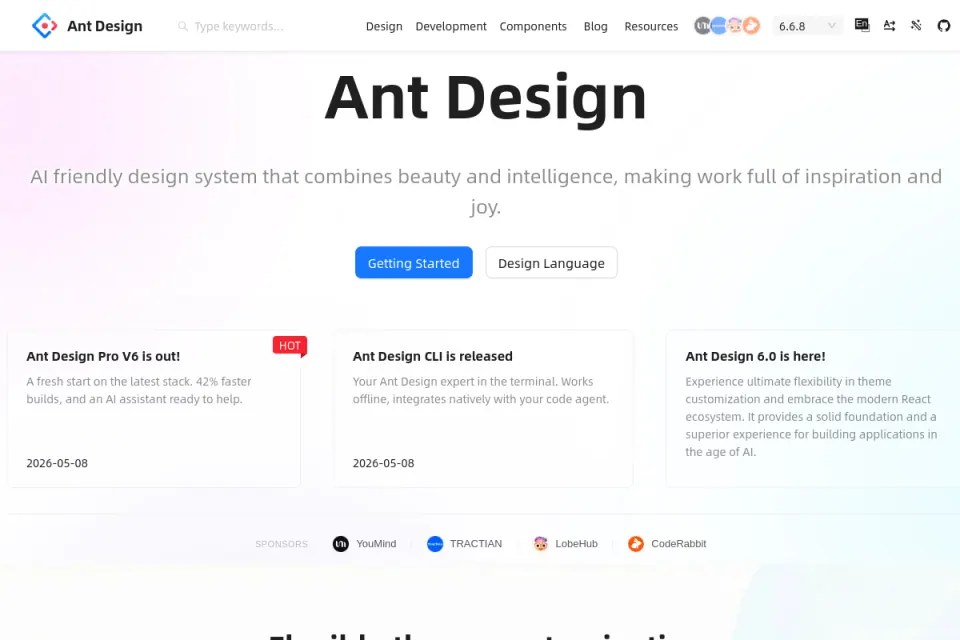
Ant Design presents an enterprise-class React UI library and design language. Its current documentation provides a wide component set, examples and APIs, and its repository describes TypeScript support, internationalisation and theme customisation.
For the support workspace, broad coverage can be useful for tables, forms, pagination, drawers, notifications and status feedback. An opinionated system may shorten implementation when the product's needs align with its patterns.
The tradeoff is visible and structural. Extensive defaults can make a product feel generic if the team only changes colour. Designers should examine layout, typography, density, empty/error states and task sequencing, while developers verify accessibility and behaviour in the actual composition.
- Useful when: A React product needs broad enterprise components and accepts an opinionated starting point.
- Check next: Current version, browser support, theme approach, component-level accessibility, bundle implications and licence.
- Do not assume: Component coverage replaces workflow design or usability validation.
Fit and limitations
Map the missing layer before comparing catalogues
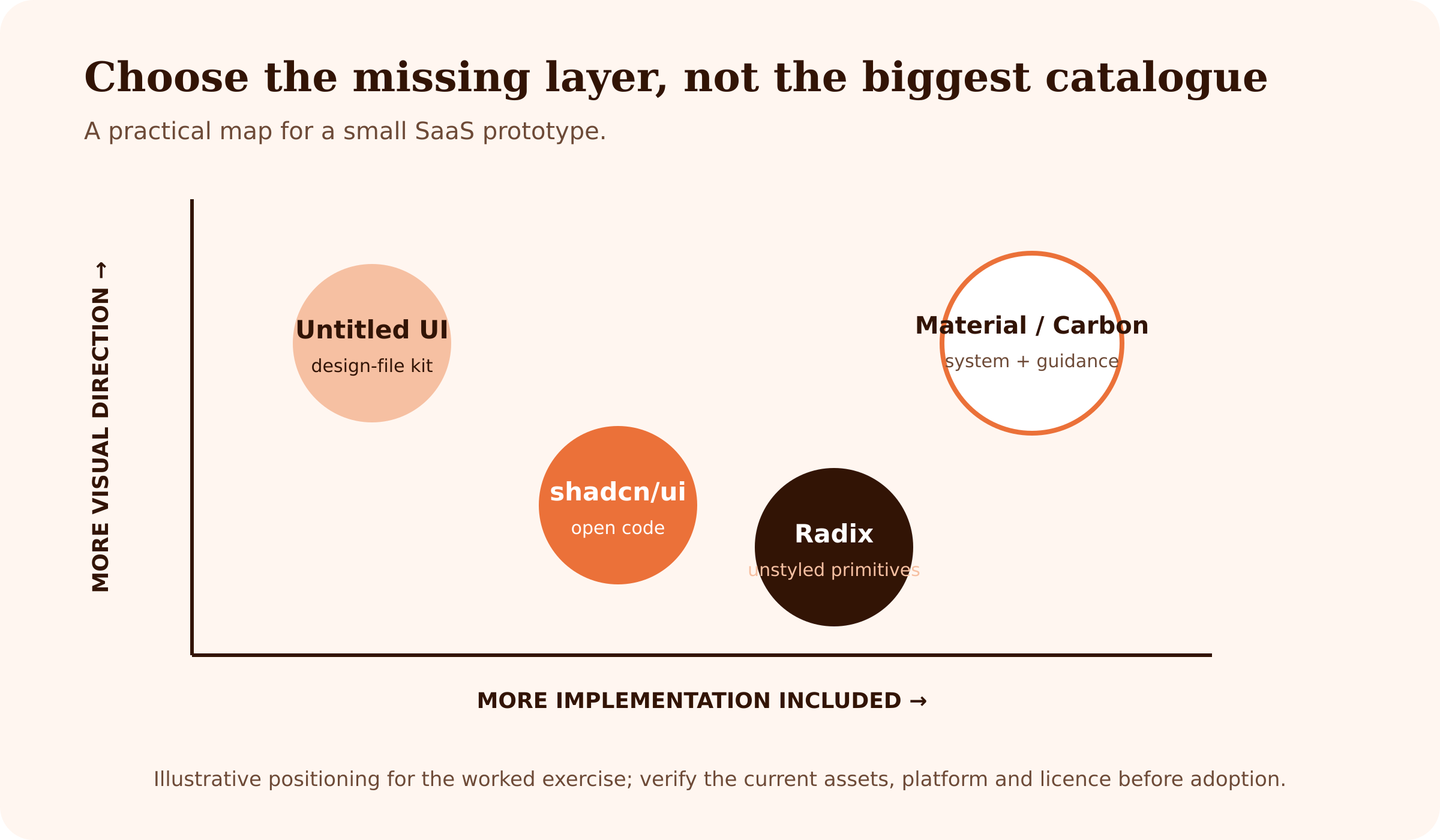
The diagram is an illustrative map for the worked exercise, not a measured product ranking. Untitled UI sits toward editable visual direction. Radix sits toward implementation behaviour with deliberately low visual opinion. shadcn/ui combines working code with stronger defaults. Material and Carbon combine broader guidance with design and implementation resources.
The map helps a team ask, “What are we missing?” If the designer has no reusable file, a code primitive does not solve the immediate gap. If the design is complete but the React team needs robust overlays and menus, another Figma page may add little value.
A component is not a complete flow
The six resources can accelerate common controls, but the support workflow still needs product decisions:
- Which ticket information appears in the list and detail view?
- How are assignment, status and priority changed without accidental loss?
- What happens when the request fails after an optimistic update?
- Which actions are available in bulk, and how is selection preserved?
- How do permissions change the visible controls?
- What does an empty workspace teach a first-time user?
Those questions require research, content, interaction design and validation. Reusing a component should create time for those decisions, not hide them.
Accessibility claims have boundaries
A library may implement focus management, keyboard behaviour or ARIA semantics for a primitive. The product team still controls labels, instructions, errors, contrast, page structure, motion, reading order and how components are combined. Validate the completed workflow with keyboard navigation, screen readers where appropriate, zoom, responsive layouts and realistic content.
Design-code parity is an operating practice
A Figma kit and React library do not stay aligned by proximity. Teams need shared names, tokens, state definitions, ownership and an update routine. Record which source version was used, what was changed and which side is authoritative for behaviour.
How to choose
Work through a small SaaS prototype
Return to the customer-support workspace. The team has two weeks to create a clickable design prototype and an implementation spike for the ticket list, details and status update.
Use this sequence:
1. Inventory the task. List the required screens, components and states: loading, empty, permission-restricted, validation, success and failed request. 2. Mark the missing layers. The designer needs editable table, form and overlay patterns. The developer needs reliable dialog, dropdown and focus behaviour. The brand has tokens but no complete component system. 3. Shortlist by layer. Consider a structured Figma kit for design speed, a primitive or open-code option for React behaviour, or a broader system if the team will adopt its guidance consistently. 4. Run the same slice. Build one ticket row, one assignment dropdown, one confirmation dialog and one failed-update message in each serious candidate. 5. Record the handoff gap. Note mismatched names, missing states, token differences and behaviour that exists on only one side. 6. Choose the smallest sufficient foundation. Avoid adopting a whole system when a few primitives solve the problem, and avoid assembling unrelated fragments when governance is the real gap.
Use a decision table:
| Criterion | Evidence to collect |
|---|---|
| Task coverage | Required components and states completed in the prototype slice |
| Design-file fit | Variants, variables, responsive behaviour and editability |
| Code fit | Framework, API, styling, dependencies and browser support |
| Accessibility | Documented component behaviour plus product-level test results |
| Brand control | Token mapping and the effort needed to avoid superficial recolouring |
| Maintenance | Owner, version, update path and local modifications |
| Licence | Official licence and any paid/free asset boundaries |
The winning resource is the one that reduces the team's specific uncertainty with acceptable ongoing cost. It is not necessarily the option with the most components.
If a designer wants structured practice with components, variables, auto layout, prototyping and design systems, Upslide Design School's free 14-day UI/UX course offers a practical learning sequence. The support-workspace slice can serve as the project brief.
Frequently asked questions
What is a UI kit?
A UI kit is usually a reusable set of interface assets such as components, styles, variables and example screens. The term is used loosely, so check whether the resource is a design file, code package or both.
How is a UI kit different from a component library?
A design-file UI kit helps designers assemble and adapt screens. A coded component library supplies implementation building blocks and behaviour. Some products offer related versions, but parity and licensing should be verified rather than assumed.
How is a UI kit different from a complete design system?
A design system connects reusable assets with principles, tokens, behaviour, documentation, governance and contribution practices. A kit can be one part of that system without providing the operating model.
Can founders use a UI kit before hiring a designer?
Yes, a kit can help a founder make a task visible and produce a discussion artifact. It should not be treated as proof that the workflow, accessibility or information architecture is correct. Use realistic content and ask users or team members to complete the task.
What should a designer check before choosing a kit?
Check platform, components, states, responsiveness, variables, accessibility guidance, licence, update history and how the assets map to production code. Test one complete product slice rather than browsing screenshots only.
Are free UI kits suitable for commercial projects?
Some are, but terms vary by resource and by free or paid version. Read the current official licence and asset-specific conditions. Do not infer commercial permission from a “free” button or a community copy.
What accessibility and interface-state work remains after choosing a kit?
The team still owns labels, content, contrast, page structure, errors, loading, empty states, permissions, responsive behaviour and testing in the finished composition. A component foundation can help, but it does not validate the whole product.
Key takeaways
- Define whether the team needs design assets, code, system guidance or a combination.
- Compare resources against one complete product slice and the same required states.
- Treat design-file and code parity as a maintained process, not a promised by-product.
- Verify licences, versions and free/paid boundaries from official sources.
- Preserve accessibility testing at the product level even when primitives provide strong foundations.
- Choose the smallest sufficient layer that the team can maintain.
We help SaaS and enterprise teams turn fragmented components into coherent product workflows and design systems. If the team needs support adapting a foundation to a real product, explore Upslide's UX redesign services. For continued discovery, browse the UI Kits collection in the Upslide Inspire Resource Box.