


When you draw a grid in a generator, do you know which part becomes the track definition, which part positions the items and what the receiving page still has to supply?
A CSS grid generator can make a layout concrete and produce a useful starting artifact. The next decision concerns the actual HTML and CSS: the intended children, their placement, the space available and the order in which the document makes sense.
This guide compares three documented visual generators and an original receiving-layout exercise. It separates tool descriptions from executed local checks; the exercise is authored by Upslide, rather than exported from the three providers.
Review the generated rules and the document they receive as one layout contract.
Design task
Decide what the generator needs to produce
A designer preparing a card collection and a developer arranging a page shell can both need a grid, while expecting different outputs. One may want repeating equal tracks; the other may need a fixed sidebar, a spanning content region and deliberate changes at another available width.
Describe the arrangement before choosing a tool. Record the intended items, the relationships between them and the constraints that should survive the next edit.
A useful starting brief identifies:
- The actual grid container and its direct children.
- Column and row sizing, including any content-sized tracks.
- Gaps between tracks and separate outer spacing.
- Items that span tracks or occupy named areas.
- The meaningful document order.
- The receiving stylesheet, components and layout conditions.
An attractive canvas does not establish any of those receiving conditions. The exporter can supply a layout fragment while the project still supplies the surrounding document and its content.
For the earlier question of what information belongs together, the published low-fidelity wireframe guide offers a different planning task. Settle the information structure before using a visual editor to distribute its boxes.
Distinguish tracks from their boundary lines
A track is the space between two grid lines. Three explicit columns have four boundary lines; placing an item from the first line to the third spans two tracks, rather than three.
MDN's line-placement guide explains this numbering and its relationship to writing mode. An editor's diagram can help expose the distinction, but the actual start and end references remain the useful handoff evidence.
Also distinguish the declared grid from tracks created to accommodate placement. The implicit-column reference documents how an item placed beyond explicitly sized columns can create another column.
That is a different issue from whether a label wraps. The original exercise below keeps its content simple so the placement rule and resulting track structure can be inspected directly.
Keep the receiving foundation identifiable
A generated class name does not establish that the application uses an existing component, spacing token or breakpoint convention. Decide where the layout belongs and which project values should replace sample values.
The published UI-kit and component-library guide helps with that foundation choice. A grid generator supplies layout rules; it does not approve the surrounding components or their product behavior.
Resource kit
Sarah Drasner's CSS Grid Generator: begin with a bounded visual layout
Sarah Drasner's CSS Grid Generator is a useful route for a small, explicit starting arrangement. Its official project README describes setting row and column numbers and units, then dragging within cells to create placed divs.
The author explicitly presents it as a subset of Grid. That boundary makes the shortlist clearer: investigate its output for the required arrangement without expecting every feature of the underlying layout system.

Credit: Sarah Drasner. Actual public editor with its initial tracks and controls; no provider export or generated-code benchmark was performed.
Its MIT software licence is a separate source record. Retain applicable notices when reusing the software; do not turn the licence into permission for unrelated artwork or project material.
Layoutit Grid: connect the visual editor with HTML and CSS
Layoutit Grid is another visual authoring route. The official README identifies HTML and CSS output and credits Leniolabs and contributors.
It also distinguishes the application from a library: the documented package is not currently intended as an application dependency. Evaluate the editor and its receiving files, rather than assuming that installing a package reproduces the visual workflow.

Credit: Leniolabs and contributors. Actual current v2 editor showing explicit-grid, implicit-grid and placement sections, with HTML and CSS panels. No export or integration was operated.
The project's MIT licence describes its software terms. A screenshot of its canvas remains source context; no generated repository, export quality or integration result from Layoutit is claimed in the original exercise.
CSS Portal: qualify the placement and output controls
CSS Portal's Grid Generator documents track units, gaps, selected-item placement and alignment. Its current instructions also describe a named-area option, HTML and CSS copying, a complete-page route and download.
Those are useful controls to investigate when a layout needs a more explicit handoff. The documented keyboard movement and resizing instructions concern operating the editor; they do not certify the accessibility of the exported interface.

Credit: CSS Portal. Actual public layout editor and preset controls; no copied page, download or responsive-output test is represented.
The provider's general claims about responsive or cross-browser output are not adopted as test results. Confirm the actual selected rules and receiving page. No account entitlement or exact pricing comparison is established here.
Shortlist by the artifact and the remaining work
| Route | Documented starting purpose | Evidence to retain |
|---|---|---|
| Sarah Drasner's generator | Bounded visual row, column and item placement | Selected tracks, placements and received code |
| Layoutit Grid | Visual layout with HTML and CSS output | Output files and the intended receiving structure |
| CSS Portal | Placement and alignment controls with several output routes | Selected settings and the exact copied or downloaded artifact |
More nearly identical entries would not improve this task. Choose a plausible route, inspect its actual output and identify any requirement the visual editor leaves to the receiving project.
How the pieces work together
Preserve the relationship between HTML and placement
First identify which objects will actually become grid items. A wrapper can change that relationship: the children drawn in an editor may not correspond to the direct children in an existing component.
Do not flatten meaningful markup merely to make a generated selector match. Investigate the layout boundary and the receiving structure, then adapt the rules deliberately.
A useful handoff names the maintained HTML or component source, the grid container, the intended item classes and any required wrappers. That is more actionable than sending a screenshot and a stylesheet whose selectors match no current objects.
Inspect the sizing rule rather than its label
A fractional track, a fixed track and a minimum-bounded flexible track describe different constraints. A control labelled flexible does not establish how a minimum, gap, long item or surrounding container will be handled.
Keep the exact rule with the layout. If the receiving project substitutes tokens or different units, treat that as an edit to inspect rather than a cosmetic rename.
A generator can be useful without writing every change needed at another width. A single layout, a fluid sizing rule and a set of authored breakpoint transitions are different artifacts. Confirm what was actually received before promising any of them.
Separate an area name from an assigned item
A named-area map can make a small layout easier to discuss, but its names still need corresponding item assignments. Repeated cells using one name must form a rectangle for the map to be valid, as the official area reference explains.
Record the map and the item relationship together. A familiar label such as main does not automatically bind the generated CSS to a particular element in the receiving application.
Line-based and named-area placement can both be appropriate. Choose the representation the next maintainer can inspect and revise without guessing which rule controls an item.
Keep visual order and logical order separate
Grid placement can move a box without moving its source record. MDN's accessibility guide explains why visual rearrangement is not a substitute for the document's logical order or default sequential navigation.
That matters when one region introduces another, or when controls form a meaningful sequence. Begin with understandable source order, then inspect the actual implementation with the interaction methods it supports.
The local exercise records document order and visible geometry separately. It does not turn those structural observations into a screen-reader, comprehension or complete accessibility result.
Limitations and alternatives
A generator is a starting route, not an independent layout engine
The receiving browser interprets the CSS. A visual tool can help construct the declarations while leaving the project's stylesheet, content and supported environment responsible for their actual use.
A developer comfortable with the layout may prefer writing a few rules directly. That is a reasonable alternative when it makes the maintained source clearer or avoids transferring sample classes into an existing component.
The selection should solve an authoring problem. It does not need to become a permanent application dependency or an extra step on every subsequent content edit.
Check the output instead of inheriting a comparison's promises
Older generator roundups can be useful for framing questions, but their feature lists can become stale. The current CSS Portal instructions, for example, describe named areas and download routes that an older comparison did not record.
That discrepancy is a reason to inspect the current source, rather than declare one author wrong about a different release. Keep the inspection date and the selected surface with any capability statement.
Likewise, another author's successful export or responsive demonstration remains that author's work. This article does not present a three-provider output benchmark or claim that the same project was exported from all three tools.
Keep behavior, accessibility and delivery as separate checks
A generated grid does not implement the application's data rules, save operation or navigation behavior. A correctly positioned button can still have no working operation behind it.
Review names, interaction, focus and meaningful sequence in the implemented page. Check the project's actual supported browsers and devices when those requirements matter; a clean editor preview cannot certify every destination.
Do not infer a speed, search-ranking or maintainability improvement from a smaller rule count. A concise stylesheet and a successful user task are different forms of evidence.
Worked example
Author the same source under three placement conditions
Upslide authored a small document containing four links labelled A, B, C and D. Each of the three cases retains those links in that source order.
The declared grid has three 120-pixel column tracks, two 60-pixel row tracks and 12-pixel gaps. Its container is 384 pixels wide: three column widths plus two gaps. The rule for an additional implicit column specifies 80 pixels.
These values are teaching conditions, not a responsive layout recommendation or a generator default. The entire fixture is original; no provider exported it.
In the first case, D is placed between column lines four and five on the first row. That placement goes beyond the final boundary of the three explicitly declared column tracks.
In the second case, D is placed between lines one and three on the second row. The explicit track declaration, container width and source order remain unchanged.
In the third case, A, B and C are assigned to columns three, one and two. D retains the second case's spanning placement. The intended distinction is visual movement without a source-order change.
Inspect actual tracks and item geometry
The original page was opened in Edge at a 1,466 CSS-pixel viewport. An independent reading of the actual link rectangles and parent computed styles produced the following results; the table does not come from a generator export.
| Authored case | Client / scroll width | Computed column widths | D’s observed position and width |
|---|---|---|---|
| Placement outside the explicit grid | 384 / 476 pixels | 120, 120, 120, 80 pixels | x = 396, y = 0; width 80 pixels |
| Span inside the explicit grid | 384 / 384 pixels | 120, 120, 120 pixels | x = 0, y = 72; width 252 pixels |
| Reordered first row, same span | 384 / 384 pixels | 120, 120, 120 pixels | x = 0, y = 72; width 252 pixels |
The outside placement created an additional 80-pixel column. The explicit container stayed 384 pixels wide while its scrollable content reached 476 pixels. Moving D inside the declared grid removed that extra column; its 252-pixel span contains two 120-pixel tracks and their 12-pixel gap.
The third case retained document order A, B, C, D, while rectangle positions gave the visual order B, C, A, D. This establishes a difference between source order and visual placement in this authored page.
No keyboard navigation, assistive technology, other browser or provider export was tested. The measurements do not establish a universally appropriate layout or an accessibility outcome.
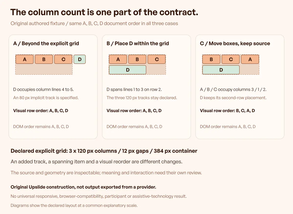
The purpose is to expose the receiving contract. An additional track is not automatically an error; it is an error when it contradicts the required arrangement. A spanning item is not automatically a repair; its actual role and placement need to fit the design.
The same distinction applies to visual order. The third case is an authored demonstration of differing orders, rather than evidence that the revised sequence serves a real task.
Make the acceptance record useful for the next edit
| Review area | What the record should identify |
|---|---|
| Source | Maintained document or component and its intended order |
| Explicit grid | Declared tracks, gaps and sizing constraints |
| Placement | Start/end lines or the map and assigned items |
| Implicit grid | Any additional tracks and the rules sizing them |
| Receiving result | Actual computed layout and the relevant item geometry |
| Remaining checks | Supported environments, interaction and accessibility work |
Retain the actual output before modifying it for a project. Then keep the receiving adaptation distinguishable from the provider's original artifact so a later defect can be traced to the correct version.
Resource Box links the selected generators. Daily Inspire can help discuss spatial relationships in complete pages; a reference screenshot does not identify its hidden generator or stylesheet.
Frequently asked questions
What should a CSS grid generator produce?
The useful artifact depends on the receiving project. Identify whether it needs a layout fragment, HTML and CSS, a complete starting page or a specific integration. Verify the actual output and what remains for the developer instead of treating every copy button as an application export.
Does a three-column grid have three boundary lines?
It has four boundary lines around its three explicit column tracks. An item's start and end lines describe the interval it occupies. Keep those numbers separate from track count when inspecting a generated placement.
Can an explicitly placed item create an implicit track?
Yes. Placement outside the explicitly sized grid can require an additional track. The fixture deliberately includes that condition; inspect the actual sizing rule and result rather than assuming that the visible column-count control describes every resulting track.
Does drawing an item elsewhere change the document order?
A placement rule can change visible position without changing the HTML. Preserve a logical source sequence and test the finished implementation where order matters. The fixture records source and geometry separately; it does not certify assistive-technology behavior.
Are named areas automatically connected to the right elements?
No. The named map and item assignments must agree. Inspect the receiving elements and the validity of the map rather than assuming that an editor's region labels identify existing application components.
Will a generator automatically supply every breakpoint?
Check its current selected output. Flexible tracks, one fixed composition and separate breakpoint rules are different things. A provider's general responsive description does not establish which arrangement was generated or whether it fits the project's actual content.
Were the three tools tested against the original fixture?
No provider output comparison is claimed. The tools were qualified through official sources and actual public previews. The receiving-layout fixture was independently authored to explain checks that can be applied to an actual future export.
When is hand-written CSS a reasonable alternative?
When a few understandable rules fit the existing component and its maintainer can inspect them directly. A generator is useful when its visual feedback helps construct a reviewable artifact; it is not mandatory after the team understands the required layout.
Key takeaways
- Choose the receiving artifact and its actual children before selecting a generator.
- Separate tracks, boundary lines and item placement.
- Inspect additional implicit tracks and the rules sizing them.
- Keep visual arrangements distinguishable from document order.
- Retain the original output, receiving adaptation and remaining implementation checks.
We help teams connect interface structure with clear implementation requirements. Discuss the design work with Upslide when the grid decision belongs within a wider product workflow.


