
A background image earns its place when the page remains understandable with it, without it and after the layout changes. A beautiful desktop hero can still put a bright patch behind a mobile heading or crop away the subject that made the image relevant.
Choose and review the image with the real content. The work includes its role, crop, text surface and fallback. Those decisions belong together.
This guide provides a practical resource kit and an original schematic exercise for designers and SaaS founders. Source capabilities and accessibility guidance were checked on 2 November 2026. The exercise is a teaching construction, not a tested customer website or a claim that a particular layout has passed a full accessibility audit.
Design task
Decide whether the image is atmosphere or information
Imagine a SaaS team preparing a page about clearer project reviews. It wants a warm, photographic hero with a headline and a link to explore the product. The picture establishes a working mood; the surrounding text supplies the message. Removing it should not remove instructions or evidence about the software.
That is a different task from showing the actual interface or explaining a process. If an image contains information the visitor needs, preserve that meaning through the page's content and appropriate image treatment. Do not hide a meaningful product view in a decorative background just because it is convenient to crop.
W3C's decorative-image tutorial distinguishes decoration from informative content. It explains that decorative images supplied as image elements should have an empty text alternative, and discusses CSS backgrounds for decorative styling. The author's judgment depends on the reason for including the image.
Specify what must remain usable
For the fictional hero, the required outcome is straightforward: the heading and supporting copy remain readable, the action remains identifiable and the image's focal point does not conflict with them. If the photograph fails to load, the page should still communicate the same message.
List those requirements before searching. Mark the area expected to hold text, but treat it as a starting hypothesis. The text can wrap, grow or move as the layout changes. A safe area on one artboard is not a permanent property of the image.
Resource kit
Assemble the parts around one layout
Use photography sources for candidate material and a contrast checker for explicit colour pairs. Keep the page preview as the place where those parts are evaluated together.
| Resource | Role in this task | Limit of the resource |
|---|---|---|
| Pexels | Find a photographic candidate | Availability does not establish a suitable crop or text contrast |
| Burst | Explore business-oriented photography | The actual item and applicable licence still need review |
| Kaboompics | Explore curated scenes and related visual directions | A coordinated image is not automatically cleared for every use |
| WebAIM Contrast Checker | Inspect specified foreground/background pairs | One pair does not represent an entire changing photograph |
This kit does not require a subscription or an automated image pipeline. Start with the working tools the team can use and record any unmet requirement before expanding the stack.
Find a candidate with a clear job
Pexels provides photography under its stated licence, with conditions including restrictions on implied endorsement and certain uses involving identifiable people. Use its imagery as a candidate, not as an implied portrait of your customers.
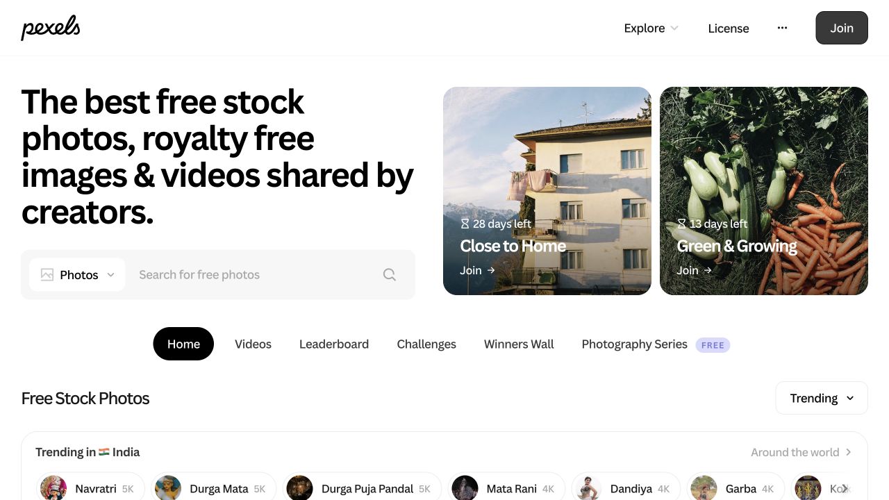
Actual homepage captured and visually inspected on 2 November 2026 at 1280 × 720. Credit: Pexels and displayed contributors. The preview identifies the source; it is not a completed search, download or image-level rights check.
Burst's terms distinguish CC0 material from other licensed content. Its business-oriented collections can help frame a search, while the chosen item's route remains part of the review.

Actual homepage captured and visually inspected on 2 November 2026 at 1280 × 720, with promotional notices dismissed and the large panel minimized. Credit: Burst by Shopify; the displayed hero credits Matthew Henry. This is source context, not an asset-level clearance.
Kaboompics' licence page separates Standard and Editorial Use Only images and restricts AI training and image generation. Check those distinctions before selecting an image for a promotional page or sending it into another service.
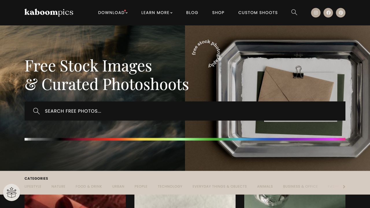
Actual homepage captured and visually inspected on 2 November 2026 at 1280 × 720, with cookie and newsletter overlays dismissed. Credit: Kaboompics. No particular photograph has been selected or cleared for this exercise.
Check a defined colour pair
WebAIM's Contrast Checker accepts foreground and background colours and reports contrast against text thresholds. It is useful when the text sits on an opaque surface or when you have identified the relevant image colour to inspect.
It does not make a photograph uniform. Record which colours you checked and where they came from. A successful calculation for a dark corner cannot certify white text that also crosses a bright window.
How the pieces work together
Match subject, text and crop
Start with the actual heading and supporting copy. Place them beside the candidate's focal point, not on top of the detail that makes the photograph interesting. Compare the balance with the intended action visible.
Then inspect a narrow layout. An image fitted to fill its container may lose different areas as the proportions change. MDN's background-size reference explains that cover preserves the image ratio while filling the container, cropping excess area when proportions differ. It also explains the role of a background colour where an image does not cover the surface.
Do not assume that centring is correct. Adjust the composition around the actual subject, or choose a different mobile treatment when a single image cannot support both arrangements.
Assess the text where it actually sits
W3C's explanation of Contrast Minimum gives a minimum ratio of 4.5:1 for ordinary text and 3:1 for large text at Level AA, with defined exceptions. Large text is generally at least 18 point, or 14 point when bold. A heading's visual prominence alone does not determine its category.
For a photograph, the relevant background is behind the text. W3C's F83 technique describes failures caused by insufficient contrast over images. Its quick check compares dark text with the darkest area, or light text with the lightest area; when that does not establish sufficient contrast, the background behind the letters needs inspection.
Do not use the average colour of the entire photo as a substitute. Keep the actual rendered crop, text position and meaningful bright or dark areas in the review.
Choose a treatment you can maintain
The available options include moving the text, selecting a quieter image, adding a measured overlay or putting text on an opaque panel. A separate text section can be a good solution when overlap adds more complexity than value.
Choose the least complicated arrangement that preserves the page's purpose. If every future photograph would need careful manual adjustment, the CMS should either require that review or use a stable text surface that reduces the dependency.
An overlay is a design input, not an automatic pass. Its effect depends on the colours, opacity, text and area it covers. Retest when any of those change.
Keep the action on a readable surface
The heading is not the only foreground element. Supporting copy, links, button labels and visible focus treatment can land on different parts of the image. Check the complete component rather than approving the biggest words and assuming the rest is safe.
If a button has its own solid surface, review the label against that surface and the component's visibility in context. Do not let a decorative layer intercept the action. A screenshot shows the appearance, while an actual interaction check establishes whether the control can be reached and used.
Limitations and alternatives
A solid background is a valid choice
If the image contributes little and complicates reading, remove the overlap or the photograph. A restrained solid surface can keep the message and product reference clear. The design does not need a photographic hero simply because the template includes one.
Use an informative image separately when the reader needs to inspect a product detail. A visible caption or explanation can help connect it to the task without forcing the heading onto a busy screen capture.
One viewport does not establish the result
The same crop can move beneath the text as a section becomes taller. Long copy, enlarged text and different line breaks can change the relationship without changing the image file.
Review the intended supported layouts and the actual content, including a realistic long heading. Record the conditions inspected. We have not run browser or assistive-technology tests on a production hero for this article, and the original schematic below is not evidence that such checks have passed.
Loading and delivery need their own review
A background can be unavailable or arrive after the text. Define a fallback surface that preserves the message and controls. Do not leave foreground colour dependent on a photograph that might never appear.
The exported asset also needs appropriate dimensions, quality and delivery for its placement. There is no universal image width or file-size limit that suits every site. Inspect the actual page and its performance evidence before treating an optimization setting as successful.
Usage conditions still apply after editing
Cropping or darkening an image does not automatically resolve its applicable licence or any additional rights. Keep the original asset record, intended use and editing route together. If you plan to use an AI service, verify that the source permits that processing rather than assuming that every kind of modification is allowed.
This guide does not make jurisdiction-specific legal conclusions or clear a particular photograph. It identifies source distinctions relevant to choosing the workflow.
Worked example
Separate the moving image from a stable text surface
Use a fictional image made from a dark area and a bright patch. The wide composition places the bright patch away from the headline. A narrow crop shifts that bright area beneath part of the same headline.
This is deliberately schematic. There is no downloaded photograph, live website or measured user response. The point is to isolate the dependency that can be hard to notice in an attractive hero.
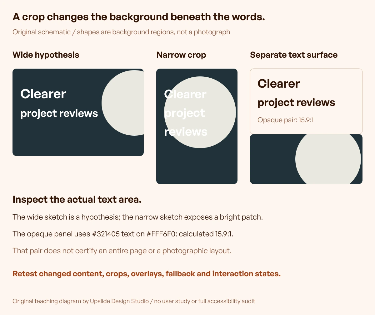
Original teaching diagram by Upslide Design Studio. Shapes represent changing background regions, not a real photograph. Contrast values, where shown, describe explicitly stated solid-colour pairs only.
The first arrangement needs a crop-specific contrast check even if it looks comfortable. The second exposes the failure risk: unchanged text now crosses a substantially different background. Reusing the desktop approval would miss the changed condition.
The third arrangement puts the text on an opaque cream surface and keeps the schematic image separate. The photograph can still support mood, while its moving highlights no longer determine the text's background.
Define what the exercise does and does not establish
For the solid panel, dark text in #321405 on #FFF6F0 has a calculated contrast ratio of approximately 15.9:1 using the WCAG relative-luminance formula. That calculation applies to that opaque pair. It is not a measurement of every pixel in a photographic layout or a declaration of overall accessibility conformance.
The exercise does not require you to use cream and chocolate. Its reusable principle is the explicit relationship between text and its actual surface. Use the site's intended colours, calculate the relevant pairs and check the resulting component in context.
Review the alternatives with a decision sheet
| Arrangement | Useful when | Required review |
|---|---|---|
| Text on a quiet part of the image | The composition supports all intended layouts | Each crop and the actual text area |
| Text over a measured overlay | The visual direction needs overlap | Composite colours, coverage and changed content |
| Text on an opaque panel | Stable reading is more important than uninterrupted photography | Text/panel pair, layout and focus treatment |
| Text outside the image | Narrow layouts or detailed subjects make overlap awkward | Reading order, spacing and connection to the image |
Use the sheet to explain the decision to another teammate. “Added an overlay” is less useful than “Text now stays on an opaque surface at the supported narrow layout; the image remains decorative.”
Set a small acceptance checklist
- The image's role is documented as decorative or informative.
- The real heading, supporting text and action are present in the review.
- The focal point survives each intended crop or a different layout is provided.
- Contrast is evaluated against the relevant rendered background.
- Text remains available when the image is absent.
- The component accommodates longer and enlarged text without losing its content.
- The action and its focus treatment remain usable in context.
- The original source and applicable usage conditions remain connected to the file.
The checks are tasks to perform, not results already obtained for a reader's site. Keep failed or untested checks visible until the actual page has been reviewed.
Continue in Resource Box and Inspire
Use Resource Box to find candidate imagery and contrast tools. Keep the image source, chosen treatment and review conditions together so the next editor can maintain the result.
Use Inspire to study visible relationships between imagery, headings and product content. Credit the original website and avoid inferring conversion performance or accessibility conformance from a screenshot. Daily references can broaden a search; they are optional to this workflow.
For another way to pair visuals and a task, the published onboarding illustration guide explains how to keep an image subordinate to the action it supports.
Frequently asked questions
What makes a good background image for a SaaS website?
It supports the page's message while leaving its content and actions understandable. Check the real text, focal point, narrow crop and fallback. A high-quality photograph can still be the wrong choice for a particular layout.
Is a dark overlay enough to make text readable?
Only after its actual effect has been checked with the text and image. The result depends on the colours, opacity and coverage. If maintaining that relationship is difficult, consider a stable panel or moving the text outside the image.
Should every background image have descriptive alternative text?
The treatment depends on the image's role. W3C distinguishes decorative images from informative ones. Keep meaningful information available in the content and use the appropriate image treatment; don't add a description solely because a decorative file exists.
Why does the image crop differently on mobile?
The container and image can have different proportions. A cover treatment fills the container while preserving the image ratio, cropping excess area. Inspect the resulting subject position and text background at the actual layout rather than assuming the centre crop works.
Can a contrast checker certify the whole hero?
A colour-pair checker evaluates the supplied pair. A photograph has multiple background colours and can move under the text. Review the relevant regions and every intended state. A passing text pair does not establish that the complete component meets all accessibility requirements.
What should happen when the image does not load?
The text and action should remain understandable on the defined fallback surface. Check that condition in the actual page. The image should not carry essential wording that disappears when the file is unavailable.
Does this article need new daily Inspire examples?
No. It uses existing resources, current primary guidance and an original schematic. Daily visual references are optional. Recheck the actual component when an editor changes the image, text, crop, overlay or layout.
Key takeaways
Review background images with the real text and the intended crops. Keep decorative styling separate from information the reader needs. Measure relevant colour relationships, provide a usable fallback and choose a stable text surface when overlap creates avoidable maintenance work.
If your SaaS website needs a clearer relationship between message, imagery and action, we can help refine the design.