
When you add an illustration to an onboarding screen, can you explain what it helps the person understand before they take the next action?
That question is more useful than asking whether the screen looks friendly. An attractive image can support an explanation, but it can also compete with the instructions, suggest a result that has not happened or push the important control out of view.
The illustration should have a defined communication role within a real task. Start with the state, message and action, then decide whether an image contributes enough to deserve space beside them.
This guide shows how to make that decision using existing Resource Box libraries and an original setup-state example. The library previews are attributed website captures; they are not screenshots of tested onboarding flows or evidence of improved activation.
Design task
Name the uncertainty the screen needs to resolve
Different onboarding moments carry different questions. A welcome screen may need to explain the first useful task, while a connection step needs to explain which account will be connected and what happens next.
Write the question in plain language before searching an illustration library. For example: “Why should the person connect a calendar, and what will become available after they do?” That is more specific than “make the integration screen welcoming.”
A useful illustration brief identifies:
- The current state: not started, in progress, blocked or completed.
- The single idea the picture should help communicate.
- The explanation and action that must remain visible.
- Any result the image must avoid implying prematurely.
- The contexts in which the image needs review, including narrow layouts and themes.
The same scene should not automatically appear across all states. A celebratory image can contradict a message saying that setup is incomplete, even when both use the same brand colors.
Keep a version without artwork
Build the message and action before adding the illustration. The person should still be able to understand the task if the decorative image is absent.
Compare that version with the illustrated alternative. If the picture adds visual weight without resolving a question, reduce it, change its subject or remove it from this step.
An illustration needs a communication job, not an empty space to occupy.
This is a review method, not a claim that onboarding should always be visually minimal. An introductory explanation may justify a substantial visual, while a compact recovery message may need only precise copy and a useful action.
Resource collection
Compare the libraries against the whole task
| Resource | Useful exploration direction | Review before selecting an asset |
|---|---|---|
| unDraw | Searchable conceptual illustrations | Whether the concept is specific enough and the selected asset's terms fit the use |
| Storyset | Styled scenes with documented customization options | Which layers, background and export are appropriate for the screen |
| Open Doodles | Expressive drawn characters and compositions | Whether the tone supports the task and remains coherent with nearby states |
| Humaaans | Mix-and-match people illustrations | Whether character composition explains the intended situation rather than becoming generic decoration |
| DrawKit | Collections across illustration styles and formats | Whether one collection covers the required sequence and its individual terms are suitable |
| Liniqo | Product-oriented subjects within a hairline illustration library | Whether the selected subject matches the actual task and remains clear at the intended scale |
The goal is a coherent small set. Choosing one attractive scene from each library can leave the product with conflicting visual languages, even when every individual asset is well drawn.
unDraw: look for the concept behind the keyword
unDraw's illustration directory is a starting point for investigating concepts. Search results should be inspected against the task rather than selected merely because their title matches a feature name.
A broad “working together” scene might help establish a collaborative product's context. It may communicate little about a specific calendar connection, required permission or incomplete setup state.
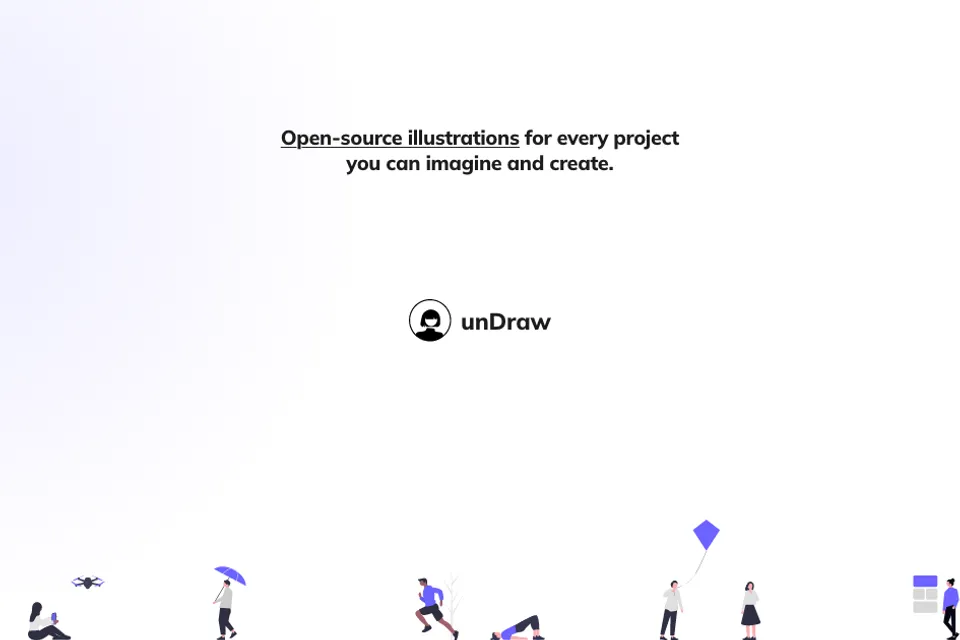
Existing Resource Box website preview. Credit: unDraw and its illustration creators. This image represents the library, not an implemented onboarding screen.
Keep the official licence with the selected asset record and check the actual intended use. A searchable resource page does not remove the need to preserve the source and applicable terms at handoff.
Storyset: remove detail that competes with the task
Storyset's workflow documentation describes choosing a concept and style, changing color, adjusting layers or backgrounds, and exporting illustrations. Those options are relevant when a scene is suitable but contains more detail than the screen needs.
For a setup step, inspect which parts explain the concept and which parts are background scenery. A simpler composition may leave more room for the instruction and action without requiring a different visual style.
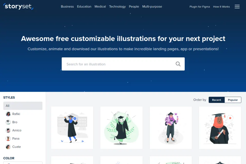
Existing Resource Box website preview. Credit: Storyset / Freepik. The preview shows library browsing; it does not establish the licence or export entitlement for a particular selected asset.
The ability to animate an asset is a separate choice from whether this step needs movement. Complete the static communication review before introducing motion into a screen where someone needs to read, choose or type.
Open Doodles: evaluate the tone as well as the drawing
Open Doodles presents a drawn illustration set with individual format links and an editing route. Its expressive character style can be investigated where the product's tone supports it.
The review should consider the situation surrounding the artwork. A playful figure may suit an introductory explanation and feel inappropriate beside a serious account-connection failure.
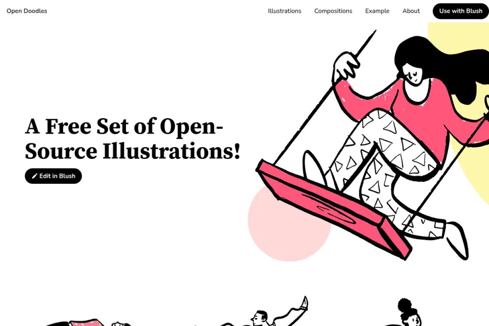
Existing Resource Box website preview. Credit: Open Doodles / Pablo Stanley. The original artwork is a source reference, not an Upslide-created character.
Inspect a few neighboring states before committing to the style. The required sequence should feel coherent even when the person encounters an error or returns later with setup unfinished.
Humaaans: make the people relevant to the situation
Humaaans describes a mix-and-match people illustration library. That gives a team material to explore when the relationship between people is part of the message.
For example, a team invitation step may benefit from a composition about collaboration. The interface still needs to state who is being invited and what the invitation will do; character art cannot supply those operational details.
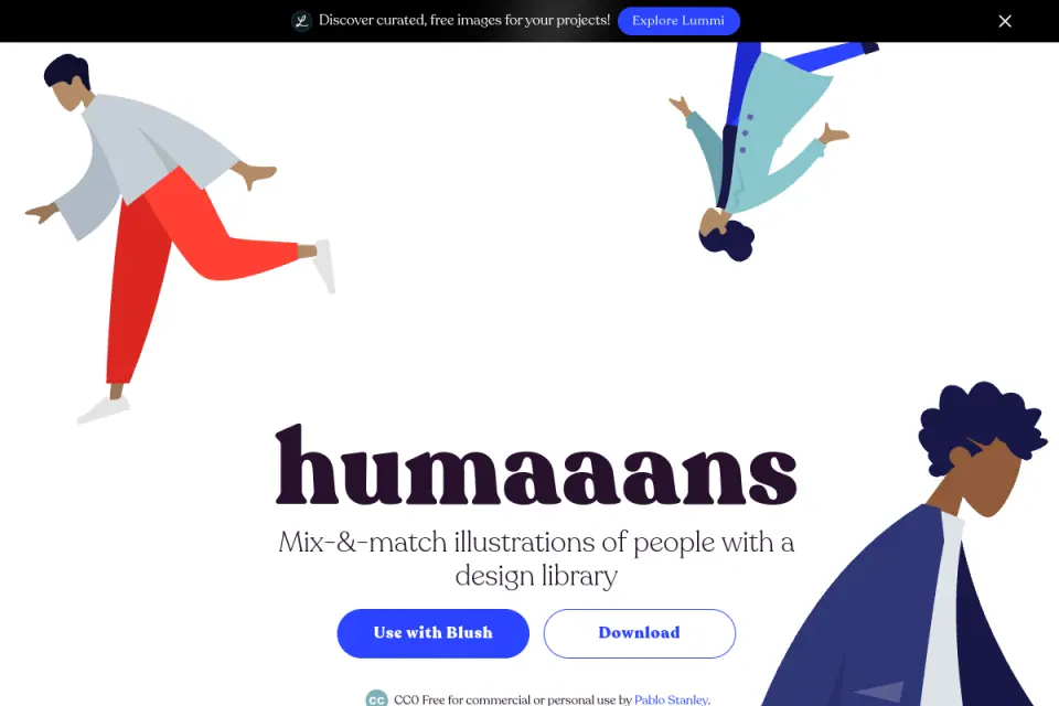
Existing Resource Box website preview. Credit: Humaaans / Pablo Stanley. The composition demonstrates a library style and does not depict a real customer team.
Review representation across the whole set rather than treating one character as a default for every user. The specific choices should suit the product's audience and avoid suggesting that one type of person exclusively belongs in a role.
DrawKit and Liniqo: check sequence coverage
DrawKit offers illustration collections, while Liniqo presents a hairline illustration library with product-interface subjects. Liniqo was added to Resource Box after checking its official site during this research.
For either resource, inspect whether the intended style covers the actual sequence: introduction, a pending task, an interruption and a completed result. A large catalogue is less relevant than having suitable assets for those specific communication needs.
Keep a shortlist with a reason for each selected scene. “Matches the connection task” is a useful note; “looks modern” does not explain how the asset will support the screen.
Fit and limitations
Distinguish illustration from product evidence
An illustration can communicate a concept without showing an actual interface. A stylized dashboard or connected-device scene should not be presented as a faithful preview of features the product does not have.
This distinction matters when a founder reviews a polished onboarding concept. A convincing image may create the impression of automation, collaboration or completed setup before the underlying behavior has been defined.
Label illustrative concepts clearly in design reviews. Where the person needs to recognize a specific control, inspect whether an accurate product reference would explain the task better than metaphorical artwork.
Match the image's role to its text alternative
The W3C image decision tree distinguishes decorative, informative and functional image situations. The appropriate text alternative depends on what the image contributes in its actual context.
An image that repeats nearby text may be decorative in that placement; an image carrying information unavailable elsewhere needs a different treatment. Review the implemented result with the relevant accessibility guidance rather than assigning every onboarding image the same generic description.
The core instruction and next action should remain real text. Avoid making essential setup information available only inside an illustration, especially when it needs to be translated or read by assistive technology.
Avoid borrowing another product's outcome claims
The library descriptions and existing previews in this guide do not establish an improvement in activation, task completion or retention. Those outcomes require evidence from the actual onboarding experience.
Adobe's Spectrum illustration guidance is a useful primary reference for a structured illustration system. It illustrates the value of defining variants and usage within a particular design system; it does not prescribe the exact sizes or styling that every SaaS product must adopt.
How to choose
Work through one illustrative setup sequence
Consider a fictional scheduling product asking a workspace owner to connect a calendar. The exercise below defines communication needs; it is not an observed flow from one of the resource libraries.
| State | Required explanation | Possible illustration role | What to avoid implying |
|---|---|---|---|
| Not connected | Explain what connection enables and identify the next action | A simple calendar relationship or object | That events are already synchronized |
| Connection interrupted | Explain the interruption and an available recovery action | A restrained supporting visual, if it adds useful context | That the failure is humorous or already resolved |
| Connected | Confirm the actual completed result and next available task | A modest completion treatment | That unrelated setup tasks are also complete |
The image follows the state. The state should never be inferred from whichever piece of artwork happens to be easiest to find.
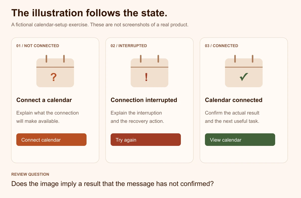
Original illustrative diagram by Upslide. The screens are a communication exercise, not real product screenshots or measured redesign results.
Review the candidate with the complete screen
Place the selected asset beside the actual heading, explanation, controls and supporting links. Check the composition at the intended narrow width as well as the wider review layout.
The important questions concern the whole screen:
- Is the task understandable before studying the illustration?
- Does the image reinforce the correct state?
- Can the main action still be located without scanning decorative detail?
- Does the illustration remain useful when the explanation becomes longer?
- Is the style coherent with the interrupted and completed states?
Do not approve an asset solely from the library's spacious preview. The destination screen may have less room, more copy and a more urgent action.
Separate visual preference from comprehension
A review can ask which illustration people prefer, but it should also ask what they believe is happening and what they would do next. Keep those answers separate in the notes.
If a person describes a connection as completed while the screen is still requesting permission, investigate the mismatch between the image, message and action. Changing a decorative detail may not solve a state explanation that is itself unclear.
The exercise should keep a version without the illustration available as a control. That helps the team identify whether the artwork contributes to the explanation or simply changes the mood of the screen.
Check themes, cropping and motion deliberately
Inspect the actual exported asset on the surfaces the product supports. Thin details, pale backgrounds and large decorative areas may behave differently after placement, scaling or cropping.
If animation is proposed, define its purpose and how the static state will communicate the same essential information. Review the implemented behavior and relevant motion preferences rather than assuming that an available animated export belongs in every step.
A useful test fixture contains the long explanation, a narrow layout, the alternate theme and the screen with artwork unavailable. These are review scenarios, not claims that any particular library fails them.
Store the asset decision with the design
The handoff should contain the original resource URL, asset identity, creator, selected version, applicable terms and any modifications. Add its intended state, placement and accessibility treatment.
Record what must not change without another review. For example, a completion treatment should not be reused on the pending state merely to reduce the number of assets.
For broader source discovery, the main site's illustration-resource guide covers a different question. This article's contribution is the task/state decision and worked review sequence, not another claim that a longer list of libraries creates better onboarding.
Investigate relevant real references
Use Inspire's published daily picks to study visual hierarchy, restraint and the relationship between illustration and text. Only describe a real onboarding flow when the actual flow has been inspected; a marketing homepage is not sufficient evidence.
The SaaS website examples guide can help with reading a page's communication choices. Preserve creator attribution, and distinguish an observed visual decision from a hypothesis about how people will respond to it.
Frequently asked questions
Does every onboarding screen need an illustration?
No. Begin with the task, message and action, then identify whether an image resolves a real uncertainty.
A precise recovery message or compact setup form may work better without additional artwork. Keep an unillustrated control during review so the communication contribution can be discussed explicitly.
What makes a library illustration suitable for a setup step?
It should support the step's actual concept, state and tone while leaving the instruction and action clear. Inspect the destination layout and neighboring states before selecting it. A keyword match in a library search is a useful discovery lead, but does not establish that the scene belongs in the final interface.
Can the same artwork be used for pending and completed setup?
Only if it does not confuse the distinction between those states. The text and behavior must identify what has actually happened. If the picture suggests celebration, synchronization or completion, review whether reusing it in an unfinished step would contradict the message.
Should onboarding artwork include screenshots of the product?
Use an accurate product reference when recognizing a specific interface is necessary for the task. A conceptual illustration can serve a different purpose, such as introducing an idea. Label stylized UI accurately and do not present capabilities that the product has not implemented as actual screenshots.
What belongs in an illustration handoff?
Record the exact source and creator, selected asset/version, applicable terms, modifications, intended state and placement. Include accessibility and theme decisions, plus the static treatment if animation is involved. A download folder without those decisions leaves important implementation questions unresolved.
How should the team judge whether the illustration helped?
Use the actual screen to ask what is happening and what the person would do next, then record observations separately from aesthetic preferences. For a released product, define an appropriate measurement plan before making performance claims. Library popularity or an attractive concept does not establish improved onboarding outcomes.
Key takeaways
- Define the state, uncertainty and action before searching for artwork.
- Compare a small coherent set against the complete screen.
- Keep conceptual illustration separate from evidence of product behavior.
- Review narrow layouts, themes, accessible alternatives and motion deliberately.
- Preserve source, usage and state decisions in the handoff.
We help SaaS teams make first-use tasks and the surrounding interface clearer. Explore Upslide's design services when the work needs to connect illustrations, content and interaction design into one coherent experience.