

An image resizer changes the number of pixels in a file. It does not decide how large that image should appear on a page, which part of the composition matters or whether small lettering remains useful after placement. Those decisions should lead the export.
For a website image, record the source dimensions, intended display slot, aspect ratio and important detail. Then choose a resizing route that can produce the required candidates without distorting the subject. Review the exported files and the actual page separately: a correct local dimension is necessary evidence, but it does not prove that the page serves that file.
This guide compares six resizing routes and works through an original dimension plan with actual PNG outputs. It focuses on pixel dimensions and handoff, leaving matched-byte compression comparisons and general responsive-layout design to their own guides.
Design task
Define the destination before entering a width
Consider a fictional SaaS team preparing an illustrated explanation for a launch article. In the wider layout, the image occupies a slot 640 CSS pixels wide and 400 high. In the narrower layout, it occupies 320 × 200 CSS pixels. The composition can stay the same because both slots use an 8:5 ratio.
The team needs useful candidate files for those placements. It also needs to know whether the artwork's text and shapes remain understandable at the smaller display size. A large export cannot compensate for a composition whose explanatory detail becomes too small to read.
Write the acceptance question before opening a tool: “Preserve the complete illustration at these slots, without stretching or losing the main message.” If the subject needs a different crop on the narrow layout, make that a separate art-direction decision rather than disguising it as another width value.
Separate the four meanings of size
Source dimensions describe the file's pixel grid. Display dimensions describe its space in the layout, usually in CSS pixels. File bytes describe storage and transfer size. Print density relates pixels to a physical output size.
Those measurements interact, but they are not interchangeable. Changing a density label without changing the pixel grid does not create additional image detail for a web placement. A smaller file-byte total does not tell you its width. A 640-pixel-wide file can occupy a smaller or larger CSS slot depending on the implementation.
Keep the units beside every number in a brief. “Make it 640” leaves room for several interpretations; “export a proportional 640 × 400 pixel candidate for the 640 × 400 CSS-pixel slot” states a concrete operation and destination.
Resource collection
Match the route to the work
| Resource | Relevant use | Check before adopting it |
|---|---|---|
| iLoveIMG | Batch dimensions or percentage changes | Proportion controls, maximum dimensions and smaller originals |
| Bulk Resize Photos | Repeated browser resizing of a set | Exact-size padding, source support and downloaded outputs |
| Squoosh | Inspect one image with resize and encoding controls | Keep dimension changes separate from compression changes |
| Photopea | Resize a document while reviewing its composition | Image Size and Canvas Size perform different operations |
| Adobe Express | Quick-image resizing and a broader design route | Public quick action and design-page resizing have different conditions |
| Canva | Resize imagery within a wider design workflow | Element size, page size and export size are separate decisions |
These routes address different working situations. A batch utility can be useful for a controlled library; an editor can be useful when the composition still needs attention. The comparison does not establish a fastest, sharpest or universally free workflow across every feature.
iLoveIMG: define the batch rule clearly
The iLoveIMG resize tool describes resizing by pixels or percentage and provides proportion controls. Its instructions explain that maintaining the original proportions across differently sized images can make the entered dimensions act as maximum bounds.
That matters for a mixed folder. A landscape and portrait image will not necessarily emerge with identical width and height merely because the same bounding values were entered. Decide whether the task calls for maximum dimensions or a fixed output canvas before processing the whole set.
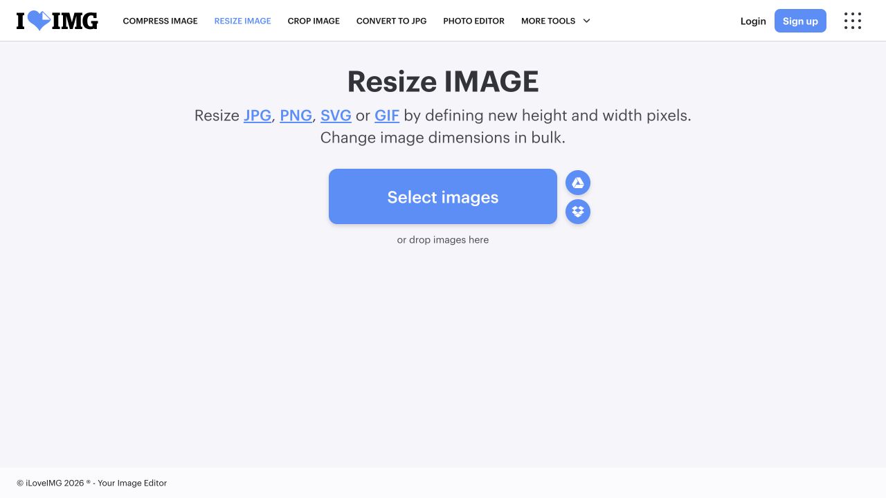
Actual public-page capture at 1280 × 720 on 2 November 2026. Credit: iLoveIMG. The entry point was inspected; no client files were uploaded and no batch result is shown.
Use a small representative set first. Include the narrowest, widest and already-small inputs. Preserve the originals and inspect the resulting dimensions rather than assuming that one successful landscape file validates every item.
Bulk Resize Photos: check exact dimensions and padding
Bulk Resize Photos offers a browser-oriented batch route. Its official support page explains that padding can avoid stretching when exact dimensions are required. It also identifies unsupported HEIC inputs and possible problems with very large images on iOS.
A padded canvas and a cropped image can share the same final dimensions while communicating different things. Choose the intended treatment explicitly. An exact square may be appropriate for a directory thumbnail and inappropriate for a wide technical diagram that needs every label.
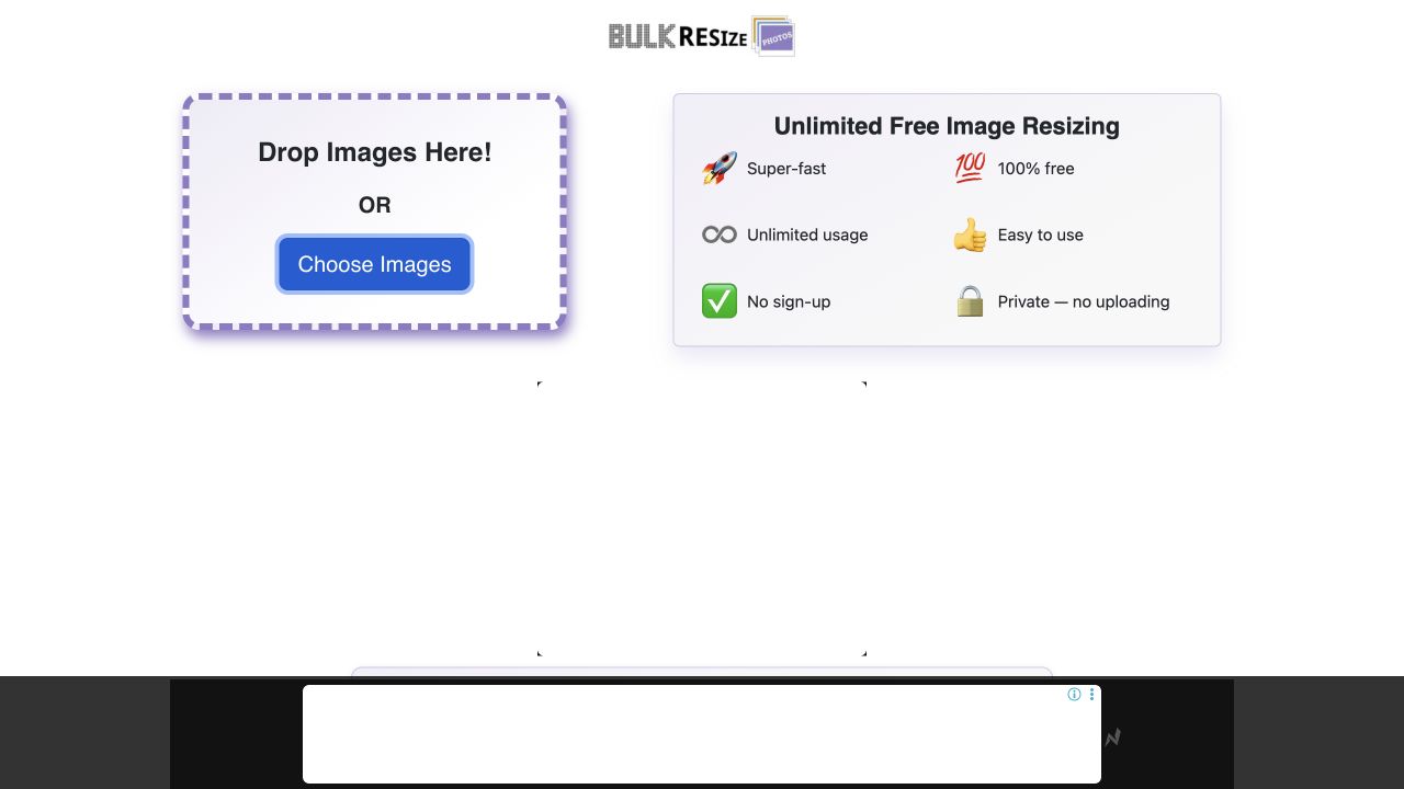
Actual public-page capture at 1280 × 720 on 2 November 2026. Credit: Bulk Resize Photos / Wruff. Provider claims and advertising belong to the source page; this is not a measured batch or privacy audit.
The provider states that image processing happens on the device. Treat that as a provider statement, not proof that the entire site has no network activity. Verify the permitted processing route before using confidential material.
Squoosh: inspect dimensions independently of encoding
Squoosh combines image inspection and compression controls. During this review, its built-in device-screen sample was opened and the Resize control enabled. The actual interface exposed width, height, method and aspect-ratio controls.
This is relevant when one important image deserves individual review. Record the dimensions first, then evaluate the encoding. If both change at once, an observer may attribute lost detail to compression when the image was also substantially downsampled.
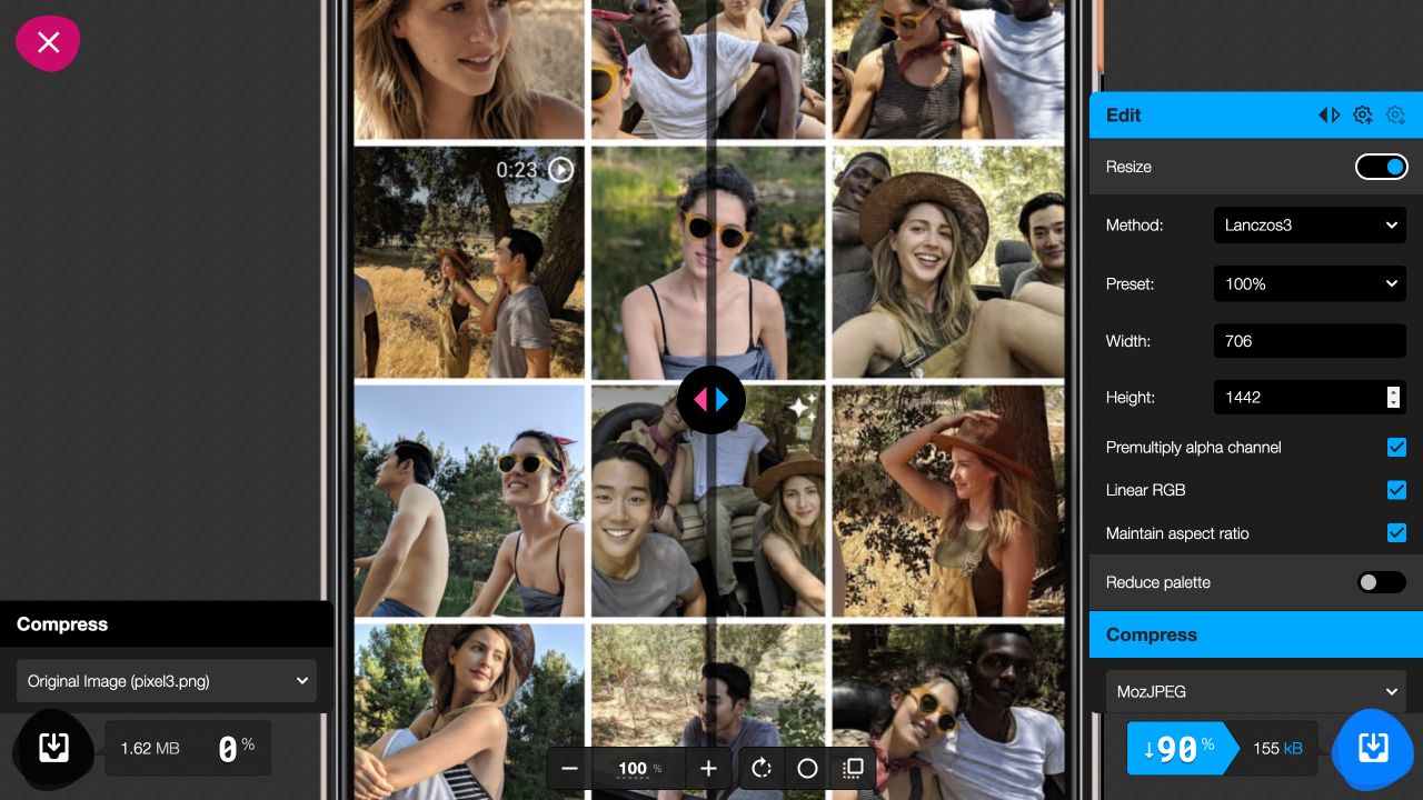
Actual interface capture at 1280 × 720 on 2 November 2026. Credit: Squoosh / GoogleChromeLabs and the displayed sample creators. The built-in sample was opened; no output was downloaded or compared as a tool benchmark.
Its official README distinguishes local image processing from analytics collection. Keep that distinction in a workflow review. A local-processing description is narrower than a complete privacy assessment.
Photopea: distinguish document size from the viewing window
Photopea's Image Size guidance explains scaling document resolution through Image Size and changing the viewing window through cropping or Canvas Size. These operations solve different problems.
Use the editor when the image needs composition review alongside resizing. If the source ratio does not match the destination, identify whether the team wants a crop, a padded canvas or a revised composition. Unlocking proportions merely to force the width and height can distort the subject.
The documentation establishes the operation, rather than a completed test in this article. We did not open a client file, compare resampling methods or certify output fidelity across Photopea formats. Keep a maintained source and export a separate delivery version so a later dimension change does not depend on enlarging a previously reduced file.
Adobe Express: keep quick actions separate from page resizing
The public Adobe Express image resizer presents an image quick action with custom sizes and preset destinations. That is relevant for preparing a standalone image.
Its design-page resizing documentation describes a different editor operation, identifies Premium-plan availability and distinguishes resizing the existing page from duplicating it. It also warns about the Expand image option, which can introduce generated content.
For a faithful website asset, decide whether the request is simple scaling, cropping or intentional content generation. These should not become interchangeable because they appear in adjacent controls. Check the exact route and account condition you need. This comparison did not log in, generate an extension or download an Express export.
Canva: identify which object is being resized
Canva's image-resizer page describes image inputs, custom or preset dimensions and download routes. Its resize-and-crop help separately explains that resizing changes an element's dimensions while cropping changes its visible region.
A designer working inside a complete campaign should identify whether the operation affects an image element, the design page or the final export. Making an element smaller on an unchanged page does not automatically produce the intended smaller delivery canvas.
Check the actual account's current controls before building a recurring workflow around them. This guide does not transfer historical paid-feature assumptions or promise that every design-resizing control is included in the public image route. Retain a copy, inspect the canvas and verify the downloaded file's dimensions.
Fit and limitations
Resizing cannot promise unchanged information at every size
Downsampling reduces the pixel grid. It may remove fine detail even when the overall composition remains recognizable. Upsampling adds pixels without recovering the original captured detail merely through a dimension change. A tool's quality claim should therefore be evaluated against the specific image and task.
For an explanatory SaaS screenshot, small labels may become unusable before the image looks visibly damaged. For an abstract illustration, the same reduction may preserve the whole idea. Choose the detail that must survive before comparing candidates.
Keep each export derived from the maintained source. Repeatedly resizing an already reduced delivery file makes later review harder and can introduce avoidable changes. If the source is insufficient, obtain a better source or revise the composition instead of promising that another numeric setting will restore missing evidence.
Resolution switching and art direction solve different problems
MDN's responsive-image guide distinguishes providing different resolutions of the same image from changing the crop or composition for different layouts. It explains how responsive source information helps the browser choose an appropriate resource.
That is the implementation context for an export plan. Designers can specify meaningful candidate dimensions and crops, while engineering owns the actual source selection and delivery behavior. A set of files in a folder is not proof that the browser receives the intended candidate.
The main-site responsive-design guide covers the wider relationship among layouts, typography, navigation and tasks. This article's narrower job is choosing an image-resizing route and making the pixel-dimension decision reproducible.
How to choose
Work from one known source to a candidate plan
We created original artwork at 1600 × 1000 pixels with a short message and simple geometric shapes. The lettering was outlined from General Sans Variable before rasterization. It is a teaching image, not a real product screenshot or downloaded asset.
Using the installed image-processing library, we produced proportional PNG outputs at widths of 1280, 640 and 320 pixels, then read their dimensions from the saved files. No crop, generated extension or third-party resizing application produced these outputs.
| Candidate | Verified dimensions | Pixel count | Possible use in the fictional plan |
|---|---|---|---|
| Large | 1280 × 800 | 1,024,000 | 2× candidate for the 640 × 400 CSS-pixel slot |
| Medium | 640 × 400 | 256,000 | 1× wide-slot or 2× narrow-slot candidate |
| Small | 320 × 200 | 64,000 | 1× candidate for the narrow slot |
These are candidates for a declared example, not universal recommended website dimensions. Doubling both width and height produces four times as many pixels. It does not promise four times the file bytes or a particular loading-time difference.
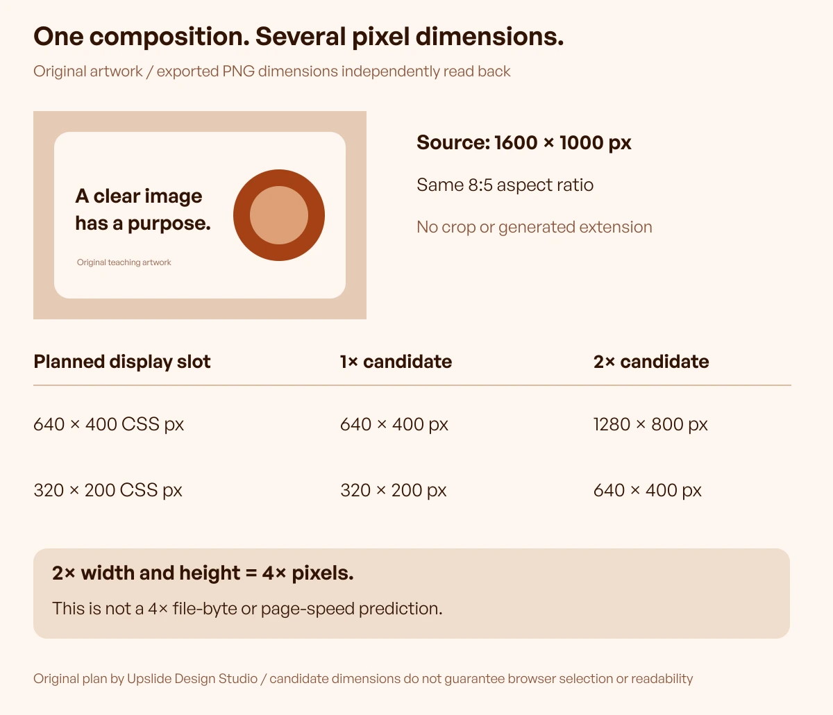
Original construction and file-dimension observations by Upslide Design Studio. The diagram describes a plan; it does not establish browser selection, perceived quality or complete-page performance.
Inspect the result at its intended display size
Open each candidate and verify the actual width, height and ratio. Then place it in the intended layout. Inspect the required message, contours and any fine details at the real display size rather than judging only a full-size export on a large monitor.
For the fictional example, the short main message needs to remain understandable in the narrow placement. If the small supporting caption is essential and cannot be read, change its treatment or provide the information as page text. A higher-density file may sharpen the same small letters without making their CSS display size more comfortable.
Review the image against its actual surface and neighboring content. A transparent edge, pale outline or large decorative margin can behave differently after placement. The dimension check and the communication review should both have a recorded result.
Use a batch rule only where the inputs support it
A useful batch instruction states the maximum width or exact canvas, proportion behavior, enlargement policy, output format and destination. Include a handling rule for exceptions: for example, retain already-small sources rather than enlarging them without review.
Test a varied small set before processing the library. A folder containing square logos, portrait photography and wide diagrams may need several policies. Forcing one ratio across all of them can create distortion, excessive padding or missing content.
Record exceptions alongside the batch output. A named exception is easier to maintain than a mysterious file that happens to have a different width. The aim is repeatability with enough context to avoid silently damaging the next unusual source.
Verify delivery before closing the task
Upload or hand off the approved files using the actual publishing workflow. Confirm which resource is served at representative narrow and wide views, because a CMS or image service may generate its own variants.
Keep the source identity, crop, candidate dimensions and intended placement together. Include the visual check and any delivery issue that remains open. Do not report a resized file as a live performance improvement before the page has been measured.
Compression is the next separate decision when the dimensions are suitable. Compare actual bytes and visible detail without assuming that a quality number means the same thing across formats or providers. A resizing route can be useful even when another tool handles final encoding.
Continue in Resource Box and Inspire
Resource Box provides the six routes discussed here and related tools for the next output decision. Choose the route around individual review, batch preparation or composition work, and follow the provider's current requirements.
Use Daily Inspire to study how real pages allocate space to artwork and product imagery. Credit original creators. A visual reference helps define the placement brief; it does not reveal the source dimensions, encoder settings or commercial performance behind the page.
Frequently asked questions
What width should I enter in an image resizer?
Start with the intended display slot and density requirements, then consider the available source. Keep the ratio and important detail in view. There is no single correct width for every website image. Record the dimensions as candidates and verify them in the actual layout.
Does resizing to fewer pixels guarantee a smaller file?
No fixed byte result follows from the width alone. Format, encoding, metadata and image content also matter. Verify the saved dimensions and file bytes separately. A pixel-count calculation describes the grid, not a complete transfer-size or page-speed prediction.
Should I unlock the aspect ratio to match a slot?
Only when intentional distortion is part of the task. Usually a mismatched ratio calls for a crop, padding or a revised composition. Those treatments have different effects on the subject. Choose the treatment deliberately rather than forcing both dimensions without review.
Is a 2× candidate twice as large?
It has twice the width and twice the height for the same ratio, which means four times the pixels. Its encoded byte size is a separate observation. A 2× candidate also does not guarantee that the browser will select it or that the composition is readable at the intended CSS size.
Can changing DPI make a web image sharper?
Changing a density label alone does not create additional pixels in the image. For a web placement, inspect the actual pixel grid and display context. Keep print-density questions separate from the candidate dimensions and delivery behavior required by the website.
Is page resizing the same as resizing an image element?
No. A design page can retain its original canvas while an image element changes inside it. An export may therefore have unexpected margins or dimensions. Identify the object being changed and inspect the downloaded file before treating it as the intended delivery asset.
When should the resizing policy be reviewed?
Review it when the source type, composition, destination slot, required detail or publishing behavior changes. Recheck representative examples and preserve exceptions. A newly added resource is a reason to evaluate an alternative, not an automatic reason to regenerate every approved image.
Key takeaways
- Record source pixels, display slot and file bytes as separate measurements.
- Preserve proportions unless distortion is intentional.
- Separate resolution changes from crop and composition decisions.
- Inspect the saved dimensions and the image at its actual placement.
- Verify the served resource and retain a repeatable handoff record.
For help aligning imagery, responsive layouts and product communication, explore Upslide's design services.