
Have you found a font combination that looks convincing in a specimen but becomes awkward when your real headline and product copy replace the sample text?
That is the gap a pairing exercise needs to close. A useful combination must support the actual reading task, fit the available space and remain manageable for the team implementing it.
The strongest starting point is a shared layout with real content. Compare one family with different weights against a two-family option, then keep the simplest arrangement that communicates the intended hierarchy.
This guide provides an original review method and a practical way to use six resources already available through Resource Box. It does not rank fonts by popularity or claim that a particular combination increases signups.
Design task
Define the text roles before choosing families
A SaaS website may need an expressive headline, explanatory paragraphs, navigation labels and a prominent action. A product screen adds different pressures: numbers, compact controls, long customer names and frequent status changes.
Those roles should be named before pairing begins. Otherwise a distinctive heading face can spread into small controls simply because it is available in the file.
A compact brief can identify:
- The main reading task and the page on which it happens.
- Which text needs personality and which needs to stay quiet.
- The languages, scripts and symbols that must be supported.
- The real layouts, themes and devices to review.
- The source files, weights and usage terms to confirm before handoff.
An early marketing page and a dense administration screen may share a family without sharing every style. Pairing is a decision about roles within a system, not a requirement to put two typefaces on every screen.
Keep a one-family control
Before adding a second family, build a reasonable version using one family with deliberate size, weight and spacing differences. This gives the team a baseline that can be maintained without a separate display face.
The two-family option should add something identifiable. It might distinguish a short editorial headline from supporting explanation, or establish a brand moment while the product body stays restrained.
A second family earns its place when the team can explain the job it performs.
If both versions communicate equally well and the extra family adds licensing or implementation complexity, the simpler control may be the better starting decision. That is an editorial trade-off to review, not a rule that every product should look alike.
Resource collection
Use different resources for different stages
| Resource | Useful role in the exercise | Evidence to retain | What it does not decide |
|---|---|---|---|
| Fontjoy | Generate combinations and hold a selected face while exploring others | The selected families and the actual text tested | Whether the result suits the complete product |
| Typewolf | Investigate typography in attributed website references | The original site and the identified typefaces | Whether copying that site's pair will fit another brand |
| Google Fonts | Locate font files and investigate the chosen family | Family, version, source and accompanying licence | The intended hierarchy or permission for unrelated artwork |
| Adobe Fonts | Explore a managed font catalogue and its documented use model | Family, selected styles and applicable service terms | Whether another teammate or client has the same entitlement |
| FontTest | Preview and compare heading/body combinations in sample layouts | The actual combination and review specimen | A guarantee that the production implementation behaves identically |
| FontDash | Browse, compare and organise a shortlist | The shortlisted families and comparison notes | A final brand or accessibility verdict |
The resources are complementary starting points, rather than a prescribed stack. One can suggest a candidate, another can help inspect its source, and the final design file can hold the shared specimen and decision record.
Fontjoy: generate candidates without surrendering the brief
Fontjoy documents generating combinations, locking selected fonts and editing the sample text. That makes it useful when the team has one preferred family and needs possible companions.
Replace the default copy immediately. A real product name, a realistic sentence and a representative paragraph reveal more than a polished specimen phrase chosen to flatter the typeface.
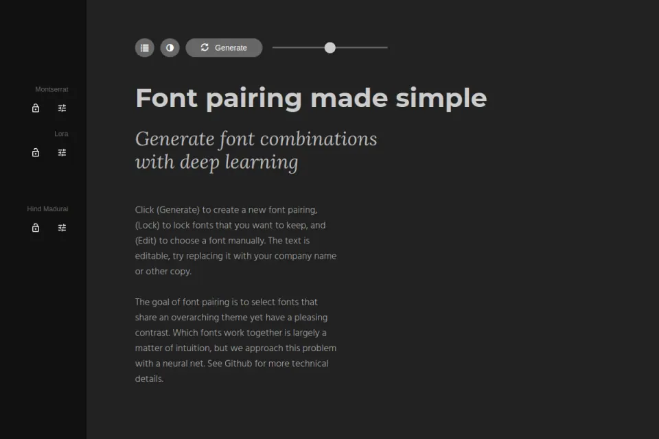
Existing Resource Box website preview. Credit: Fontjoy. The image shows the tool's presentation; it is not evidence of a completed product test.
Treat each generated result as a candidate to investigate. Keep the original task visible beside it so a striking combination does not displace a more suitable one merely because it feels new.
Typewolf: investigate the surrounding composition
Typewolf publishes website references with font identifications and typography resources. Its value in this exercise is the context around a pair: the length of a headline, the balance of text and imagery, and how much of the page the display style occupies.
The original website should remain the source of the visual reference. Record the creator and page, then describe the decision worth investigating rather than labelling the combination universally appropriate.
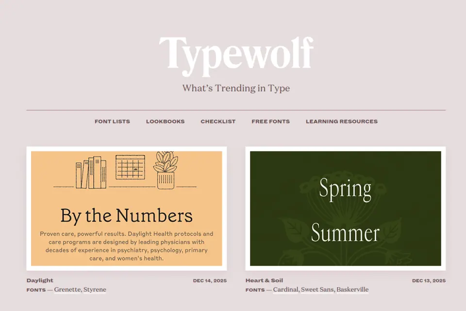
Existing Resource Box website preview. Credit: Typewolf and the featured websites. Their work is inspiration, not an Upslide project or an implied endorsement.
A pair that works above a short campaign headline may be unsuitable for a settings form. The surrounding content and scale are part of the observation; removing them can remove the reason the typography worked.
Google Fonts: identify the exact source
The official Google Fonts repository provides font files and information associated with the catalogue. Use the actual family files and accompanying information when recording a selection rather than relying only on a screenshot of a font name.
The handoff should distinguish the family from a specific style or file. A design that uses a particular weight, italic or language subset needs more detail than “use the Google font from the moodboard.”
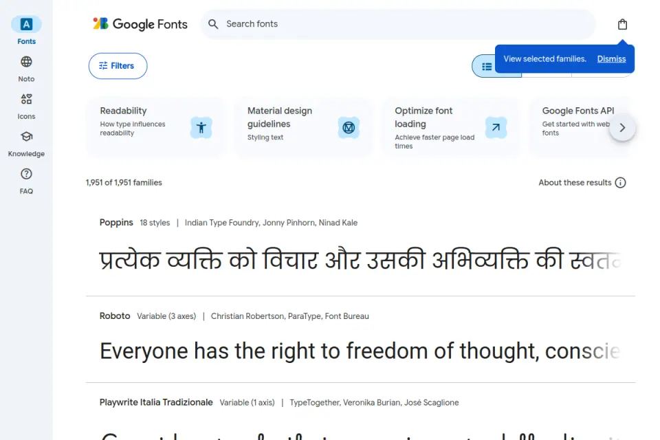
Existing Resource Box website preview. Credit: Google Fonts and the contributing type designers. The preview's displayed catalogue count is historical and is not used as a current claim in this guide.
This article does not certify the terms of every family. The selected font's own licence and intended use belong in the project record; a directory listing is not a substitute for that check.
Adobe Fonts: document the service dependency
The Adobe Fonts overview describes its catalogue, desktop and web use, and links to applicable terms. It is a relevant source when the team already uses that service and needs to understand how the chosen styles will be delivered.
Keep the design choice and the delivery arrangement separate. A font visible on a designer's computer does not establish that every client, contractor or deployed website has an identical setup.
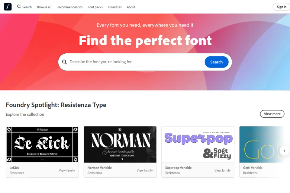
Existing Resource Box website preview. Credit: Adobe and the featured type designers. Account features and terms should be checked for the actual deployment.
For handoff, record who maintains the web project or font configuration and where the current source information lives. Avoid forwarding files based on an assumption that access to a design file also grants permission to redistribute the font.
FontTest and FontDash: compare with the same words
FontTest describes type comparison, heading/body previews and file inspection. FontDash describes browsing, pairing, comparison and shortlist tools.
Both were added to Resource Box after checking their official sites during this article's research. Neither needs to become the single mandatory tool for the team.
The useful principle is consistent input: put the same heading and paragraph into each comparison. A tool's most attractive default example should not quietly become the basis for approving a different reading task.
Fit and limitations
Similar labels do not mean similar visual weight
Numerical weight labels are useful specifications, but the finished relationship still needs visual review. A heading and paragraph set to different families can appear unexpectedly close or far apart in emphasis.
Compare the actual text rather than trying to resolve the issue through family names alone. Inspect the shape and spacing of the letters that occur frequently in the product, especially when labels are short and repeated.
Avoid replacing this review with a universal rule such as “serif always pairs with sans” or “two sans-serif families always clash.” Those categories offer exploration directions; the real specimen determines whether the proposed roles are distinguishable and coherent for the task.
A pairing suggestion is not a finished implementation
The resources above were reviewed through official descriptions and existing previews. This comparison did not benchmark loading speed, test every account feature or evaluate participants reading each candidate.
Any recommendation about a chosen family remains conditional on its actual files, language coverage, styles, rendering and permitted use. Where those checks are incomplete, the project should keep an explicit unresolved item rather than label the pairing production-ready.
For a source-focused checklist, use the existing font-resource guide. This article concentrates on comparing hierarchy within one layout, rather than repeating a directory of places to download fonts.
How to choose
Build a specimen that can expose a weak choice
Consider an illustrative customer-management website introducing a shared team workspace. Its specimen can contain the following material:
| Text role | Shared content | What the review should reveal |
|---|---|---|
| Headline | Keep every customer conversation in view | Line breaks, emphasis and relationship to the paragraph |
| Supporting copy | A realistic explanation of who the workspace serves and what it helps the team organise | Sustained reading and text density |
| Primary action | Create workspace | Whether the action belongs to the same system |
| Secondary link | Explore a sample workspace | Whether it competes with the main action |
| Record label | Northbridge Research Operations | Long-name behavior and available space |
| Numeric sample | 1,048 records · Updated 2 Nov | Numerals, punctuation and alignment |
The names and copy here are illustrative. They are not a real customer, a measured usability test or a recommendation to reproduce this exact interface.
The specimen should include the awkward content most likely to disrupt the design. A font that only works with a very short product name has not resolved a product containing longer organisation names and changing customer data.
Compare one decision at a time
Start with the one-family control, then create a second version with a different heading family while preserving the body and layout. Keep a written list of any additional changes needed to make the second version work.
If the second version requires tighter spacing, a smaller heading and different button text to fit, it is no longer a simple font comparison. Those changes may be reasonable, but the review should identify their cost and effect rather than attribute everything to the family choice.
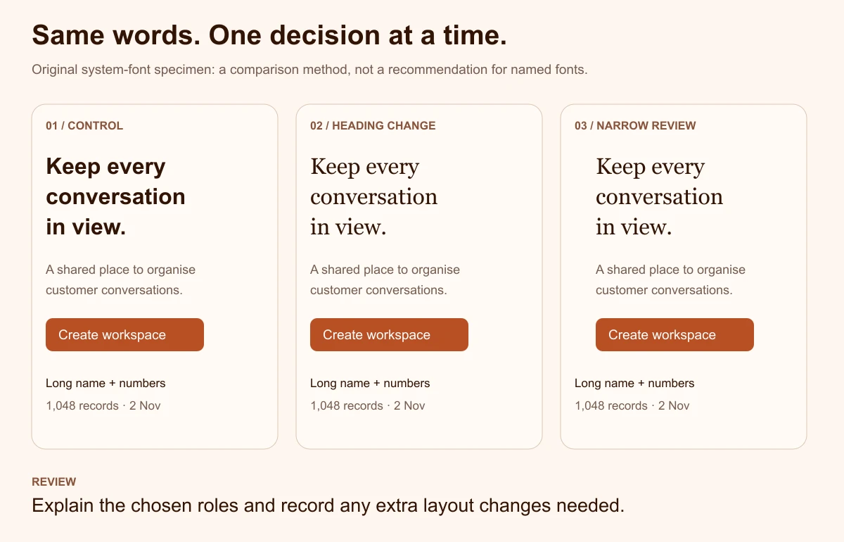
Original illustrative diagram by Upslide. It uses system-font examples to explain the comparison method, not to demonstrate specific licensed product fonts.
The purpose of the exercise is a reasoned decision. A different family can be selected when it adds the right character, provided the team also accounts for its additional files, source checks and layout adjustments.
Review the pair at realistic widths
Move the shared content into a narrow layout and inspect the same roles again. Review the headline's line breaks, the paragraph's density and the relationship between the two actions.
Keep line breaks caused by typography separate from deliberate editorial breaks. If a heading only looks balanced after inserting manual breaks, test whether those breaks still make sense when the available width or language changes.
The review should also include the actual themes the project supports. A promising light-background specimen is not enough to approve a dark surface, a busy image background or a different component treatment.
Ask questions that produce useful feedback
“Which looks nicer?” can be a helpful preference question, but it should not be the entire review. Add questions about the task:
- Which line communicates the main offer?
- Which text looks like explanation, navigation or an action?
- Which sample becomes difficult to scan at the intended size?
- Where does the typography appear inconsistent?
- What changes between the wide and narrow versions?
Record observations without turning them into unsupported performance claims. A small internal review may identify unclear hierarchy; it does not establish a percentage improvement in reading speed or conversions.
Leave a decision record that another person can use
The final handoff should name the selected family or families, each role, the intended styles and the source of the files. Include the approved specimen, the main rejected alternative and the reason for the choice.
A short illustrative record might specify:
- One family remains the product-interface control.
- The display family is approved for marketing headings only.
- Small controls keep the body style.
- Language coverage and final browser rendering require review before release.
That is more useful than a screenshot labelled “Final fonts.” It also gives future contributors a boundary: an expressive headline treatment should not spread into unrelated labels without another review.
Carry the lesson back to real references
Use Inspire's daily design picks to investigate where real pages create typographic contrast. Compare references with a similar amount of text and a similar page goal, and credit the original work when sharing the observations.
The lesson to carry forward may concern restraint, scale or placement rather than a particular family. The SaaS website examples guide provides another way to evaluate a page's argument without copying its identity.
Frequently asked questions
Does a website need two font families?
No. One family can support a clear hierarchy through deliberate styles, sizes and spacing.
Keep it as a control before introducing another family. Add a second only when it performs a role the team can explain and when its files, usage terms and implementation can be maintained.
What should stay the same during a font comparison?
Keep the actual words, layout width, spacing and component purpose consistent for the first comparison. That makes the effect of the family change easier to inspect. If other adjustments are necessary, record them explicitly and review the complete resulting design rather than presenting it as an isolated typeface test.
Can a generated combination be used immediately?
A generated pair is a starting suggestion. The chosen families still need checks for actual styles, content, required characters, intended size, source and permitted use. Use the real page specimen before committing it to a handoff, and retain any unresolved issues as visible review tasks.
How should a founder review typography without specialist terminology?
Ask about communication and consistency. Locate the offer, explanation and main action; read the realistic paragraph; inspect the long record name and number sample. A founder does not need to classify every typeface to identify unclear hierarchy, cramped content or a treatment that feels inconsistent with the product's task.
Should the marketing website and product use the same pairing?
They can share some choices while serving different reading tasks. A marketing headline may have room for an expressive treatment that is inappropriate for small controls or dense records. Document the boundary between those contexts, and evaluate the actual product screen rather than assuming the website's specimen covers it.
When should the team revisit an approved pairing?
Revisit it when new languages, longer content, additional themes or real usage expose a limitation. A new visual direction can also justify review, but a fashionable combination alone is a weak reason to replace a functioning system. Keep the original decision record so the team can distinguish a new requirement from repeated preference debates.
Key takeaways
- Name the reading roles and keep a one-family control.
- Use real content and the same layout to compare candidates.
- Choose exploration, reference and source tools according to the task.
- Check awkward text, narrow widths, themes and the actual files.
- Hand off role boundaries and unresolved checks alongside the selected families.
We help teams turn individual visual choices into consistent websites and product interfaces. Explore Upslide's design services when the typography decision needs to connect with a wider interface system.