
Have you saved a SaaS website because it looks good, then struggled to explain what the team should learn from it?
A useful reference should answer a design question. It might show how to make a complicated workflow visible, organise a broad product around recognisable tasks, or help visitors choose between trying the product and speaking to sales.
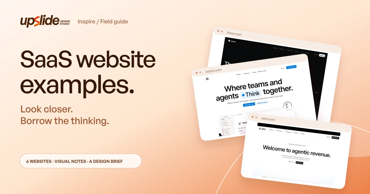
This guide studies six public websites through those decisions. The selection spans product development, knowledge work, CRM, productivity, email infrastructure and deployment infrastructure so the review doesn't collapse into a single category's visual style.
The pages and previews were reviewed on November 1, 2026. These are editorial observations about public marketing pages, not claims about conversion rates or the usability of signed-in products.
The order isn't a ranking, and inclusion doesn't imply that the product is the right purchase for every reader.
A strong reference supplies a useful design question, not a ready-made identity for another company.
Design problem
Find the question behind the visual reference
A homepage has to connect a visitor's context to a credible next step. Beautiful typography can make that argument more engaging, but it can't supply a missing explanation of what the product does.
Before collecting screenshots, choose the problem the current website needs to solve. A new category may need a concrete explanation.
An established category may need a clear reason to consider a different approach. A broad platform may need a simpler way to organise its capabilities.
- Product clarity: Can a new visitor describe the product's purpose?
- Evidence: Can that visitor see a believable task, object or result behind the promise?
- Navigation: Can different audiences find a useful route without learning an internal product taxonomy?
- Commitment: Is the next action understandable, including what happens after the click?
Those questions keep the review grounded. A large company's visual language may rely on awareness, resources or a product breadth that a smaller team doesn't share.
Compare the six websites at a glance
| Website | Design decision to study | Useful context | Adaptation risk |
|---|---|---|---|
| Linear | Connect positioning to recognisable product work | Workflow-heavy software | Specialist language may assume category knowledge |
| Notion | Organise a broad offer around user tasks | Products with several related capabilities | A small offer can appear unfocused if it copies the breadth |
| Attio | Connect a commercial promise to product context and entry routes | Products serving sales-led and self-serve evaluation | Two calls to action can compete without a clear hierarchy |
| Raycast | Give a broad utility a simple starting explanation | Products with many small capabilities | A memorable phrase still needs concrete support |
| Resend | Let a technical buyer inspect the implementation path | Developer-facing products | Technical evidence may exclude a non-technical buyer |
| Vercel | Separate a broad infrastructure platform into legible routes | Platforms with distinct product families | Established-brand shorthand may be too abstract for a new product |
The public previews below are attributed to their original websites. They preserve the examples being discussed; layouts and content can change after the review date.
Example collection
1. Linear — show the work behind the promise
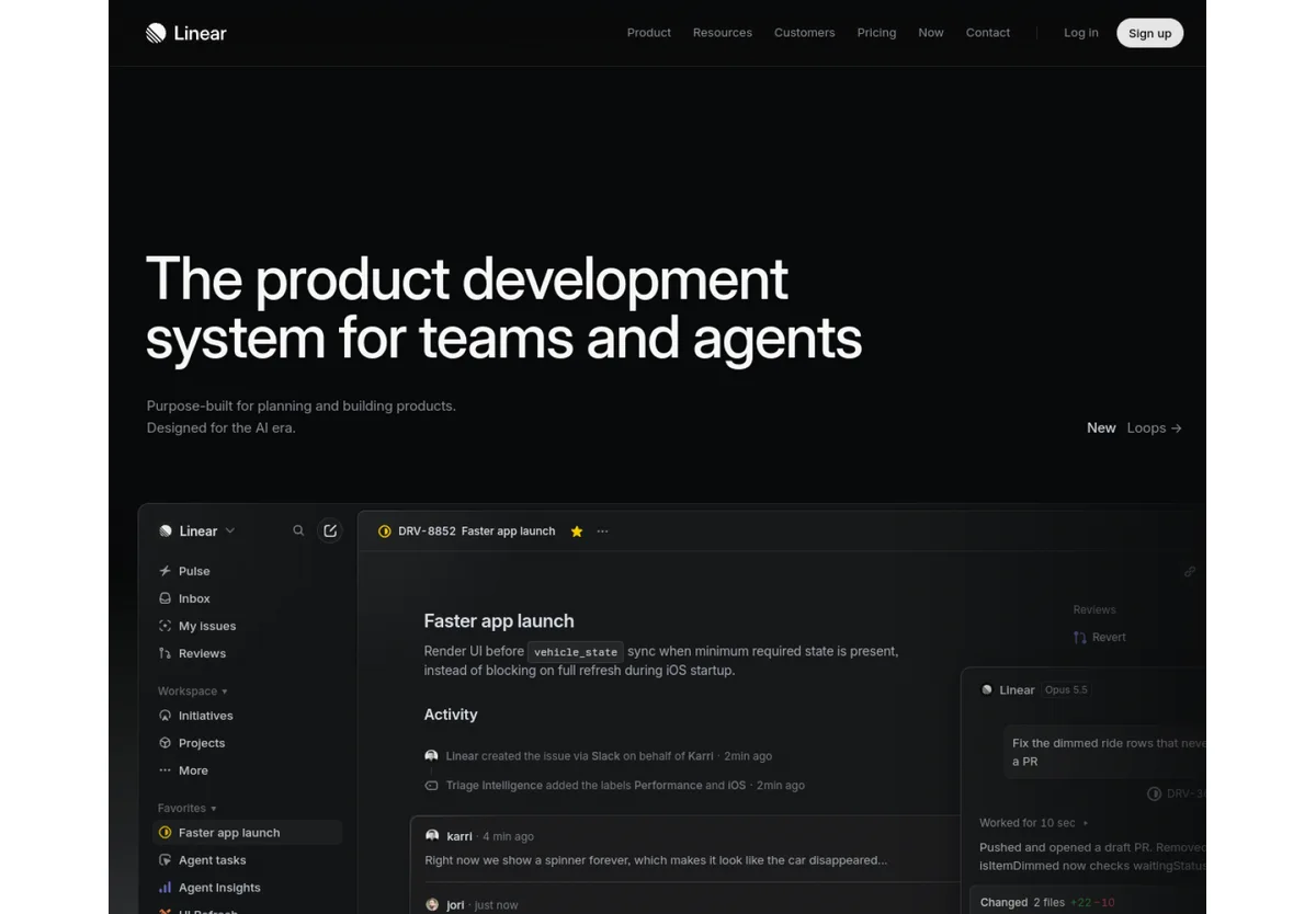
Linear's homepage introduces a product-development system for teams and agents, then brings the interface into the explanation. Issues, activity and project work give the broad positioning something concrete to attach to.
What to notice: The product object matters. A recognisable issue with a status, owner and activity helps a visitor connect category language to an action a team might actually perform.
How to adapt it: Select the object at the centre of the product's important workflow: a customer record, an inspection, an invoice or an approval. Show enough context to make the action legible, including the information that changes after it.
Where it can fail: A dense interface image can look convincing while becoming unreadable at its displayed size. Specialist positioning also needs explanation when the intended visitor doesn't already understand the category.
A useful review question is: “What would someone know about the task after seeing this image that they wouldn't know from the headline alone?” If the answer is only that the software has a dashboard, the demonstration needs a more specific purpose.
2. Notion — group capabilities around recognisable tasks
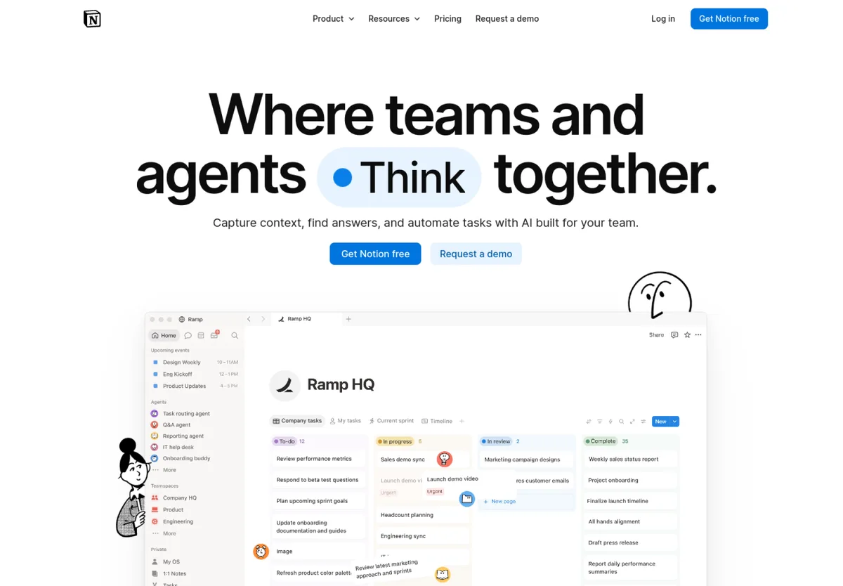
Notion's public homepage groups its product explanation around capturing knowledge, finding answers and automating work. The organising idea concerns what people want to accomplish, rather than a flat list of internal features.
What to notice: Related capabilities become easier to discuss when they share a job. A visitor can begin with a familiar activity and then investigate the underlying product features.
How to adapt it: Write down the team's important user tasks first. Group the supporting capabilities beneath those tasks, then check whether each heading still makes sense to someone encountering the product for the first time.
Where it can fail: A smaller product can imitate the breadth and lose its focus. Three named pillars aren't automatically better than one clearly demonstrated workflow.
The useful exercise is to remove every feature name from the first outline. If the remaining tasks still tell a coherent story, the structure has a reader-facing foundation; if they don't, the website may be reflecting the organisation chart more than the user's work.
3. Attio — make the evaluation routes explicit
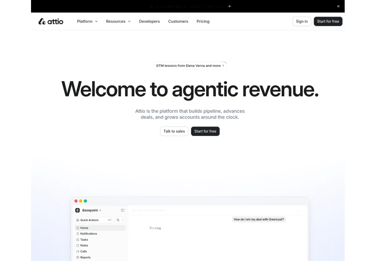
Attio's homepage connects its revenue-oriented positioning with product context and offers both a sales conversation and a free-start route. Those routes address different levels of buying readiness.
What to notice: The action is part of the explanation. A visitor considering a complex team deployment may need a conversation; another may want to explore before involving anyone else.
How to adapt it: Choose routes the product and team can support. Name the action clearly and preserve the visitor's context between the marketing page and the next screen.
Where it can fail: Two equally prominent buttons can create a new decision without explaining the difference. A free-start route is also a promise about the experience after the click, not merely a lower-commitment label.
In a review, follow both routes far enough to understand the expected commitment. The question is whether the alternatives serve different visitor needs, rather than whether adding a second button makes the hero look more complete.
4. Raycast — give a broad utility one starting idea
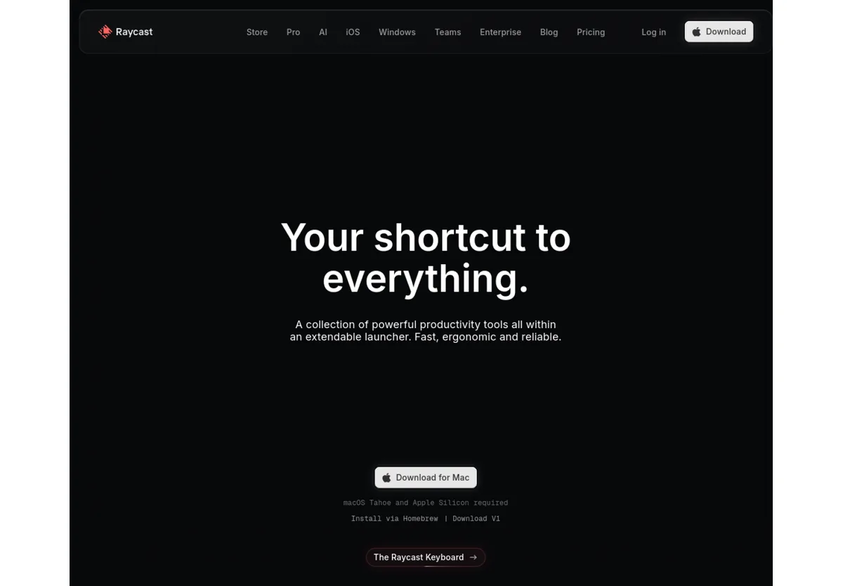
Raycast's homepage introduces a collection of productivity tools through a launcher and a shortcut-oriented proposition. Its extension catalogue then connects that broad idea to particular activities and tools.
What to notice: The starting explanation gives many smaller capabilities a shared context. The visitor can understand the organising idea before investigating individual extensions.
How to adapt it: Find the recurring action that connects the product's capabilities. Describe that action plainly, then select a few representative examples that explain its range.
Where it can fail: A broad phrase can become empty if the examples don't make the interaction understandable. A productivity product also has to explain the platform and setup conditions that affect whether a visitor can use it.
The review question is: “Could the product's capabilities be introduced through one familiar action?” That doesn't require a slogan. A specific explanation of how a user starts, acts and gets a result may be more useful than a memorable phrase.
5. Resend — let technical evidence carry part of the story
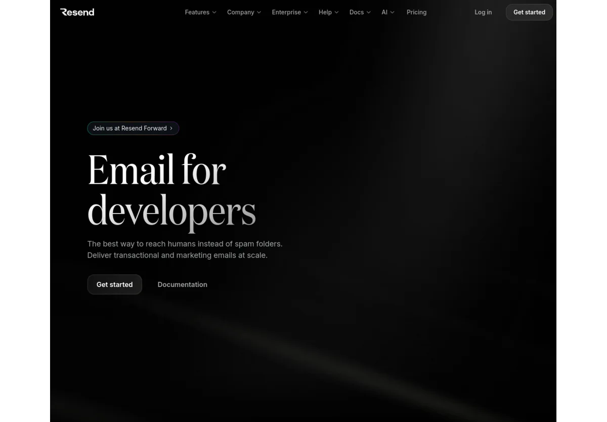
Resend's homepage identifies developers as its audience and follows the email proposition with an integration section, language choices and a code example. Documentation is a visible route into further evaluation.
What to notice: The evidence matches the buyer's work. A technical visitor can examine the shape of an integration instead of relying entirely on marketing descriptions of simplicity.
How to adapt it: Use the artefact the intended evaluator needs: a short code example, an API response, a report, a configuration screen or a sample output. Keep the example readable and explain what it demonstrates.
Where it can fail: Technical material can crowd out the business explanation or exclude a second audience. A code block also shouldn't imply that production setup, security and edge cases are all solved by the snippet.
A practical test is to ask what the next buying question would be after the example. Link to the source that answers that question, such as documentation, integration details or operating requirements.
6. Vercel — organise a platform into useful routes
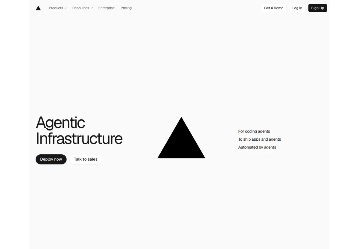
Vercel's public site presents a broad infrastructure offer with separate routes for its agent stack, core platform and tools. The navigation and product grouping are useful material for studying how a platform exposes its breadth.
What to notice: A platform has to help visitors find a relevant starting point before explaining every underlying capability. The grouping itself becomes part of the product story.
How to adapt it: Sort the product's capabilities into a small number of reader-recognisable groups. Test whether each group leads to a specific evaluation path, rather than simply reducing the number of navigation items.
Where it can fail: Broad infrastructure language can depend heavily on existing brand recognition. An unfamiliar product may need a more explicit description before visitors can interpret the same level of abstraction.
The review question is: “Can someone with one concrete need find the right route without understanding the entire platform?” That is a navigation exercise, not an invitation to add a large menu to a focused product.
Patterns worth adapting
Build a product argument instead of copying a hero
Across these examples, the useful unit of inspiration is a relationship: a promise supported by a visible task, a broad offering organised around a job, or a next action connected to a visitor's readiness.
The following original graphic is a planning framework. It isn't a reconstruction of a featured homepage or a claim that every website must use the same sequence.
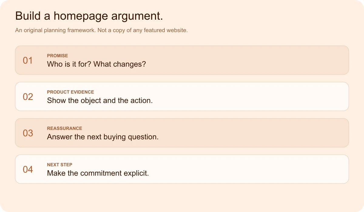
- Promise: State who the product serves and what becomes easier.
- Product evidence: Show an object and an action that make the promise believable.
- Reassurance: Answer a material evaluation question, using evidence the team can substantiate.
- Next step: Describe a useful action and its commitment accurately.
For example, a hypothetical maintenance-planning product might show an overdue inspection, the action to assign it, and the resulting work order. That is more specific than a decorative dashboard carrying the label “all-in-one operations platform.”
The supporting proof might be a product walkthrough or an accurate integration explanation. It should not be an invented customer outcome or a borrowed brand's credibility.
Match the demonstration to the viewing conditions
A detailed desktop screenshot rarely remains legible when it is reduced to the width of a mobile screen. Choose what needs to be visible at each size: a whole workflow, one important state or a specific result.
Keep the relationship between the crop and the real interface honest. Removing incidental data can clarify a demonstration, but removing the controls or context needed to understand the task can turn it into a misleading picture.
Motion should earn its place too. If the lesson concerns a transition, show that transition and explain it. If the lesson concerns information hierarchy, a stable, readable frame may communicate more clearly.
Adaptation checklist
Turn one reference into a usable brief
The reference review should produce a design decision the team can test. A short worksheet can hold the useful parts without turning the exercise into an aesthetic score.
| Brief field | What to record |
|---|---|
| Intended visitor | Role, task and existing category knowledge |
| Current uncertainty | The question the website doesn't answer clearly |
| Reference observation | A specific, visible relationship in the example |
| Proposed adaptation | What changes for this product and why |
| Required evidence | Product material or verified proof needed to support it |
| Validation question | What an intended visitor should understand or do |
For the hypothetical maintenance product, the current uncertainty might be whether an operations manager understands how an inspection becomes assigned work. The proposed adaptation would show that sequence with realistic labels and an explicit result.
The validation question could be: “Can a manager explain what happens after an inspection is assigned?” A review can record the answer before and after a prototype change without pretending that a small exercise establishes a conversion lift.
For readers who want to practise the underlying interface-design skills, Upslide Design School's free 14-day UI/UX course covers Figma, prototyping and design systems. The reference review can become a useful practice brief alongside that learning.
Use the reference without inheriting its constraints
Before approving the direction, check whether the adaptation still works for the actual product and team:
- Is the explanation understandable without the reference brand's reputation?
- Is the product evidence representative of the real workflow?
- Does every important claim have supporting material?
- Can the team deliver what the call to action promises?
- Does the mobile version preserve the meaning of the example?
- Is the page still recognisably this product, rather than a collection of borrowed surface details?
The free wireframe tools guide provides several starting points for prototyping the proposed change. The Inspire archive offers additional references when the first saved example doesn't fit the task.
Frequently asked questions
What makes a SaaS website useful as a design reference?
A useful reference makes a specific design decision visible: how a product is explained, how a workflow supports the promise or how a visitor chooses a next step. Save that observation alongside the screenshot. A visually appealing page alone does not explain whether the same approach fits another product.
Should a SaaS founder copy the layout of an established product?
Use the underlying reasoning as a starting point, then adapt it to the actual audience, product evidence and buying process. An established brand may rely on category knowledge that a new product has not earned. Check whether the explanation remains understandable without the reference company’s name or reputation.
How many website examples should go into a design brief?
Use a small set that answers different questions rather than collecting many similar screenshots. For example, one reference might explain a product task, another might organise use cases and a third might clarify the next action. Keep an example only when the brief can name the decision it helps resolve.
Should the homepage use a real screenshot or a simplified mockup?
Choose the representation that communicates the task accurately at its displayed size. A real screenshot can preserve product context, while an illustrative mockup can isolate a particular idea. Label illustrative material clearly and avoid removing information that a visitor needs to understand the workflow or its result.
Does a SaaS homepage need both a free-start and a sales button?
Only when those routes serve different evaluation needs and the team can support both experiences. Explain what follows each action and establish a clear hierarchy. Adding a second button is not evidence of improved performance; test whether the alternatives help the intended visitors choose a suitable next step.
How should desktop product previews change on mobile?
Preserve the meaning rather than shrinking every detail into the same frame. A mobile preview may need a focused crop, one important state or a short sequence. Keep enough context to explain the task, and check that labels and results remain legible at the size in which the preview is actually shown.
How can a team review its homepage before it has much analytics data?
Give intended visitors a realistic evaluation question and ask them to explain the product, the supporting evidence and the expected next step. Record misunderstandings and test a revised prototype against the same question. Treat the findings as design feedback rather than claiming that a small review proves a conversion increase.
Key takeaways
- Select references by the design question they help answer.
- Study the relationship between positioning, product evidence and the next step.
- Compare examples across categories without treating their visual styles as universal solutions.
- Record adaptation risks alongside strengths.
- Turn each useful observation into a brief and a question to validate.
We work with SaaS teams on the design decisions behind clearer products and websites. If the review has exposed a problem the team needs help resolving, explore Upslide's design services. For another reference or a resource to build the idea, continue through Inspire or the Resource Box.