
A palette becomes useful when a team knows where each color belongs. Five attractive swatches leave important questions unanswered: which color carries paragraph text, which surface contains a card, and which button deserves attention? For a SaaS founder reviewing an early website, those questions matter more than finding another hundred combinations.
Choose a color tool around the decision you need to make. Use a curated collection when you need a starting direction, a harmony tool when you need controlled alternatives, and a contextual preview when you need to see how the choices behave together. Then check the actual foreground and background pairs you intend to ship.
This guide compares six resources for those jobs: Adobe Color, Color Hunt, Happy Hues, Huemint, Realtime Colors and Paletton. The selection combines existing Inspire resources with Paletton, added after checking its official site. The assessment uses documented capabilities and inspected website previews. It is not a hands-on speed benchmark or a claim that one tool produces better business results.
Design task
Write the decision before opening a generator
An actionable brief might say: “Choose a warm palette for a customer-management product. The marketing page needs readable explanations, one clear trial action and subdued supporting sections. The product also needs statuses that remain understandable without relying on hue.” That gives the palette a job and exposes what a sample landing page cannot establish.
Separate fixed constraints from preferences. An existing logo color may be fixed; using it behind every button is a choice. A founder may prefer a pale background; body text still needs sufficient contrast. An illustration may contain many colors without requiring the navigation to repeat them all.
Write down the deliverable too. For a concept review, named colors and one annotated screen may be sufficient. For development, record exact values, semantic roles, intended pairings and state changes. Do not spend the whole exercise finding a palette and leave the handoff to memory.
Know what this comparison leaves out
The six resources help with exploration, relationships or contextual evaluation. None of their marketing previews proves that your complete interface is accessible or that your audience will understand a status. This article does not compare subscription prices, verify every export tier or certify commercial terms. Recheck the official service terms before uploading confidential brand materials or depending on an account-based workflow.
If you have not yet decided what belongs on the screen, begin with the wireframing guide. Color choices are easier to assess when the hierarchy and primary action already have a reason to exist.
Resource collection
Compare tools by the question they answer
| Resource | Useful starting question | What to bring | What still needs your judgment |
|---|---|---|---|
| Adobe Color | Which structured variations can grow from this base color? | A starting hue or reference image | Roles, actual pair contrast and final screen behavior |
| Color Hunt | What visual directions are worth exploring? | A short mood or project brief | Which colors belong to text, surfaces and actions |
| Happy Hues | How might a palette be distributed across a page? | A page hierarchy to compare against | Whether its sample composition matches your content |
| Huemint | How do generated combinations look in a sample composition? | A choice of website, brand or graphic context | Real content, accessibility and implementation decisions |
| Realtime Colors | How do selected text, background and accent roles look together? | Candidate colors and a website task | Product states, complex screens and final browser checks |
| Paletton | What happens when the hue relationships change? | A base hue and a relationship to explore | Which relationship supports the intended task |
There is no need to use every resource. A practical shortlist usually pairs one exploration method with one way to inspect the result in context. Keep the comparison small enough that you can explain why the final choice won.
Adobe Color: investigate structured alternatives
The official Adobe color-wheel page documents starting from a base color, an image or the wheel, then choosing a harmony and adjusting the result. It also describes preview and contrast features. Those controls are useful when a team can name a starting constraint and wants alternatives that relate to it.
For the customer-management brief, hold the brand hue steady and compare two relationships. Put each result into the same heading, paragraph, card and button arrangement. Ask which version creates a clear action without making every element compete. The comparison becomes meaningful because the content stays fixed.
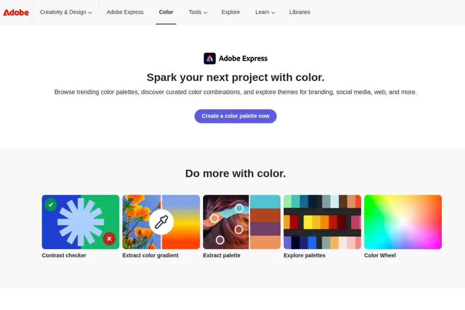
Website preview reused from Inspire. Credit: Adobe. It shows entry points to the color tools, not evidence that every workflow or account tier was tested.
Avoid treating a named harmony as a usability verdict. A relationship between hues does not tell you whether small button text remains readable or whether a warning resembles a normal link. Record those decisions separately.
Color Hunt: collect directions before choosing roles
Color Hunt presents hand-picked palette collections and browsing categories. This is a useful first stop when the team has a visual direction to investigate but has not committed to exact values.
Use it to collect a small set of candidates with different characters: a warm neutral direction, a cooler restrained direction and a more expressive option. Explain the reason for saving each. “The warm surface suits the editorial presentation” is reviewable; “this one has more likes” tells the team little about its own task.
The amount of a color in a swatch does not prescribe how much space it should occupy in your design. A strong accent might work as a small highlight and become distracting as a full-width background. Test its area and neighbors before adopting it.
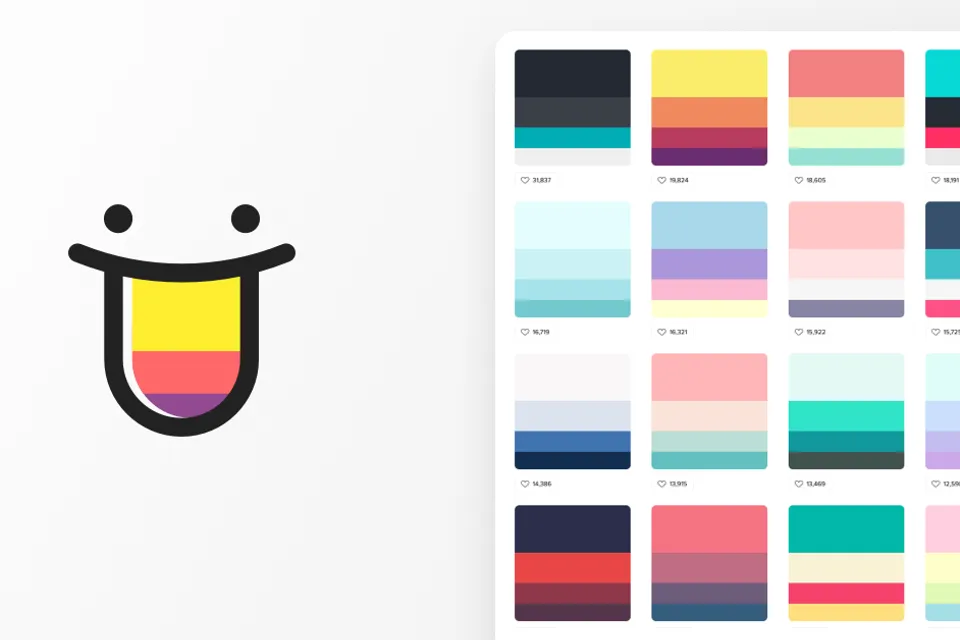
Website preview reused from Inspire. Credit: Color Hunt / Gal Shir. Palette cards are inspiration references, not finished interface specifications.
Happy Hues: study how distribution changes a palette
Happy Hues places curated colors into a sample page and identifies uses such as backgrounds, headlines and buttons. That makes it useful for discussing allocation rather than inspecting isolated swatches.
Look at the relationship between a large quiet surface and a smaller active element. Then translate the decision into your own hierarchy: perhaps the content area stays calm while one primary action receives the accent. Preserve the principle only if your page has the same communication need.
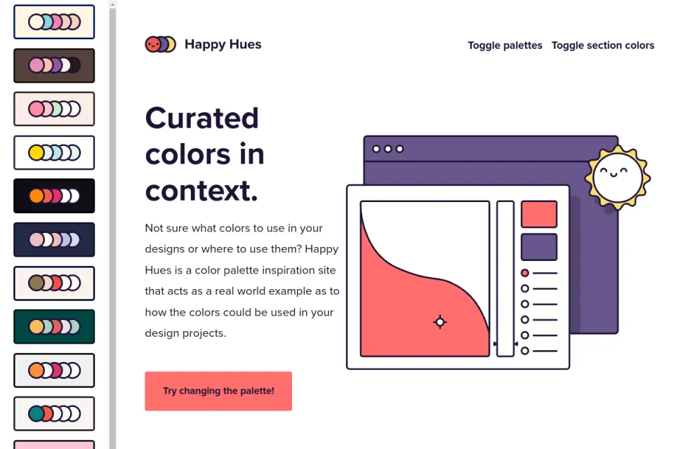
Website preview reused from Inspire. Credit: Happy Hues. The sample is a demonstration of color placement; it is not an Upslide client project or a measured conversion result.
An attractive sample can conceal problems that appear when the page contains longer headings, secondary actions and realistic tables. Use the preview to generate questions. Finish the review using your actual copy and components.
Huemint: inspect generated color in a composition
Huemint describes machine-learning-based color generation for brands, websites and graphics. Its website workspace provides composition choices and generation controls. This makes it relevant when the surrounding layout is part of the question.
Treat the selected composition as a rough stand-in. Compare how the text, surface and accent separate from each other. Save a candidate only when you can explain what it solves for your layout. A visually surprising output may be useful for exploration and unsuitable for dense customer records.
The workspace also describes a target-contrast matrix on its own numerical scale. Do not report that scale as a WCAG contrast ratio. Translate the selected colors into the real foreground/background combinations and check those combinations with the appropriate method.
Generation is a way to widen the search. The team remains responsible for selection, legibility, status meaning and the finished implementation.
Realtime Colors: evaluate a website's named roles
Realtime Colors previews colors and fonts on a sample website. Its instructions separate text and background from primary, secondary and accent colors. This is a useful review format when a founder needs to see how a candidate direction affects several page elements at once.
Use a short review script: read the heading, locate the main action, identify supporting information and inspect the quieter text. If a participant notices decorative accents before understanding the offer, reduce competition and repeat the review. That is a proposed review method, not a result from testing this tool.
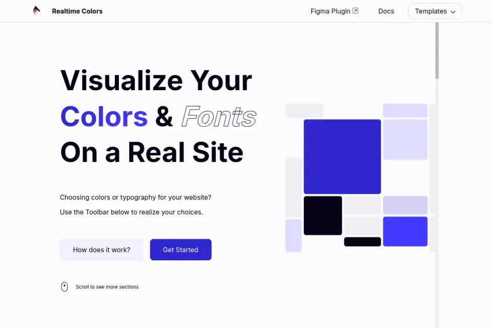
Website preview reused from Inspire. Credit: Realtime Colors. Its sample page helps compare color placement; it does not reproduce your SaaS product's interaction states.
The official site describes export options, but confirm the format you need before committing a production handoff to it. A set of exported values still needs names and intended uses that the designer and developer understand in the same way.
Paletton: explore relationships deliberately
Paletton documents harmony models, shade variations, sample previews and export formats including CSS and PNG. It is useful when the question is how a base hue relates to other hues rather than which random result feels appealing.
Try one relationship at a time. Keep the base hue, adjust the related colors and compare the same component composition. Record whether the change helps distinguish the action or simply adds another strong competing element. This creates a decision trail the team can revisit.
The tool's controls do not remove the need for a role map or final contrast review. Choose it when explicit relationships help your team reason about alternatives. Choose a contextual page preview when placement is the unresolved question. Those are different jobs, so neither tool needs to “beat” the other.
Fit and limitations
Separate documented features from tested outcomes
This comparison checked official descriptions and inspected the reused previews. It did not benchmark generation speed, interview tool users, test every account feature or verify that a particular palette changes signups. Keep those boundaries when sharing the recommendations internally.
A vendor may describe a contrast check without evaluating every final text, icon, border and state in your product. A homepage preview may look readable at large size while a small supporting label fails. Likewise, a palette described as “professional” does not establish that buyers trust it or that a color has the same meaning across contexts.
For a wider discussion of interpretation, see Upslide's color psychology and interface context guide. The purpose of this article is choosing a resource and using it to document a decision, rather than repeating a general color-meaning guide.
Check the actual pairs you intend to use
The W3C explanation of WCAG 2.2 text contrast specifies a minimum ratio of 4.5:1 for normal text and 3:1 for qualifying large text, with stated exceptions. Apply the right requirement to the actual use; a passing title does not clear smaller button text.
Test foreground against its real surface, including opacity and overlays. Do not round a failing ratio upward into a pass. Text contrast is one check within a broader accessibility review, and the requirement for large text should not become a reason to make every interface element oversized.
How to choose
Work one example from palette to decision record
Consider an illustrative customer-management page with a warm surface, a short explanation and a button labelled “Create workspace.” The values below are an original example for discussion, not a palette taken from a featured tool or a complete production design system.
| Role | Example value | Intended use | Review question |
|---|---|---|---|
| Page surface | #FFF6F0 | Main content background | Does it remain distinct from nested surfaces? |
| Main text | #321405 | Headings and body copy | Is the intended text/background pair readable? |
| Supporting text | #755D50 | Secondary explanation | Does its hierarchy survive at real size? |
| Decorative accent | #EB7139 | Small illustration or emphasis | Is it competing with the action? |
| Action surface | #B84F24 | Primary button background | Does the label have sufficient contrast? |
| Action label | #FFFFFF | Text inside the primary button | Is the exact button pair checked? |
The key decision is separating a decorative orange from the action surface. White on the lighter accent produces a different contrast ratio from white on the darker action color. Sharing a hue family does not make the two uses interchangeable.
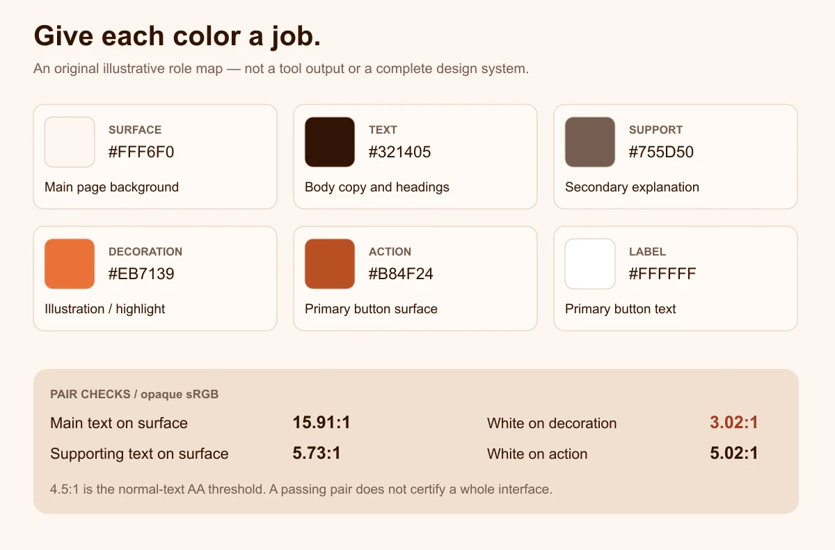
Original illustrative diagram by Upslide. Ratios are calculated from the listed opaque sRGB values using the WCAG relative-luminance formula. They are pair checks, not a complete accessibility verdict.
Keep the content fixed while evaluating alternatives
First, build a small review specimen containing a heading, a paragraph, a primary button, a secondary link and a representative card. Use realistic copy. A three-word placeholder will not reveal how a longer explanation changes the balance of the page.
Next, apply two candidate palettes to the same specimen. Keep font size, spacing, layout and copy unchanged. Ask reviewers to find the primary action and describe the hierarchy. Record observations separately from preferences. “I like green” is a preference; “the supporting link looks more prominent than Create workspace” identifies a decision to investigate.
Finally, keep the selected candidate's role names and pair checks with the file. If a developer later changes the background, the affected pair is visible. Without that record, a harmless-looking token edit can change several text relationships without anyone noticing.
Hand off a small specification
A useful handoff includes the chosen values, role names, permitted text/surface pairings and unresolved checks. Add a reference screen and explain any departure from the original palette. If the accent was darkened for a button label, preserve that reasoning so a later cleanup does not reverse it.
Assign an owner for the unresolved work. “Review accessibility later” is easy to lose. “Check the final button, supporting link and error message on the implemented workspace page before release” identifies a testable task. For dark mode, repeat the pair review with the actual dark surfaces rather than simply reversing the light palette.
Use inspiration to investigate decisions
After the specimen review, browse Inspire's published daily picks. Look for references whose page goal resembles yours. Record where each page reserves its strongest color and how much content stays visually quiet. Credit the original creators whenever you share screenshots.
Do not infer why a site converts from its appearance. You can observe placement and contrast; you need separate evidence for user understanding or commercial performance. The SaaS website examples guide offers another way to study page arguments without treating a visual choice as a guaranteed result.
Frequently asked questions
Which color palette tool should a SaaS founder start with?
Start with the unresolved decision. A curated collection is useful when you need directions to discuss; a harmony tool helps explore relationships around a starting hue; a contextual preview helps compare placement. Write a one-sentence brief first, then choose one resource that addresses it. You can add another tool when it resolves a specific gap rather than repeating the same exploration.
Does a generated palette count as an accessible color system?
No. A list of colors does not define every foreground/background pairing or interaction state. Check the actual text pairs and the wider interface requirements in context. A palette may contain readable combinations and unreadable combinations at the same time. Preserve the permitted pairings in the handoff so later implementation does not assume every color works with every other one.
How many colors should the first version contain?
Use enough roles to explain the page clearly and keep the initial set manageable. Begin with a surface, primary text, supporting text and an action treatment, then add decoration only when it serves the composition. Product statuses may require separate treatments and non-color cues. A fixed universal count is less useful than a small documented set that covers the real task.
Can we copy a palette from a website preview?
You can study how colors are distributed and use that observation to guide your own exploration. Avoid presenting someone else's website, artwork or brand identity as your work. Check applicable resource terms and the rights to any copied assets. Similar color values do not make the original layout, illustration, logo or screenshot yours to reuse without attribution or permission where required.
Should we choose the tool with the most export formats?
Only if those formats solve a real handoff need. For an early review, a documented role table and reference screen may be enough. For implementation, verify the export you actually need and check the resulting values. More formats do not guarantee consistent naming, accessible pairings or agreement about component behavior. Evaluate the exported artifact before building a workflow around it.
When should we revisit the chosen palette?
Revisit it when the actual task changes, new surfaces or states expose a gap, or testing identifies unclear hierarchy or unreadable combinations. Record which decision changed and why. A new tool release or a fashionable palette is not, by itself, a reason to replace an established scheme. Preserve stable roles where possible and review the affected pairs after any substantive change.
Key takeaways
- Choose the resource around the question: direction, controlled relationships or contextual placement.
- Compare candidates using the same realistic content and layout.
- Give colors named roles and check the actual foreground/background pairs.
- Keep the selected values, reasoning and unresolved checks with the handoff.
- Use Resource Box to explore tools and Inspire to study real visual decisions, without inferring performance from appearance.
If your team needs help carrying a visual direction through a complete website or product interface, explore Upslide's design services.