
When you hand over a website design with several font weights, how can you tell whether the delivered font file actually supports those choices? A family name alone doesn't answer that question.
A variable font offers adjustable values within the design space its creator supplied. The useful design decision is which of those values the website needs, how they map to text roles, and how the team will verify the implementation.
This guide uses resources in the Inspire Resource Box and an inspected General Sans Variable file to build an original acceptance exercise. It doesn't rank font families or promise that switching to a variable file will make a website faster.
Design task
Turn a visual choice into a file specification
A design file might show regular paragraphs, medium controls and semibold section headings. The implementation needs enough information to reproduce those roles without guessing which files, supported ranges or style variants were intended.
Start with a small inventory of actual text roles. Record the family, size, weight, style and any deliberate axis setting for each role, alongside the source of the font.
The inventory should distinguish three questions:
- Capability: What variations does this exact file contain?
- Design decision: Which variations are approved for each text role?
- Implementation: Does the delivered page render the intended values and remain usable when the font isn't available?
Those questions require different evidence. Font metadata can establish an available weight range, but it doesn't establish readability, permitted deployment or the browser's final rendered result.
An available axis is a capability. A type system is the set of decisions made within it.
Keep discovery and implementation reviews separate
The existing font-source guide helps a team discover families and preserve their terms. This article begins after a candidate file exists and concentrates on supported variation, role mapping and implementation acceptance.
A typography review can also remain broader than the font technology. The main-site UI typography checklist covers hierarchy, spacing, long content and fallback conditions; those decisions still matter when the chosen file is variable.
Resource kit
Use a source, an inspector and a platform reference
| Resource | Job in this workflow | Evidence it can contribute | Boundary |
|---|---|---|---|
| Google Fonts | Investigate available families and delivery requests | Family details and official API guidance | A directory preview doesn't certify the final page |
| Fontshare | Inspect a selected family's distribution and terms | Family page, style variants and applicable licence | “Free” doesn't mean every modification or redistribution is permitted |
| Wakamai Fondue | Inspect the features in an actual font file | File-specific feature information and CSS guidance | An inspection doesn't approve visual fit or deployment rights |
| MDN Web Docs | Check how browser font properties behave | Current property and descriptor references | Documentation is not an implementation test |
These resources cover Fonts, Design Tools and Research in the Resource Box. A team can use another capable inspection method while preserving the same evidence and decision boundaries.
Google Fonts: specify what the website uses
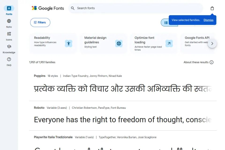
The stored catalogue preview shows family browsing and variable-font labels. It is an older public capture, so its displayed family count isn't used as a current statistic.
Google's CSS API documentation explains requests for individual styles and continuous axis ranges. Its guidance is to request the styles actually used rather than assume that a broader request is always preferable.
For a team using that delivery route, the handoff should identify the requested family and styles or range. A reference screenshot showing several weights doesn't establish what the site's request delivers.
This guide doesn't submit a live font request or measure its payload. The resource is relevant because its official request model gives the team something specific to inspect in its own implementation.
Fontshare: check the selected family and its actual terms
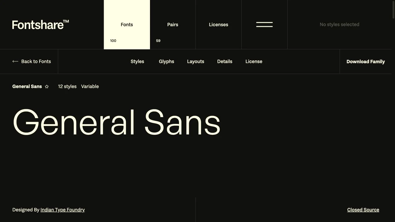
The General Sans family page was inspected on November 2, 2026. It identifies Indian Type Foundry as the publisher and displays separate upright and italic variable entries alongside static styles.
That distinction matters: a family can supply more than one variable file. “One family” shouldn't be translated into “one file contains every style” without inspecting the distribution.
The page identifies the ITF Free Font License. The checked terms permit use on the licensee's own websites and applications, including self-hosting, while placing restrictions on modification, redistribution and offering the font as a selectable asset to third-party users.
The terms also distinguish creative outputs from modified font software. Preserve the applicable agreement and obtain any additional permission needed for a proposed use; this example doesn't certify every deployment or font version.
Wakamai Fondue: investigate the file rather than its filename
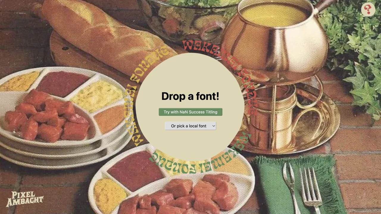
Wakamai Fondue describes itself as a tool for finding out what a font can do. Its official information panel says it reports font features and supplies CSS guidance.
The inspected screen is the public starting page, not a report produced by uploading a project font. No private file was uploaded during this research.
An inspector is useful when a filename or catalogue label leaves uncertainty about axes, supported characters or available features. Save the result with the exact file identity so a later download doesn't silently inherit an older inspection.
MDN: prefer the appropriate browser property
MDN's variable-font guide describes registered axes such as weight, width, slant, italic and optical size. A particular file needn't contain all of them.
Its font-variation-settings reference treats that property as a low-level mechanism and recommends ordinary font properties where an appropriate one exists. It also notes that corresponding low-level settings can override those properties.
For a weight-only implementation, that makes font-weight a clearer starting point than scattering a separate low-level weight declaration through components. Any exceptions should be deliberate and documented.
Worked example
Inspect one real file without claiming a production benchmark
The exercise uses the General Sans Variable WOFF2 file already bundled with Inspire. Local inspection on November 2, 2026 found a 38,132-byte file with one variation axis: wght, ranging from 200 to 700, with a default value of 700.
These observations describe that exact local file. They aren't a claim about every General Sans download, the current size delivered to a browser, the entire family's styles or the rights attached to another copy.
The file does not expose width, optical-size, italic or slant axes in its inspected axis table. Those controls therefore shouldn't appear in this file's handoff as if they had been verified.
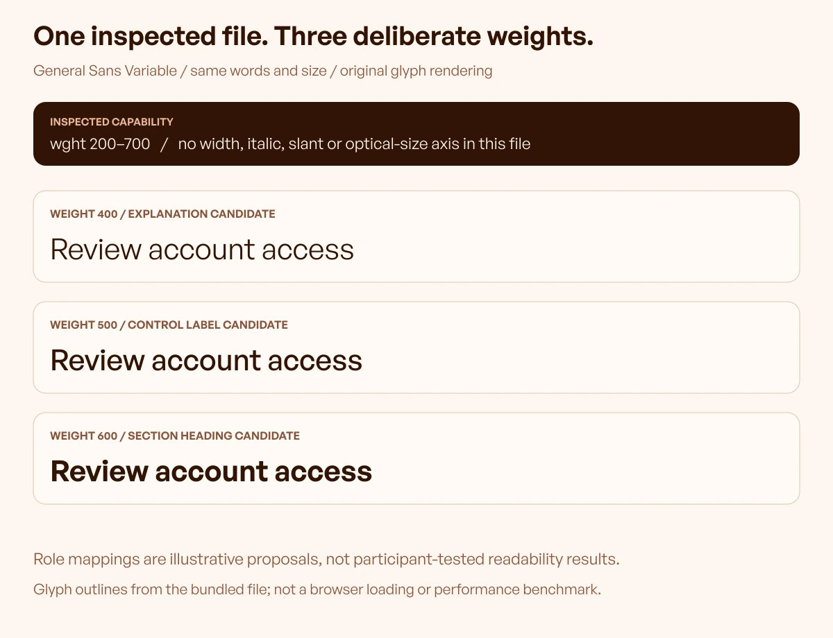
The original specimen renders “Review account access” at weights 400, 500 and 600 from the same inspected font. Size, text and placement remain consistent so the visible change comes from the weight selection.
It is an editorial rendering of actual glyph outlines, not a browser screenshot or a participant readability study. The suggested role mapping is a design proposal to evaluate, not a result established by testing users.
Convert the range into a small role map
For an illustrative account-settings interface, the team could propose:
| Role | Proposed value | Reason to investigate | Required follow-up |
|---|---|---|---|
| Explanatory text | 400 | Maintain a quieter reading role | Review full paragraphs and actual size |
| Control label | 500 | Distinguish an action from supporting copy | Check long labels and states |
| Section heading | 600 | Mark a local group of settings | Review hierarchy in the complete screen |
All three values fall within this file's inspected range. That establishes availability for the specimen, not approval for every interface or an obligation to use exactly three weights.
The distinction prevents a common handoff problem: treating a font's full range as the design system. An editor shouldn't need to choose freely among hundreds of values each time a heading is added.
Declare the available weight range deliberately
MDN's font-weight descriptor reference documents range declarations inside @font-face. Its example also shows that the declared range can restrict the weights made available through that face.
For the inspected file, an illustrative implementation handoff would specify:
- Declare the inspected WOFF2 source under the project’s chosen font-family name.
- Identify its upright style and supported weight range of 200–700.
- Assign the section-title role a weight of 600 within that range.
- Keep the loading policy and fallback behaviour as explicit implementation decisions.
The delivered asset must match the project's own permitted distribution. These instructions aren't proof that a browser fetched the intended file; that still requires review on the implemented page.
How the pieces work together
Preserve an identity for the inspected asset
Begin with the file's source, family, version if supplied, size and an identifier such as a checksum. Record the inspection date and which axes were actually found.
The point of a checksum is traceability, not a performance score. If a file changes, the team can decide whether its earlier inspection and approved specimens still apply.
Keep the asset record beside the role map. A design token such as “section title” needs a recoverable relationship to the intended font file and settings.
Review the actual language and symbols
A supported weight range says nothing by itself about the characters needed by the product. A SaaS interface may contain customer names, currency, punctuation, identifiers and multiple scripts.
Prepare a realistic sample rather than infer coverage from a catalogue's attractive headline. Include text that can expose substitution or missing characters, then inspect which font actually renders those parts.
For example, an account-management review could include an organisation name, an email address, a date, a currency value and the languages in scope. The example text should come from safe representative material, not a customer's private record copied into an unrelated tool.
Compare the delivered file with the design decision
After implementation, review the page's actual font sources and rendered output. A correct family label in a design file doesn't rule out an omitted asset, a mismatched style declaration or a fallback taking over.
The acceptance record should connect:
1. The approved role and its intended value. 2. The exact source or delivery configuration. 3. The actual page and representative content. 4. The observed result in required browsers and layout conditions. 5. Any correction and the subsequent retest.
Keep this review distinct from the local specimen. The specimen proves the exercise was rendered from the inspected font; only the implemented page can supply implementation evidence.
Make the loading decision visible
A type system should explain what readers see while the preferred font is unavailable and what happens if it never arrives. Inspect the configured fallback with the same long labels and numeric content used for the preferred font.
The team should also check whether a font change alters wrapping or component height in a way that disrupts the task. The right acceptance conditions depend on the actual page rather than a single preferred font-display setting applied without review.
If the font is supplied through a hosted service, preserve the request or configuration alongside the file evidence. If it is self-hosted, preserve the approved source and delivery path instead.
Limitations and alternatives
Compare real alternatives before claiming a smaller payload
A variable font can replace several static styles, but the useful comparison is the set the page actually uses. A site needing one upright style has a different decision from a product using several weights and italics.
Monotype's font-format guide explicitly recommends comparing actual static and variable files for the use case. It also distinguishes variable-font capability from the file container and from permission to deploy it.
Build a small comparison sheet with the actual required styles, available files, permitted distribution, language needs and observed delivery. This article supplies no static General Sans payload comparison, so it reports no saving.
The decision can favour a variable file for flexibility and maintenance even when a speed advantage hasn't been established. It can also favour static files when those are the appropriate approved assets for a simpler requirement.
Don't invent axes to repair a layout
If a heading wraps awkwardly, a width axis may sound attractive, but it is available only when the selected file supplies it. The inspected General Sans file doesn't, so the exercise cannot demonstrate a width adjustment.
The design can instead revisit the content, container, size or another suitable type choice. Treat any new family or file as a new decision with its own source and review requirements.
MDN's optical-sizing reference documents auto and none for that property and explains that an optical-size axis is required for an effect. The inspected weight-only file cannot demonstrate optical sizing simply by adding that declaration.
Keep expressive variations within an approved role
A font with custom axes can invite experiments that suit an editorial headline but distract inside repeated controls. A useful handoff specifies which roles may vary and which should stay stable.
There is no need to animate a font to justify choosing a variable file. If motion is proposed, assess it as an additional interaction decision, including the actual device behaviour and the project's user-preference requirements.
Use Inspire's daily references to notice where typography is expressive and where it stays quiet. A reference image doesn't establish its font file, loading strategy or axis settings.
Leave an acceptance record another person can repeat
Before sign-off, collect the source record, supported axes, role map, approved specimen and implementation observations. Record any absent script, unresolved style or delivery question explicitly.
Recheck when a font file is replaced, a new script is introduced, the delivery route changes or a shared text role is revised. A previous approval belongs to a particular combination of asset, settings and use.
Frequently asked questions
Does a variable font contain every style in its family?
Not necessarily. Inspect the actual distribution and file. A family can have separate upright and italic variable files, and each file exposes only the axes and ranges it contains.
Can any number be used as a font weight?
The choice needs to fit the supplied font and the implementation's declared range. Availability also doesn't make every intermediate value useful; approved text roles should identify the values the design system actually uses.
Is a variable font always faster than static fonts?
No speed advantage is established by the label alone. Compare the files and styles needed for the actual page, then inspect delivery and rendering under the project's relevant conditions.
Should font-variation-settings replace font-weight?
Ordinary properties are the clearer starting point when they express the intended setting. Use low-level variation settings deliberately for requirements that need them, and review interactions with corresponding font properties.
Does optical sizing work with every variable font?
No. The font must supply the relevant optical-size axis. The inspected file in this exercise exposes only weight, so the specimen doesn't claim an optical-size comparison.
What does the General Sans specimen prove?
It shows the same text rendered from one inspected local font at three available weight values. It doesn't prove browser loading, user readability, universal language coverage, licensing for another deployment or a performance improvement.
What should a founder request at handoff?
Request the file source and terms, available axes, approved text roles and evidence from the implemented page. The team should be able to explain unresolved issues without relying on a family name or an attractive catalogue specimen.
When should the font decision be revisited?
Review it after a file or delivery change, new language requirements, altered text roles or observed implementation problems. Preserve the earlier record so the team can identify the changed requirement rather than restart a preference debate.
Key takeaways
- Inspect the exact file before promising weights, styles or axes.
- Turn available variation into a small set of approved text roles.
- Keep local specimens separate from implementation and user-test evidence.
- Compare actual delivery alternatives before claiming savings.
- Preserve source, terms, file identity and a repeatable acceptance record.
- Use the Resource Box for source and inspection support, and Inspire for contextual visual study.
We help SaaS teams connect design choices with consistent product interfaces. For structured typography and interface practice, explore the free Upslide UI/UX course.