
Can a visitor understand the kind of work you want to do next, or does your portfolio mainly show that you have done a lot of different things?
Portfolio website examples are useful when they help answer that question. The decision is about what to introduce, which work to foreground and how much explanation the visitor needs before opening a project.
For designers, that means editing a body of work into a clear professional proposition. For SaaS founders reviewing potential collaborators, it means separating visual taste from evidence of the contribution the product actually needs.
Choose a portfolio structure around the question the next visitor needs answered.
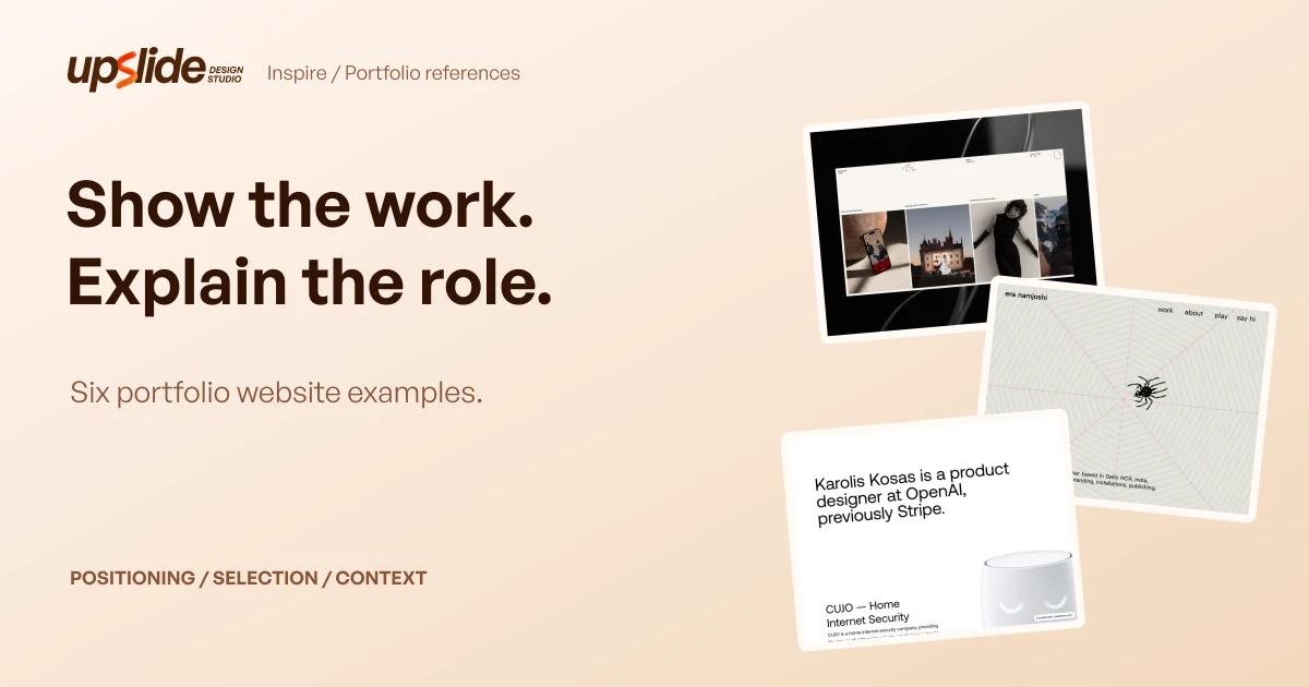
The six references below come from published Inspire editions. Their previews were inspected on 2 November 2026 alongside available first-party page text; the collection includes individual practices and one agency, with their differences kept visible.
Design problem
A portfolio has to make the work interpretable
An attractive image can establish a visual direction. It may not explain the brief, the person's contribution or whether the project resembles the work a visitor wants to commission.
The homepage therefore needs to establish a useful relationship between identity and evidence. A short introduction can frame the projects, while a project preview gives the introduction something concrete to point toward.
A reader comparing examples can ask:
- What professional question does the introduction answer?
- What is the first piece of work the site makes visible?
- Does the presentation explain the person's contribution?
- What can the visitor inspect next?
- What would still require a conversation or a fuller case study?
These are editorial review questions. They do not form a ranking model, conversion prediction or accessibility certification for the sites in the collection.
Different visitors need different levels of explanation
A design peer may recognise a technique immediately. A founder looking for help with a complex interface may need the project context, responsibilities and implementation boundaries spelled out.
A portfolio can accommodate both without turning every thumbnail into a long case study. The introduction establishes the practice, the selected work signals relevance, and the project page carries the explanation that cannot fit on the homepage.
This collection looks at that first relationship. It does not infer private project outcomes, employment histories or the quality of a working relationship from a screenshot.
Example collection
Six references with different starting points
| Published Inspire reference | Visible starting point | Useful comparison question | What the preview cannot establish |
|---|---|---|---|
| Brandon Yasin, 2 November | A restrained panel with varied project crops | Can selected work communicate range without many interface elements? | The complete contribution behind each project |
| Emotion Agency, 2 November | A purple landscape and large statement | Does an atmospheric introduction support the intended service proposition? | Performance, implementation quality or business results |
| Era Namjoshi, 29 October | A web illustration and concise practice description | Can a personal visual idea coexist with understandable positioning? | The full depth of the project archive |
| Karolis Kosas, 26 October | A large role introduction and product image | Does the page connect professional identity to project context? | Independently verified career or project outcomes |
| Edoardo Lunardi, 25 October | A workspace-like composition with several content routes | Can a portfolio distinguish work, experiments and writing? | The usability of every interaction or the site's technical performance |
| Maurice Moynihan, 23 October | A distinctive wordmark and labelled practice routes | Can a personal identity remain strong with a quiet page structure? | Whether playful copy suits another person's audience |
The dates identify the published Inspire editions from which the references were selected. They are not claims that every site launched, changed or was independently audited on that day.
Brandon Yasin: let the selected work occupy a restrained frame
The Brandon Yasin portfolio is represented by a cream panel against a dark, glossy surround. Four differently cropped project images sit beneath small navigation, with a handwritten mark contributing to the identity.
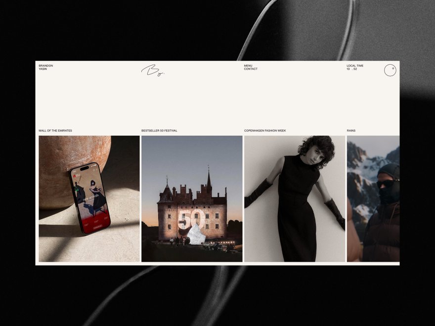
Published in Inspire on 2 November 2026. Credit: Brandon Yasin and the credited project creators. This is the existing published preview, not a fresh full-site capture.
The visible composition is useful for comparing how much framing a project collection needs. The surrounding interface stays compact while the differing image crops establish variation across the selected work.
The accessible first-party page also separates work, background and contact information. Its project contributions still need to be interpreted in their original context; the thumbnail strip alone cannot establish what the designer did on each engagement.
Emotion Agency: give the atmosphere a stated service context
The Emotion Agency site places a glowing particle form above a mirrored purple landscape. A large serif statement occupies the lower area, while navigation remains comparatively small.
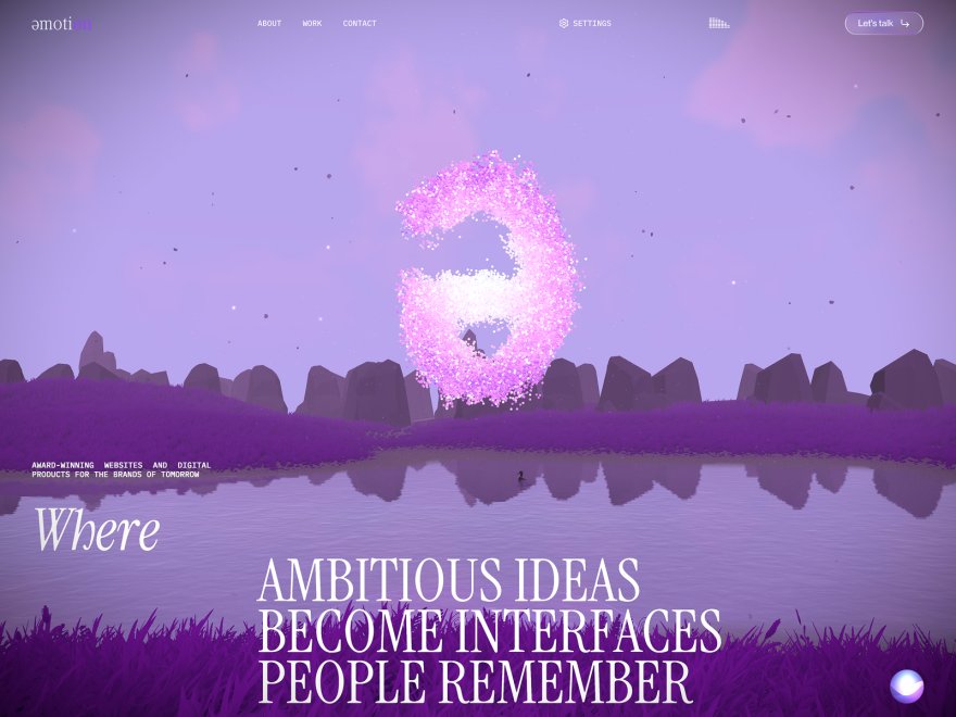
Published in Inspire on 2 November 2026. Credit: Emotion Agency. The preview shows a captured visual state; animation behaviour and loading performance were not tested for this article.
The first-party page connects its expressive presentation with services and a project list. That matters when comparing an agency portfolio with an individual portfolio: the visitor needs to understand the team's scope as well as its visual character.
The useful observation is the relationship between an atmospheric introduction and a stated practice. It is not evidence that a similar scene would improve another site's enquiries, or that the agency's private project results have been verified.
Era Namjoshi: connect a personal motif with a clear practice description
The Era Namjoshi site uses a fine web illustration across a pale background, with a small central spider and compact navigation. The introduction identifies an illustration and visual-design practice rather than leaving the motif to explain the profession by itself.
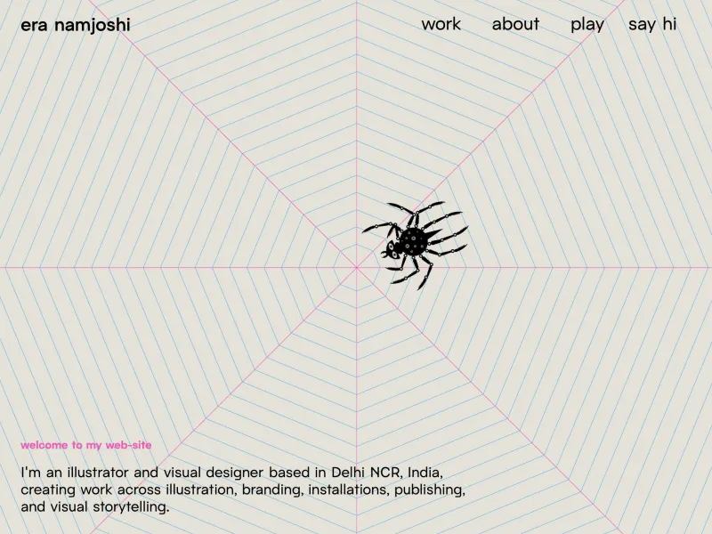
Published in Inspire on 29 October 2026. Credit: Era Namjoshi. Existing preview inspected for this article; the original site may have changed since capture.
This example is useful when a portfolio needs to retain a personal idea without obscuring its professional context. The illustration supplies character; the nearby description explains the kinds of work being presented.
A designer adapting that relationship should develop an appropriate motif from their own practice. Reusing the spider, composition or wording would transfer someone else's identity rather than solve the positioning question.
Karolis Kosas: move from the role introduction into a project
The Karolis Kosas site uses a large, left-aligned professional introduction on white, followed by a product image and project description. The visible hierarchy gives the introductory text and the work separate, readable areas.
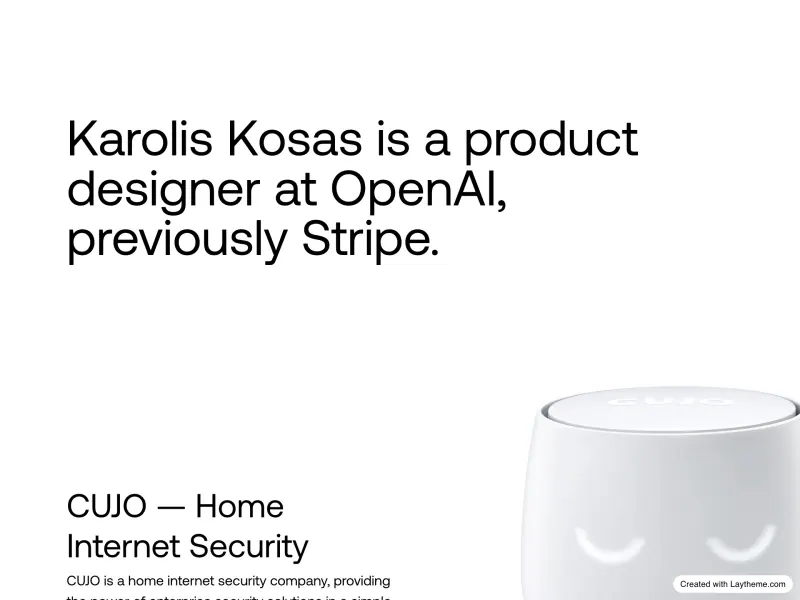
Published in Inspire on 26 October 2026. Credit: Karolis Kosas and the credited project teams. Career statements visible in the source are first-party claims, not independently verified by Upslide.
The official page provides short project descriptions and routes to further detail. That relationship is useful for a product designer whose contribution may require more explanation than the final image can provide.
The adaptation question is how little text can establish useful context before the next project view. The screenshot does not prove the projects' business impact or establish that the same hierarchy suits a different body of work.
Edoardo Lunardi: separate the kinds of evidence being offered
The Edoardo Lunardi site is represented by overlapping dark windows and a horizontal work strip. Its visible labels distinguish areas such as a work gallery, an article, an experiment and build notes.
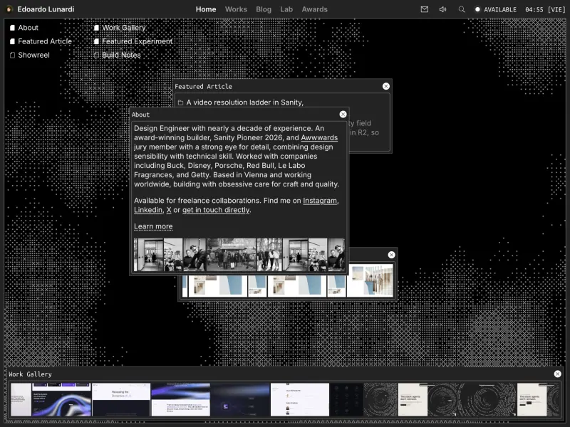
Published in Inspire on 25 October 2026. Credit: Edoardo Lunardi and credited collaborators. Existing preview; this article does not claim a completed interaction or performance audit.
The distinction between evidence types is worth studying. A project, an experiment and an article can demonstrate different aspects of a practice, and labelling them helps avoid treating all three as equivalent commissioned work.
The workspace metaphor is an observed visual choice. Its suitability for another portfolio depends on whether the navigation and content remain understandable to that portfolio's intended visitors.
Maurice Moynihan: put a strong identity inside a quiet structure
The Maurice Moynihan site places an irregular rounded wordmark on a largely pale page, with small floating objects and a restrained navigation row. The visual signature comes mainly from the lettering and the contrast in scale.
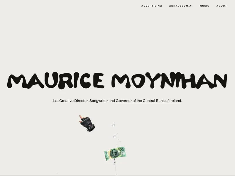
Published in Inspire on 23 October 2026. Credit: Maurice Moynihan. The site includes playful biographical language; it is not treated here as verified factual biography.
The first-party navigation separates areas of the practice, including advertising and music. That is a useful contrast with a large undifferentiated archive: the identity can remain expressive while the routes use recognisable labels.
The lesson to evaluate is the relationship between a memorable mark and a restrained surrounding structure. It does not require copying the lettering, humour or objects used by this particular creator.
Patterns worth adapting
Treat the first project as part of the positioning
The order of work helps define what the portfolio is offering. A page can claim product-design expertise while leading with unrelated visual experiments, leaving a prospective collaborator unsure which statement to believe.
A useful editing exercise is to pair the introduction with the first visible project. Ask whether the project provides relevant evidence for the work the introduction describes.
This is a reason to revise the selection before adding another section. The portfolio may already contain an appropriate project that is simply buried behind less relevant work.
Keep the project's role distinct from its appearance
A founder evaluating a possible collaborator needs to know whether the person designed the interface, created the brand, developed the site or contributed a narrower part. A final image can be shared by several collaborators without explaining those distinctions.
A short project note can identify the task and contribution before the full case study. Where a project was self-directed, a concept or a collaboration, that context should be made explicit.
The note should remain proportionate to the evidence. An unsupported growth figure or an inflated role description makes a portfolio harder to assess even if its visual presentation is convincing.
Separate selected work from a broader archive
A homepage selection can communicate the current direction of a practice. A broader archive can preserve other material without giving every project equal weight in the introduction.
The distinction is especially useful when the work spans several disciplines. A relevant route into an archive is easier to interpret than a long homepage whose purpose changes repeatedly as it scrolls.
The collection does not establish a universal number of projects. The useful criterion is whether the visible selection supports the work the person wants to do next.
Let different reference types play different roles
An atmospheric agency introduction can inspire a discussion about visual identity. A text-led product portfolio can inform the amount of context needed around a project.
Those references do not need to collapse into one hybrid layout. Record the decision being studied in each, then decide which decision fits the actual portfolio brief.
For a SaaS founder reviewing designers, this also prevents taste from becoming the only selection criterion. The most relevant next question may concern the designer's contribution to a comparable problem, rather than whether their homepage resembles the founder's preferred style.
Adaptation checklist
Build a project-selection board before redesigning the homepage
Create a small board using the projects that can legitimately be shown. For each, record the intended audience, the specific task, the contributor's role and the material available to explain the work.
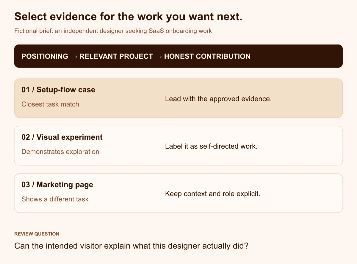
Original editorial exercise by Upslide Design Studio. The projects are fictional and do not describe the creators in the reference collection.
Consider a fictional independent designer seeking more SaaS onboarding work. The available material includes a client-approved setup-flow case study, an unrelated visual experiment and a product-marketing page.
The exercise is to choose the lead project using the intended work and available evidence. The setup-flow case may be the closest match, provided its contribution and constraints can be explained honestly; the experiment can remain available in a separately labelled area.
Write a project note that someone else can interpret
A project note should give the reader enough context to decide whether opening the fuller case is worthwhile. It can remain compact when its fields answer specific questions.
| Field | Question it answers | Fictional example |
|---|---|---|
| Context | What kind of task was involved? | A setup flow for a team scheduling product |
| Contribution | What did this designer own? | Interaction concepts and interface specification |
| Constraint | What shaped the available options? | Existing account and permission requirements |
| Evidence | What can the visitor inspect? | Approved flow diagrams and annotated interface states |
| Boundary | What should not be inferred? | No independently measured adoption result is available |
The example is a proposed writing structure, not evidence of a completed Upslide project. Its purpose is to make the contribution legible without manufacturing a business outcome.
Choose resources after the content structure is clear
Resource Box includes Framer and Webflow as website-building options to investigate. The current product, publishing and plan requirements should be checked directly before selecting a route.
For preparing a visual presentation, Shots provides a mockup-creation destination to inspect. A presentation frame should support the work rather than hide essential interface details or imply that a concept has shipped.
These resources are already in the directory; the research did not identify a necessary missing tool to add for this article. There is no benefit in expanding the shortlist merely to make the guide longer.
Review the result with the intended visitor
Ask a relevant reviewer what work the portfolio appears to offer, which project they would open and what they believe the author contributed. Compare those answers with the actual intent of the page.
This is a proposed review exercise, not a study conducted on the reference sites. If the answers diverge, revise the introduction, project selection or supporting note before assuming the whole visual direction is wrong.
For a different page-selection task, the published SaaS website examples guide compares product-marketing references. Keep a portfolio's professional-evidence task separate from the job of selling a software product.
Frequently asked questions
How many projects should a portfolio homepage show?
There is no fixed number that suits every practice. Start with enough relevant work to explain the direction of the practice, and give additional material a clear destination when it does not need equal emphasis.
The first selection should support the kind of work the person wants next. An extensive archive can remain available without becoming the whole introduction.
Should every portfolio project have a full case study?
The amount of context should match the work and the visitor's questions. A complex product-design contribution may require decisions and constraints that cannot be understood from the final image.
A shorter visual project can still include a clear contribution note and appropriate credits. Do not add invented research or outcomes to make a project appear more substantial.
Can a portfolio include concepts and experiments?
Yes, provided they are labelled accurately. A self-directed experiment can demonstrate an approach or craft without being represented as commissioned, implemented or independently measured work.
Keep that distinction visible in the project list and fuller presentation. The reader should not need to infer which parts are concepts and which reflect a real engagement.
What should a SaaS founder look for when reviewing a designer's portfolio?
Look for relevant problems, a clear account of the person's contribution and evidence that can be discussed in context. Visual quality is one part of the evaluation, while the project boundaries and decision-making need their own questions.
A public portfolio cannot establish everything about collaboration or implementation. Use it to identify the follow-up questions rather than treating the homepage as a complete assessment.
Does a portfolio need animation or a distinctive visual metaphor?
It can use either when it supports the work and remains understandable to the intended visitor. The references show different visual approaches rather than one required style.
Review whether the visitor can identify the practice, reach the relevant work and understand the next route. This article does not supply performance or accessibility findings for the animated examples.
When will this collection be updated with new Inspire picks?
Newly published portfolio picks are candidates for review, not automatic additions. Each needs a relevant original destination, an inspectable preview, creator attribution and an observation that contributes a useful comparison.
The collection should retain at least six qualifying references. If a source disappears or no longer supports the observation, revise the explanation or hold the affected update until a suitable replacement is inspected.
Key takeaways
- Pair the introduction with work that supports the intended professional direction.
- Distinguish the person's contribution from the appearance of the final project.
- Label concepts, experiments and collaborative work honestly.
- Study individual portfolio decisions instead of combining every visual effect.
- Update references through inspection and attribution rather than automatic inclusion.
Start by revising one project's place and contribution note. That bounded change can clarify the portfolio brief before a larger redesign begins.
At Upslide Design Studio, we help teams make design decisions clearer. The reference analysis here is independent of whether a designer or founder chooses to work with us.