

When part of an interface moves, can you still explain what changed, which object you were using and where you can go next?
That question makes UI animation examples useful to designers and SaaS founders. A polished recording can suggest a direction, but it leaves out the trigger, surrounding content and conditions that made the movement understandable. A single screenshot leaves out the transition altogether.
This guide examines three public component demonstrations: a Headless UI dialog, a Radix UI accordion and a Motion reorder grid. We operated their controls and inspected their current published implementations. Observed state changes and documented motion are identified separately; we did not measure animation duration, frame rate or user comprehension.
Keep the object and its context understandable across the change.
The examples are working demonstrations from resources already in Resource Box. They are not customer research, production SaaS results or daily website picks. The aim is to turn a visual reference into a precise design question, with enough evidence to discuss the pattern and its limits.
Visual problem
Describe the relationship that changes
An expanding answer changes the amount of content inside a page. A dialog introduces a separate layer.
Reordering changes where an existing object sits among its neighbors. All three can involve animation while asking the reader to understand different relationships.
Name the relationship before choosing an effect. “Keep the answer attached to its heading” gives a designer something to inspect. “Make the FAQ feel smoother” does not establish what must remain clear when one answer replaces another.
For a product interface, preserve the surrounding task too. An animation beside an unrelated showcase label may be attractive without helping someone compare reports, edit a record or arrange a queue. Use the reference to investigate a relationship, then evaluate the actual product context separately.
Distinguish three kinds of evidence
The first kind is an operated state change: a control was activated and the visible or accessible interface changed. That establishes an interaction occurred. It does not establish what happened in every frame between the two states.
The second kind is implementation evidence. Published code or CSS can identify a height animation, scale transition or layout mechanism. It describes how the example is written; it is not a measurement of the experience on every browser or device.
The third kind is a finding about people. Whether someone understood the transition, located the next action or made fewer errors requires appropriate evaluation. Neither a vendor's elegant example nor our inspection supplies that finding.
| Evidence retained | What it supports | What it leaves open |
|---|---|---|
| Control and resulting state | The demonstrated interaction changes the interface | Exact temporal behavior and comprehension |
| Actual example implementation | The declared movement and its state relationship | Delivered performance across environments |
| Source and capture context | Which public example was examined | Current behavior after a later revision |
| A proposed review task | What the team should investigate | A result from real participants |
Reference examples
Compare three actual interface patterns
The examples below span three domains and three existing resources. The collection is deliberately small: each source supplies a different relationship to inspect. It is not a ranking of libraries or a claim that three examples represent every useful form of interface motion.
| Source | Demonstrated relationship | Main design question |
|---|---|---|
| Radix UI accordion | Content revealed beneath a persistent heading | Can the answer remain attached to its question? |
| Headless UI dialog | A dismissible layer within the current page | Can someone distinguish the layer from a new location? |
| Motion reorder grid | An existing item changes position among neighbors | Can the same item be located after reordering? |
Radix UI: reveal an answer without losing its heading
The official Radix accordion example starts with its first answer expanded. We activated “Can it be animated?” and inspected the resulting expanded answer and the collapsed previous heading. The controls and content provide an actual example of changing disclosure within a page.
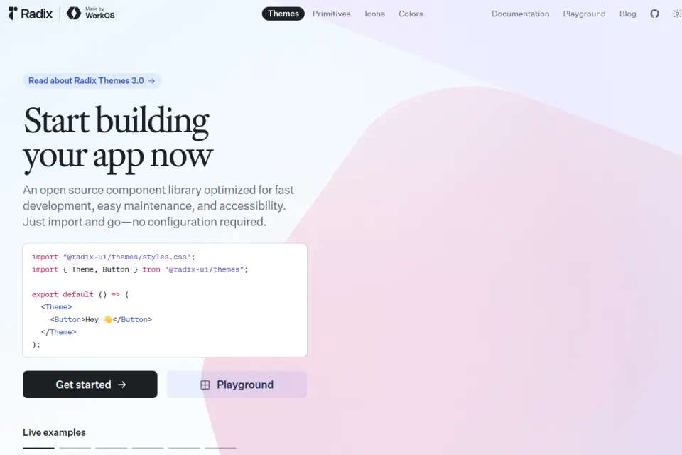
Credit: Radix UI / WorkOS. This existing Resource Box homepage capture was inspected November 2, 2026; its original capture date is unknown. It shows Radix Themes as source context, rather than the operated Primitives accordion.
The example's own CSS tab defines opening and closing height keyframes, connected to its open and closed states. It also defines a chevron transform transition. Those source rules support the animation description; the changed accessibility state alone would not prove temporal movement.
The useful design relationship is between a persistent heading and the answer revealed beneath it. Another item closing at the same time can alter the position of surrounding content. Inspect the resulting layout as well as the motion around the activated heading.
For a SaaS settings page, the equivalent question might concern an expanded explanation or optional configuration. Determine whether hiding the content is appropriate before copying the effect. Important requirements should remain discoverable, and a disclosure should not become a place to conceal consequences.
The content-size guidance explains using the component's measured-content CSS variables for the size animation. That is source-specific implementation guidance, not a universal instruction to use one fixed panel height.
Headless UI: introduce a layer with a clear way back
The Headless UI dialog example contains a sample “Payment successful” panel. We dismissed it with its acknowledgement button, inspected the remaining “Open dialog” control and reopened the panel. No payment or external transaction was performed; these are demonstration labels.
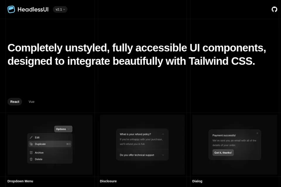
Credit: Tailwind Labs / Headless UI. Existing Resource Box homepage capture, inspected November 2, 2026; original capture date unknown. Source context with sample component cards, not a record of our activated dialog states or an accessibility audit.
The example's Code tab declares a panel transition whose closed presentation has reduced scale and zero opacity. That implementation explains the intended change in appearance. Our open and closed observations establish the available states and controls, without supplying a measured transition time.
The design question concerns the relationship between the layer and its surrounding page. What remains recognizable when the panel appears?
Which action dismisses it? Does the person return to a meaningful place after closing it?
A visual treatment alone does not answer every dialog question. Focus, keyboard operation, scroll handling and the intended dismissal conditions need their own review. Headless UI documents these concerns alongside its component; adapting a screenshot does not automatically reproduce them.
For founders reviewing a product concept, distinguish an acknowledgement from a decision. A demo containing a success message does not justify showing success before the real operation is confirmed. The general feedback sequence belongs to the product's actual state model; this example concerns the presentation and dismissal of a layer.
Motion: preserve identity as an item changes position
The public Motion reorder grid displays numbered tiles. We dragged tile 01 from the first position into the second row. The resulting accessible order was 02 through 07, then 01, followed by 08 through 16.
Credit: Motion and its contributors. Existing Resource Box homepage capture, inspected November 2, 2026; original capture date unknown. Source context only: this image does not show the operated reorder grid or prove temporal movement.
The actual example source declares maintained item values, a reorder callback, spring transitions on items and a scale change during dragging. Those are documented implementation choices. The order change confirms the demonstrated rearrangement, while the source supplies the explanation of intended layout motion.
This pattern asks the designer to preserve object identity through movement. Tile 01 remains the same labelled item after its position changes. In a real queue, a distinctive title, stable identifier or other meaningful cue may matter more than the tile's decorative color.
The Reorder documentation also describes updating the maintained values when order changes. Keep the interface's order separate from persistence in the actual product. A rearranged demo does not establish that a server saved the sequence or that a later session will restore it.
Review the neighboring items as well. The moving item can remain recognizable while someone loses track of the place it came from or the destination they intended. A useful evaluation names the requested new position and checks the resulting sequence, rather than judging only whether the drag looked polished.
Principles and tradeoffs
Keep the source observation separate from the interpretation
For the accordion, the observation is that a different answer becomes expanded. The source describes height keyframes. The interpretation to investigate is whether revealing content this way preserves the heading-answer relationship in the intended layout.
For the dialog, the observation is that the sample panel can be dismissed and reopened. The source describes scale and opacity changes. The interpretation to investigate is whether the layer and its return path remain understandable in the actual page.
For reordering, the observation is a changed sequence with tile 01 still present. The source describes layout and dragging behavior. The interpretation to investigate is whether someone can follow the same item and confirm its new place.
These interpretations are proposed design questions. No comprehension, conversion, error-rate or time-saving result was collected. Keep that boundary visible when a reference is shown in a stakeholder presentation.
Worked layout exercise
We constructed an original reference record for a fictional reporting interface called Traceboard. It uses three tasks: reveal a report explanation, open a report-details layer and reorder a report in a saved list. The records are a teaching exercise, not screenshots or results from a real SaaS product.
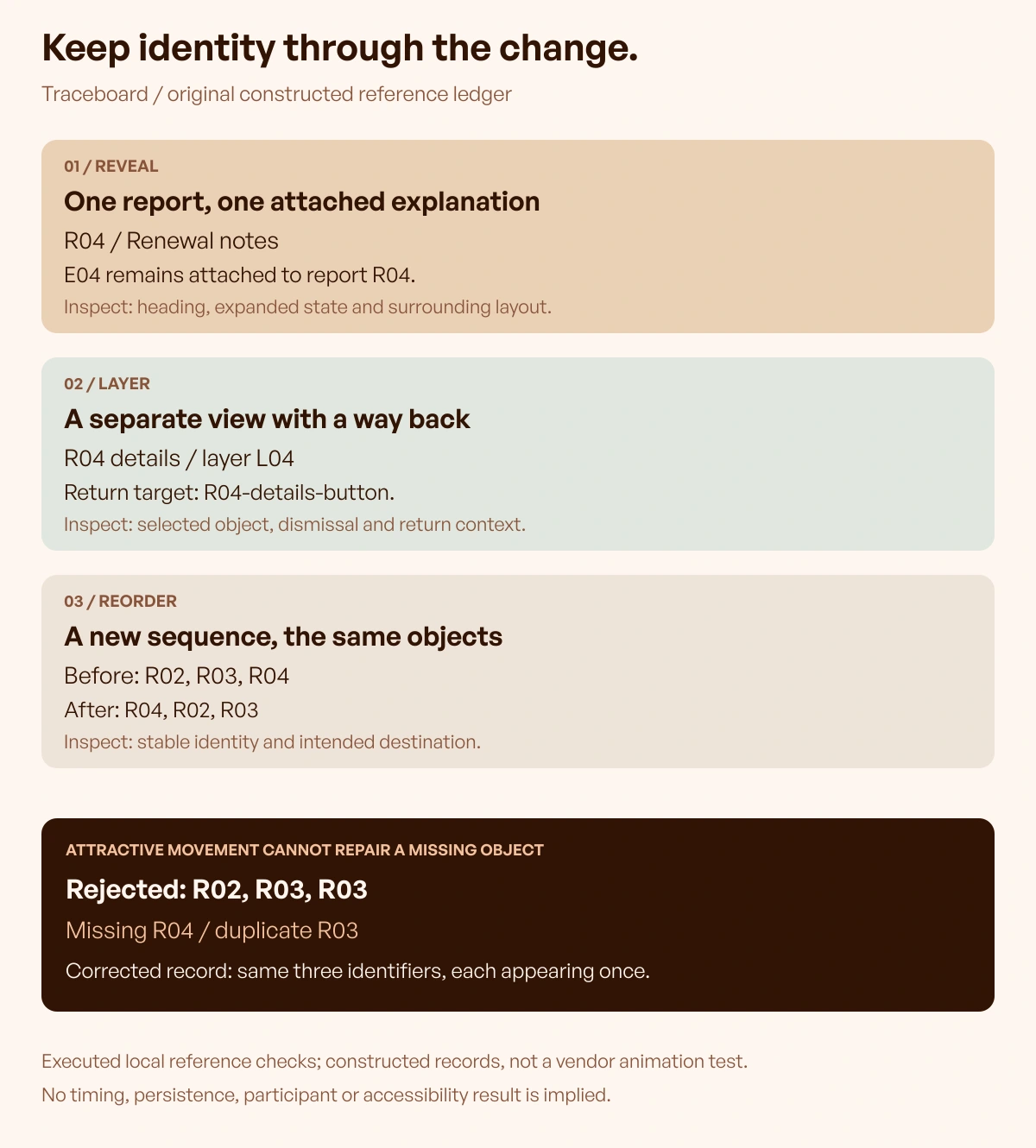
Original explanatory graphic and constructed records: Upslide Design Studio. Local checks verify declared references and item identities; they do not test vendor animation behavior or participant understanding.
For the reveal task, the record keeps explanation E04 attached to report R04. For the layer task, it keeps report R04 and a return target together. For the reorder task, it keeps the same three report identifiers while changing their sequence.
The local checks reject a constructed reorder that accidentally drops R04 and duplicates R03. The corrected order retains the same identifiers exactly once. That difference would matter even if both proposals were presented with attractive movement.
The exercise does not prescribe a database schema or a particular animation API. It makes the intended relationship inspectable. A designer and developer can then discuss which real state, label or source needs to remain stable during the change.
Avoid copying the example's subject matter
A component demonstration often uses convenient sample content. The Headless UI payment message does not mean a payment workflow is the right model for every dialog. The Radix feature questions do not establish how a long compliance explanation should be disclosed.
Likewise, numbered tiles remove much of the complexity of real report names, descriptions and status information. Use the observed pattern as a reference, then introduce representative content. A long title or a changed neighboring row can reveal a different design problem.
The same caution applies to an attractive recording found in a gallery. Retain the source credit, distinguish a concept from an implemented interface and avoid inferring its library or business performance. The reference supplies something to investigate, not a complete specification.
How to choose
Begin with the starting and ending states
Write down the relevant object, context, trigger and intended destination. For a disclosure, identify the heading and its answer.
For a layer, identify what opens it and where the person returns. For a reorder, identify the requested sequence and the stable item identities.
Then describe the transition's proposed purpose in one sentence. If that sentence only says the interface should appear sophisticated, clarify the information or relationship the movement is meant to communicate.
If the underlying layout is still uncertain, use the published free wireframe tools guide to establish the screens and their content before refining the transition. Keep the same object labels in the wireframe and motion reference.
Use Upslide's microinteraction examples when the uncertainty concerns pending, successful or failed operations. A transition between views and a confirmed save are different aspects of the design, even when one interaction includes both.
Inspect a meaningful interruption
Choose an interruption that belongs to the actual task. Someone might close a layer immediately after opening it, open a different explanation or change their mind about a report's position. State the intended result before experimenting with the visual effect.
Treat that as a proposed review contract unless it has actually been run in the selected implementation. The public examples above were operated for their named interactions; we did not execute a complete interruption suite or certify their behavior under every rapid input.
Keep the last valid task state recoverable. A decorative completion should not override a newer action, and a rearrangement should not silently remove the item someone was moving. Verify those behaviors in the real interface rather than assigning them from a library's reputation.
Define a useful reduced-motion route
MDN's reduced-motion reference explains how a user preference can inform the presentation. Define what the component should communicate when movement is reduced, then inspect the implementation.
The explanation still belongs to its heading. The layer still needs a clear dismissal and return route.
The reordered items still need recognizable identities and an understandable sequence. Removing motion should not remove that information.
This article did not run a complete preference or assistive-technology audit of the three demonstrations. Do not convert an available configuration option into a claim about every example, adaptation or surrounding page.
Keep a reference another person can reproduce
Retain the exact source route, inspection date, activated control and resulting state. Note which movement comes from the published implementation and which behavior was actually operated. Include a short limitation beside the capture rather than hiding it in an unrelated document.
For the real product, add representative content and the intended interruption or alternative. Ask another person to locate the changed object and explain the next available action. Record what happens before making a broad claim that a transition is clearer or more efficient.
That gives the reference a practical role in a design review. It becomes a source-backed question and a small acceptance exercise, with a visible boundary between an appealing idea and a verified result.
Continue in Resource Box and Inspire
Open Resource Box to inspect the original Radix UI, Headless UI and Motion examples and their current source guidance. Choose the relationship your interface needs to explain before deciding how it should be implemented.
Use Daily Inspire for attributed visual references in complete pages. Those references can help frame hierarchy or presentation; a static gallery capture cannot establish an interaction's temporal behavior.
Frequently asked questions
What makes a UI animation example useful?
A useful reference identifies the trigger, object, surrounding context and resulting state. Current source information can explain the intended movement. Evidence about comprehension or task success requires a separate evaluation.
Can a screenshot prove that an interface is animated?
A screenshot records one presentation at one point. Even before-and-after images do not reveal every intermediate frame. Keep actual interaction observations separate from implementation documentation and temporal measurements.
Are these examples production SaaS case studies?
They are public component demonstrations from existing Resource Box sources. We operated specific controls and inspected their source context. No customer outcomes, production persistence or participant findings are claimed.
Is an accordion animation always the right choice?
First determine whether content should be hidden at all. Keep important requirements discoverable and review the heading-answer relationship with representative content. A disclosure animation does not justify an unsuitable information structure.
Does reordering a tile prove its position was saved?
The demo demonstrates an interface order change. Persistence depends on the actual application's data handling. Check the intended saved state and later retrieval separately before presenting a reorder as a confirmed update.
Do the source settings establish the ideal animation duration?
They describe those examples' implementations. We did not measure duration or compare timings with participants. Choose and evaluate behavior for the actual task, content, input and environment.
What should remain when motion is reduced?
Keep the meaningful resulting state, recognizable objects and available actions. A disclosure, dialog or reordered list should remain understandable. Verify the actual component and its surrounding interaction rather than inferring support from its source name.
Key takeaways
- Identify what is revealed, layered or moved before choosing an effect.
- Separate operated state changes from documented motion and measured outcomes.
- Preserve object identity, surrounding context and a clear next action.
- Review representative content, interruption and reduced movement in the actual interface.
If the investigation reveals a wider interface-design problem, we can help through Upslide's design services. Keep the same neutral evidence and review criteria when working internally or with any design partner.