
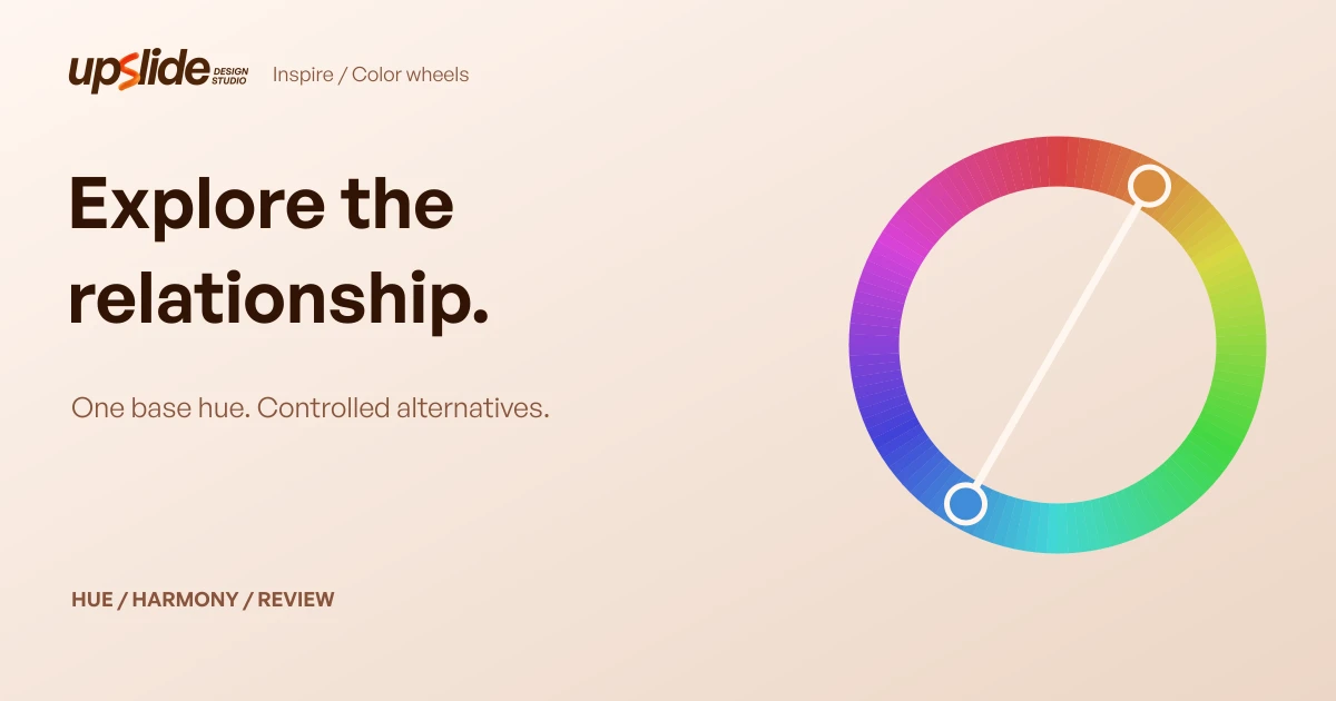
A color wheel helps you change a palette deliberately. Instead of refreshing a generator until something looks promising, you can hold one hue steady and ask what happens when its companions move closer, opposite or evenly around the circle. That makes alternatives easier to explain to a founder, another designer or the person implementing the page.
Start by choosing the wheel's model. A traditional red–yellow–blue wheel and a screen-oriented RGB/HSL wheel organize relationships differently. Then choose a relationship, compare a small number of alternatives and evaluate the actual use separately. A complementary pair is a hue relationship; it does not establish readable button text.
This guide compares six public wheel resources and works through an original HSL exercise. It uses inspected interfaces and official documentation, rather than an account-feature benchmark or a claim that a particular harmony improves conversions.
Design task
Give the wheel one question
Consider a fictional SaaS team preparing a visual direction for a scheduling product. The existing orange brand hue stays. The unresolved question is whether supporting illustrations should stay near orange or introduce a distinctly different hue. The team needs three explainable directions before committing to detailed artwork.
That is a suitable wheel task because the uncertainty concerns hue relationships. It does not require assigning every product status, choosing a new font or rebuilding the brand. Keep those decisions outside the exercise so the review can identify what actually changed.
Write the constraint as a sentence: “Keep the starting hue and compare neighboring, opposite and evenly spaced companions.” Record the model, base value and settings beside the alternatives. Without those details, two screenshots can look like competing opinions when they were generated under different assumptions.
Name the model before the harmony
An RGB wheel relates to red, green and blue light. HSL expresses sRGB colors through hue, saturation and lightness; hue is an angle around a circle. A traditional RYB wheel uses red, yellow and blue as its teaching primaries. Neither label should be silently substituted for the other.
The MDN HSL reference explains the screen-color representation and adding 180 degrees to find a complementary hue. Paletton explicitly uses a classical RYB arrangement, while Sessions exposes a choice between RYB and RGB. A tool can output hex values while using a different wheel arrangement for its relationships.
Therefore “opposite orange” needs a model and an actual value. Keep the output codes with the visual reference. Do not promise a paint mixture from a screen preview or treat a generic CMYK readout as a printer-specific production proof.
Resource collection
Compare the wheels by their controls
| Wheel | Useful reason to try it | Important boundary |
|---|---|---|
| Adobe Color | Explore named harmonies with adjustable wheel stops | Check actual pairs and account-dependent saving separately |
| Canva Color Wheel | Combine a base value with an accessible explanation of relationships | Its visible CSS export was marked coming soon when inspected |
| Figma Color Wheel | Inspect a wheel beside numeric color representations | Opening its palette in a design file is a separate workflow |
| Wixel Color Wheel | Explore companion swatches with a PDF export route | The broader design platform has separate account conditions |
| Paletton | Explore classical RYB relationships, variations and previews | Its wheel arrangement differs from a simple HSL-angle exercise |
| Sessions Color Calculator | Compare RGB and RYB modes with harmony choices | Sample designs and reports do not approve your interface |
These are alternatives for a specific job, not a best-to-worst ranking. Choose the controls you need and preserve the result in a form the next reviewer can inspect. You do not need six tools to make one decision.
Adobe Color: adjust a structured relationship
The official Adobe wheel describes starting with a base color, choosing a harmony and adjusting the stops. It includes monochromatic, complementary, analogous and triadic directions, alongside other color exploration and checking features.
Use it when the team wants a visible relationship that can be adjusted rather than a completely new palette each time. Keep the base fixed, select one harmony and record which companion values change. If you then change saturation or lightness, label that as a second decision.
The current public page uses Adobe Express branding. Existing saved-theme or library workflows should be checked in the actual account before becoming part of a handoff. The presence of a contrast feature does not establish that every component and state in your product has been checked.
Canva: learn the relationship while exploring it
Canva's Color Wheel combines an interactive base-color control and combination selector with explanations of the common relationships. That is useful for a founder who needs to understand what a designer means by analogous or complementary before reviewing alternatives.
Keep the discussion concrete. Point to the base and its companions, explain the relationship, then compare the same proposed illustration treatment. Avoid turning the educational terminology into a claim that one option must feel calm or energetic to every audience.
The inspected page exposed a palette PDF route, while its CSS export control was disabled and labelled coming soon. If code export matters, verify the current control rather than assuming an educational tool provides a complete design-token workflow. This assessment did not download an export or test an account feature.
Figma: see numeric values beside the wheel
The public Figma Color Wheel presents a wheel, lightness control, base hex field and color representations including RGB and HSL. The inspected complementary example displayed two swatches with copy controls.
That makes it useful when a conversation needs to move between a visible choice and a recorded value. Copying the numeric result helps another designer recreate the candidate without sampling a compressed screenshot. Keep the scheme name as well as the codes; the same output can be edited later without retaining the original relationship.
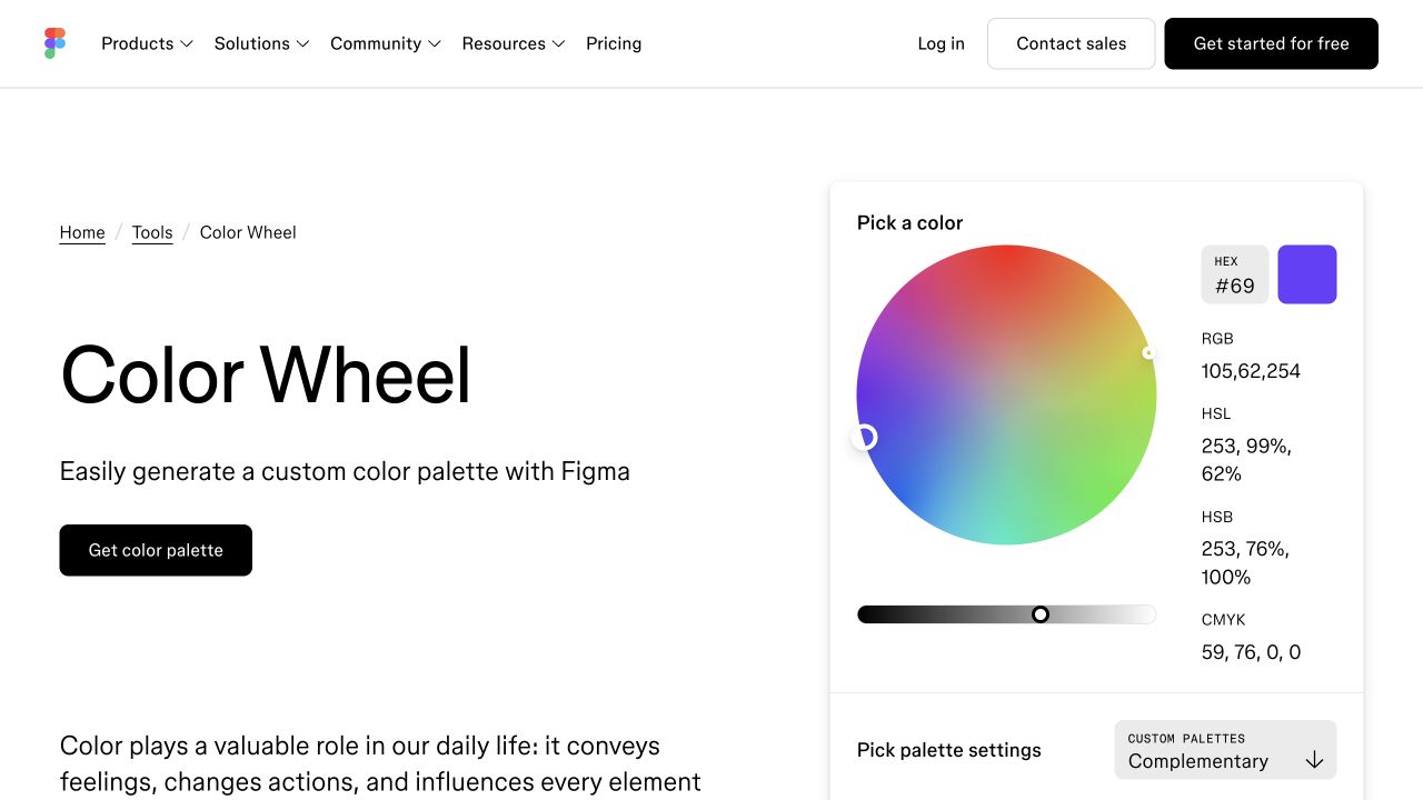
Actual public page captured at 1280 × 720 on 2 November 2026. Credit: Figma. This is tool context, not an authenticated file workflow or an export test.
The “Get color palette” route leads toward a design-file workflow. Do not assume that opening it, installing a plugin or saving into a team workspace has been tested merely because the public wheel was inspected.
Wixel: keep a portable palette reference
Wixel's wheel provides a base hex input, scheme selector and companion swatches. Its official instructions describe PDF palette export, making it relevant when a review needs a portable reference rather than a live editing session.
Use that reference to preserve the starting point. Add your own note explaining which model and relationship you explored and what still needs to be evaluated. A PDF with three codes can communicate a candidate direction; it cannot describe every permitted text pairing or product state.
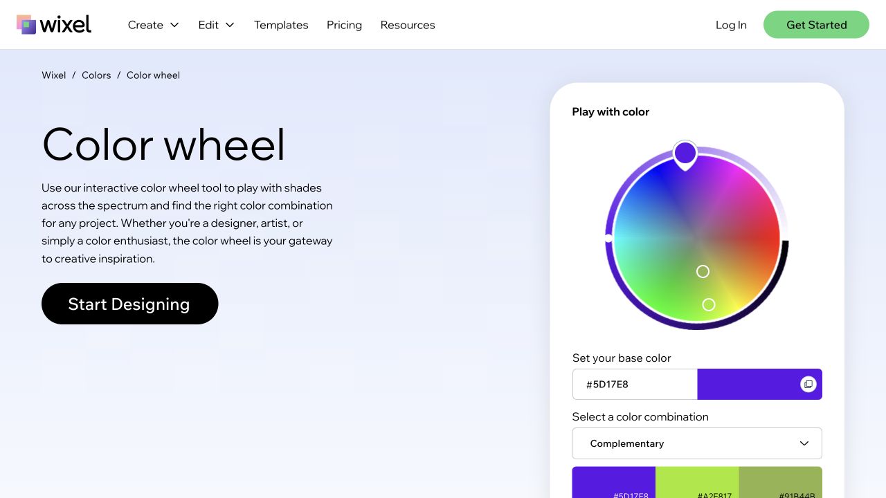
Actual public page captured at 1280 × 720 on 2 November 2026. Credit: Wixel / Wix. The visible wheel and controls were inspected; no download, account creation or paid feature was tested.
The public wheel and the broader Wixel design platform have different workflow boundaries. Check the step you actually plan to use, including any account requirement, instead of treating a free exploration feature as evidence about the entire platform.
Paletton: investigate the classical RYB arrangement
Paletton describes its classical RYB wheel, harmony models, variations, sample previews and export formats. It is useful when you deliberately want to explore that arrangement and inspect alternatives around a selected base.
This is also a useful place to learn why wheel screenshots can disagree. A hue labelled with an RYB position is not automatically the same angle as HSL hue in a stylesheet. Compare the resulting color values and document the selected model before discussing which tool is correct.
Its sample layouts and vision simulations can suggest issues to investigate. They do not prove conformance or user recognition. Likewise, a documented CSS or image export is a capability to verify in the intended workflow, not evidence that this comparison completed every export. Choose Paletton for its relationship controls, not for promises of better engagement in promotional copy.
Sessions: make the mode choice explicit
The Sessions Color Calculator exposes RGB and RYB modes and six harmony choices. Its instructions explain base inputs, adding colors, generating a scheme and reviewing a report with color values and sample applications.
This is useful for teaching a team to inspect the mode before selecting a relationship. Compare the same starting value under the available modes and note the resulting companions. Treat differences as information about the model and implementation, rather than a reason to average the outputs together.
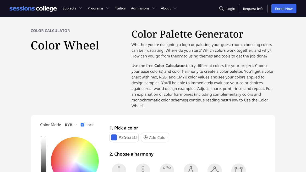
Actual public page captured at 1280 × 720 on 2 November 2026. Credit: Sessions College. The capture includes the introduction and upper calculator controls; it does not show a generated report or a completed export.
The sample applications are useful review aids. Your scheduling product still needs its own content, component states and implementation checks. A generic magazine or website specimen cannot establish those outcomes.
Fit and limitations
Separate hue distance from readability
Two colors opposite each other can have insufficient light–dark contrast for text. Conversely, two colors with the same hue can form a readable pair when their relative luminance differs sufficiently. The wheel answers a relationship question; a text contrast calculation answers a different question.
The W3C explanation of minimum text contrast specifies 4.5:1 for normal text and 3:1 for qualifying large text, with exceptions. Check actual foreground/background combinations. Do not infer a pass from the distance between handles or round a failing value upward.
The W3C explanation of use of color also addresses information conveyed through color alone. A green and red pair still needs understandable labels or other cues where meaning depends on distinguishing them. A visually attractive harmony is not a complete accessibility review.
Equal HSL lightness is not equal perceived brightness
HSL makes an angle exercise easy to repeat, but its lightness coordinate does not make different hues appear equally bright. A yellow and a blue with the same saturation and lightness can behave very differently as large surfaces or small text.
This is why the first exercise holds settings constant to expose the hue relationship, then deliberately stops before approving UI use. Once a candidate is selected, adjust and check the actual application. Do not preserve the initial lightness merely to keep the triangle mathematically neat.
Color associations also depend on context. “Analogous” describes neighboring hues; it does not guarantee calmness. “Complementary” does not guarantee action. Discuss the relationship as a way to generate options, then test the communication task with the intended audience.
How to choose
Work the same base through three relationships
Use an explicitly defined HSL screen wheel for this original exercise. Start at hue 30 degrees, saturation 65% and lightness 55%. Hold saturation and lightness constant. The values below are calculated examples rounded to 8-bit sRGB hex; they are not copied from a featured tool or approved production colors.
| Direction | Hue positions | Example hex values | What the experiment changes |
|---|---|---|---|
| Base | 30° | #D78C42 | The starting reference |
| Complementary | 30°, 210° | #D78C42, #428CD7 | Adds the opposite hue, 180° away |
| Analogous | 0°, 30°, 60° | #D74242, #D78C42, #D7D742 | Uses neighbors 30° either side |
| Triadic | 30°, 150°, 270° | #D78C42, #42D78C, #8C42D7 | Uses three positions 120° apart |
The ±30-degree analogous spacing is our chosen teaching example, not a universal requirement for every analogous palette. A tool may choose different neighboring spacing or vary saturation and lightness as part of its preset. That difference needs an explanation, not a claim that the tool is wrong.
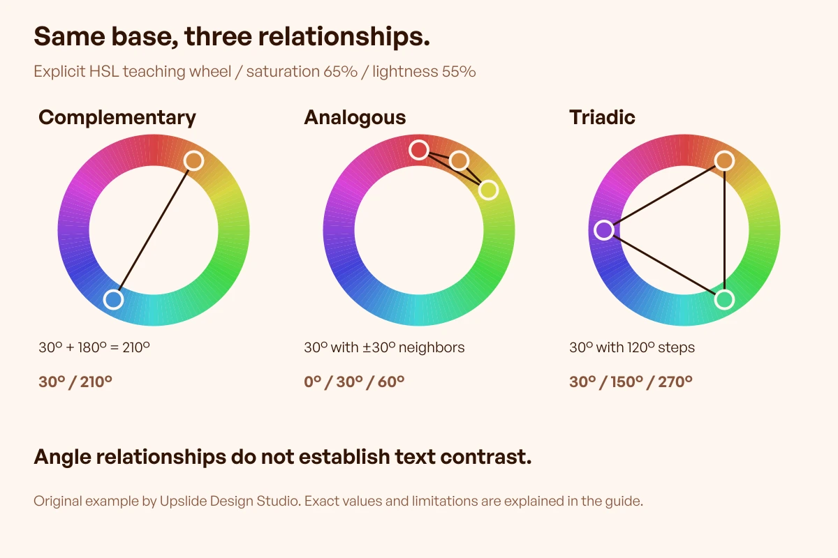
Original teaching graphic by Upslide Design Studio. The base, angle steps and fixed settings are explicit. The relationships illustrate exploration, not an accessibility result or a finished SaaS palette.
Review one controlled difference at a time
For the fictional scheduling team's illustration, create three small direction studies using those relationships. Keep the subject, composition, size and surrounding copy unchanged. The purpose is to see what the companion hues change, so a new illustration style in every version would obscure the comparison.
Ask which study preserves the intended focus and which introduces competing emphasis. Record observations about the actual composition. “The second accent attracts attention away from the calendar” is a useful issue to investigate; “triadic palettes convert better” requires evidence this exercise does not provide.
Then select one candidate to develop. Change saturation, lightness or the amount of each color deliberately, noting why. A relationship can survive those changes without requiring each hue to occupy equal space. You can also reject all three if the brand constraint or artwork task was poorly defined.
Keep an exploration record, not a false specification
A useful record contains the tool and URL, model or mode, exact base, selected relationship, output values and what was held constant. Include the comparison image and one sentence explaining the selection or rejection. This allows another designer to distinguish a conscious adjustment from a mismatched wheel.
Mark what the record does not establish: text contrast, state meaning, dark-mode behavior, printing conditions and implementation results. Assign those checks to the next stage rather than hiding them behind the word harmonious. For assigning page roles and comparing contextual preview resources, use the published color palette tools guide.
Study real compositions without copying the conclusion
Use Inspire's published picks to investigate how websites distribute a small set of hues. Record visible decisions such as a restrained background and a more prominent illustrated accent. Credit the original site and creator when sharing a reference.
A screenshot does not reveal which wheel, model or research produced the palette. Treat the reference as a composition to study, then develop your own controlled alternatives. Browse the Resource Box when the unresolved question calls for a wheel, contextual preview or separate checking tool.
Frequently asked questions
What does a color wheel actually help me decide?
It helps you explore relationships between hues around a chosen base. You can compare neighbors, opposites or evenly spaced companions while keeping other settings controlled. It does not decide the hierarchy, meaning or readability of a finished interface. Define the question first so the output supports a reviewable decision.
Why do RGB and RYB wheels give different companions?
They organize colors using different underlying models and arrangements. RGB relates to light, while classical RYB is a traditional artistic teaching arrangement. Record the selected mode and actual values. A hex output does not by itself tell you which wheel generated the relationship.
Are complementary colors automatically accessible together?
No. Opposite hue positions do not establish sufficient text contrast or meaningful distinctions without color. Check the intended foreground/background pair and the wider task. A complementary pair can remain useful for decoration while needing different lightness values or a separate treatment for text and controls.
Is an analogous palette always three colors?
Three neighboring hues are a common teaching example. The useful idea is proximity around the wheel, not an immutable count or angle. Record the spacing you choose, then evaluate the composition. Our 0°, 30° and 60° exercise makes its assumptions visible so it can be repeated.
Should I keep saturation and lightness fixed?
Keep them fixed when isolating the effect of hue relationships in an initial comparison. That makes the exercise easier to interpret. Adjust them afterward when the actual illustration or interface requires it. Equal HSL lightness does not make different hues equally bright or every combination readable.
Which wheel is best for a founder reviewing a designer's work?
Choose one whose mode, base and output values can be explained clearly. An educational wheel can help establish shared vocabulary; adjustable stops can help a designer explore controlled alternatives. Review the decision record together. A larger feature list is less useful than understanding why the selected companions fit the task.
When should I stop exploring and choose a candidate?
Stop when the comparison answers the original question or shows that the brief needs changing. Save the alternatives and the reason for the decision, then move to contextual checks. Generating more combinations without a new question often creates more preferences to reconcile without improving the evidence.
Key takeaways
- Name the model or mode before comparing color-wheel relationships.
- Hold the base and relevant settings constant to explain what changed.
- Use exact values and an explicit angle exercise to make alternatives repeatable.
- Check readability, meaning and the actual composition separately.
- Keep the selected direction and unresolved checks with the design record.
For help carrying a visual direction into a usable website or product, explore Upslide's design services. The tool choice remains independent of that service decision.