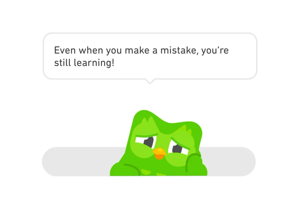


GoogleEXAMPLE 01


Teach a shortcut in response to repeated effort
Google introduces a faster keyboard action when a person repeatedly performs a slower one. The advanced option appears when its benefit can be understood.
Reveal complexity when it becomes relevant.
01 / UNDERSTAND
Show the information and controls needed for the current task, with a clear route to more detail. This can help beginners get started without removing advanced capability. People must still be able to discover what is available.
The information horizon is the functionality and complexity someone can see at a particular moment. Showing everything immediately can overwhelm a newcomer. Build understanding progressively, introducing a capability when it becomes useful. Learning can span several sessions. Keep essential prices, conditions and consequences visible before any related commitment.
A settings screen does not need to expose every preference at once. Start with recognisable categories, then reveal the controls for the category someone chooses. The additional capability remains available without competing with the current decision.
The aim is to help someone focus, understand the available choices and find the next action. A visibly labelled route to more detail is essential. If a person needs two pieces of information together, keep them together rather than creating extra navigation.
02 / RECOGNISE
Examples of how the principle can appear in an interface.
Google introduces a faster keyboard action when a person repeatedly performs a slower one. The advanced option appears when its benefit can be understood.
Stuff separates additional onboarding tasks from the initial checklist. People can expand the advanced area when ready rather than processing every capability at once.
FROM UPSLIDE’S COURSE
In the course’s radiology redesign example, a wide patient table and separate screens made it difficult to find a case and assemble the information needed for a report. The revised table prioritises the patient and scan information needed to choose a case. Selecting a row opens a workspace with patient details, scan images and report writing together.
The disclosure happens between choosing a case and working on it. Once reporting begins, the information used together stays visible together. Hiding the scan behind another page would add memory and navigation costs.
Group related questions into understandable steps, show progress and let people return to earlier answers without losing their work. This is staged disclosure: the sequence divides a task into manageable parts. It is useful when the stages make sense to the person answering, rather than simply dividing a form into equal lengths.
Ask whether someone is attending before requesting meal preferences or guest details. Show the follow-up questions relevant to their answer. When an answer changes, make the resulting changes clear and prevent hidden, irrelevant fields from blocking submission.
03 / CONNECT
The visible information horizon can affect understanding, feature adoption and productive habits. Introduce advanced capability as it becomes relevant while preserving discoverability.
Possible influences to investigate, rather than guaranteed outcomes for every product.
04 / APPLY
Show the information needed for the current task first
Use clear labels for additional options
Keep information used together visible together
Reveal conditional fields only when relevant
Preserve answers when people move between steps
Test whether people can find and use the extra options
Disclosure can add clicks while reducing the amount someone must interpret at once. It can also make a frequently used action harder to reach. Observe whether people discover the extra options, complete the task correctly and recover when they change their mind. Compare the whole task, including backtracking, rather than counting clicks alone.
Further reading: Nielsen Norman Group — Progressive Disclosure.
05 / EXPLORE WITH UPSLIDE
Use a practical guide, read a deeper explanation, or examine a related Upslide project.
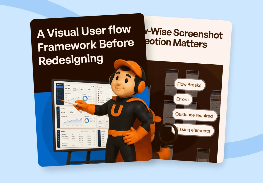
Separate primary, secondary and detailed information according to the next task.
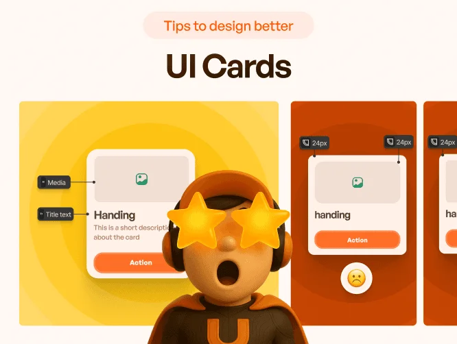
Use card anatomy and hierarchy to make one set of information easier to compare.
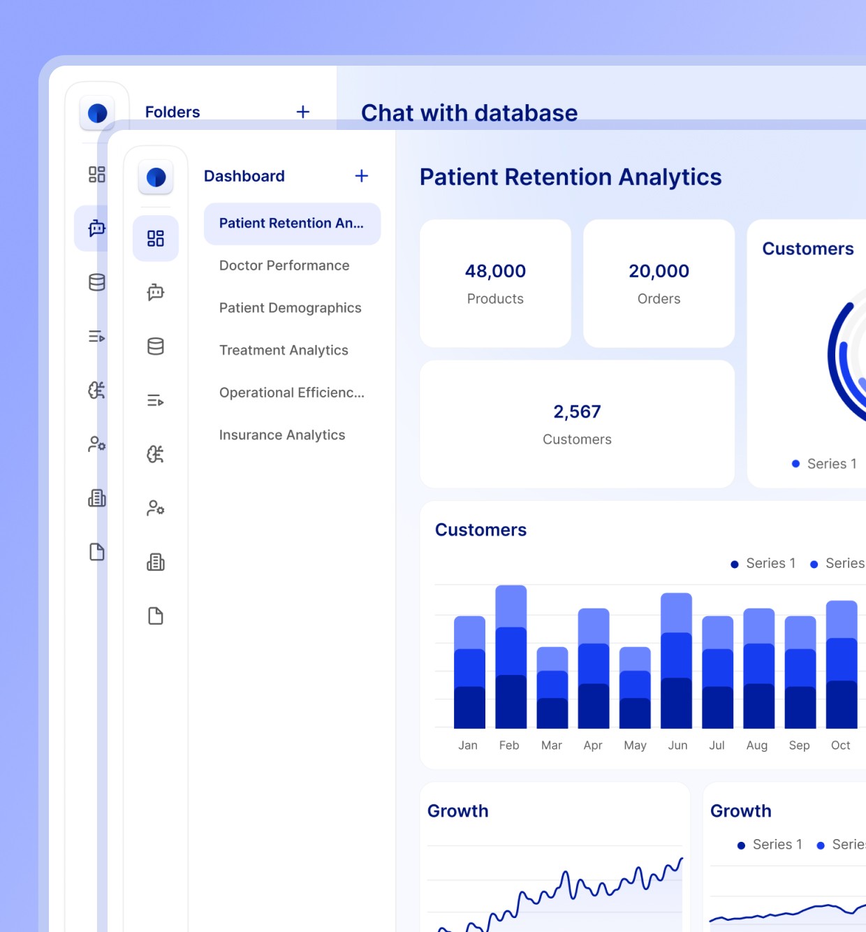
Explore ECHO’s restructuring of data access and advanced functionality.
CONNECT THE IDEAS
Keep exploring