

November 4, 2026.
 Websites
Ferndesk
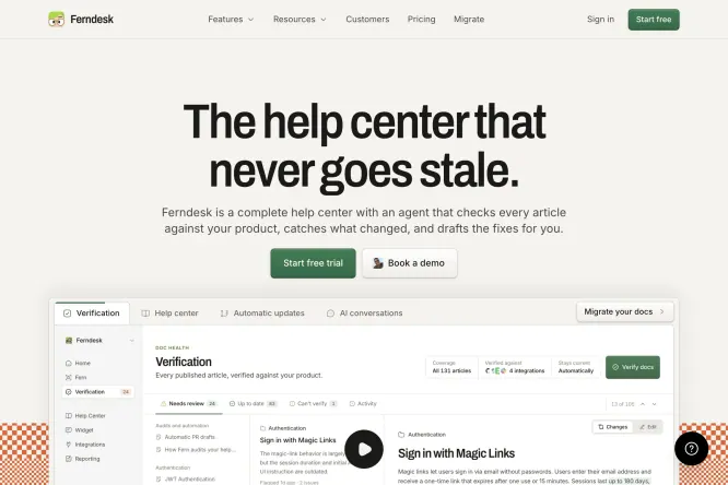
A warm cream hero combines a blunt two-line promise, green actions and a detailed support dashboard, while orange pixel accents keep the sober SaaS layout approachable.
 Websites
Fiddle.Digital
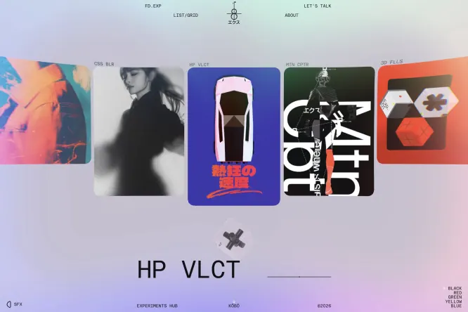
A horizontal gallery of high-contrast visual experiments sits over a soft iridescent field, using cropped cards and tiny utility labels to create the feel of an active design lab.
 Websites
Kooler
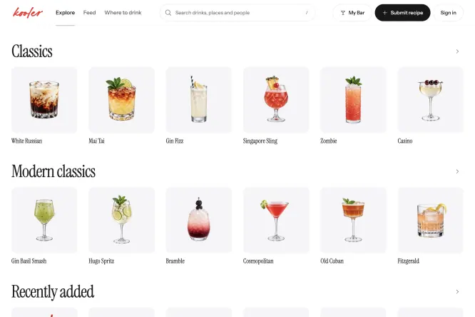
Serif category headings, generous white space and consistent drink cards make a large cocktail library easy to scan, while hand-drawn marginal art adds personality without disrupting the grid.
 Portfolios
Doodle Deli
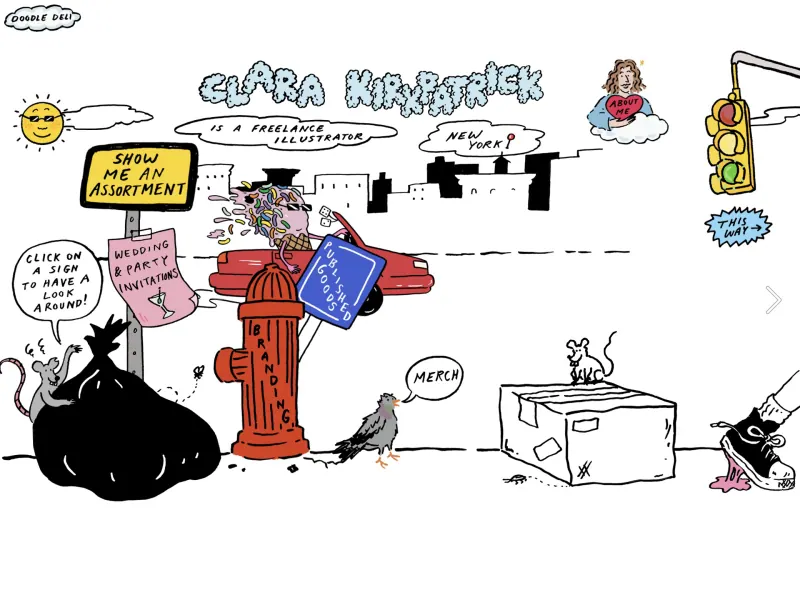
Loose black linework, hand-lettered labels and selective red, blue and yellow accents turn a portfolio landing page into a playful illustrated neighborhood full of discoverable details.
 Portfolios
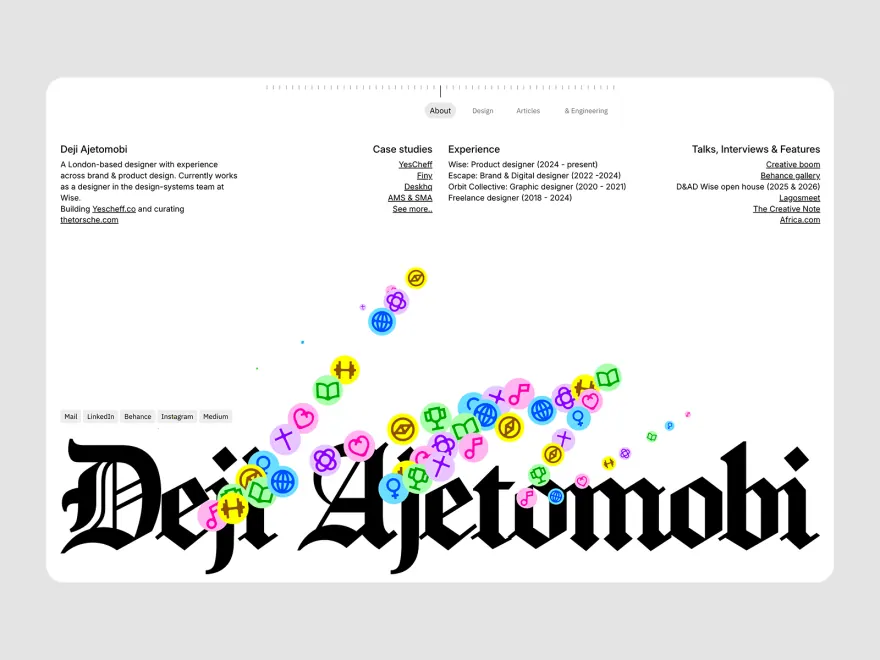
Deji Ajetomobi
A restrained résumé grid gives way to an oversized blackletter name, with a trail of tiny colored icons bridging the formal information above and the expressive identity below.
 UI & Interaction

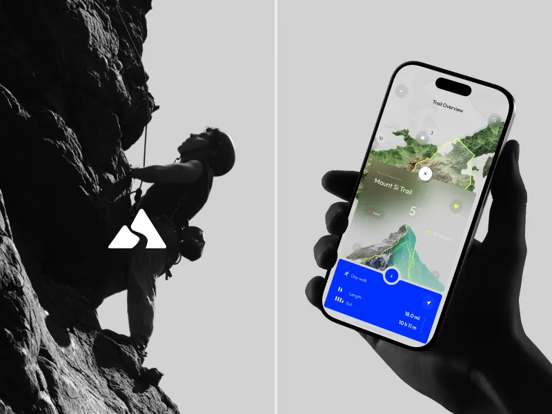
TheTrail App – Travel Dashboard & UX UI Design
A monochrome climbing photograph frames a bright phone map, using one saturated blue route card to pull elevation and trip details forward without competing with the landscape.
 UI & Interaction
Vulcan - Control Panel UI
Dark translucent control panels float across an angled tablet and smartwatch, while amber status highlights and compact gauges make the industrial interface feel technical yet readable.
 Branding

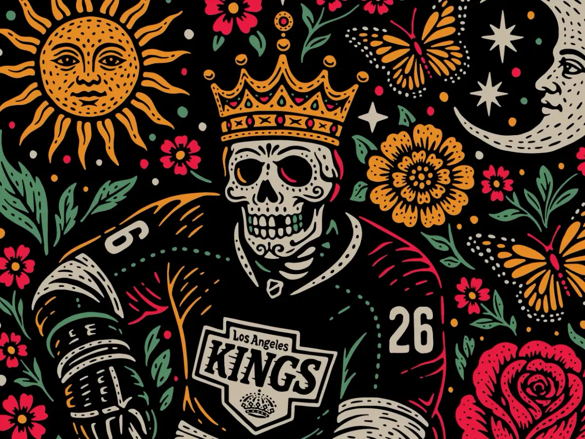
LA Kings 2026 Dia de Los Muertos Apparel
A crowned hockey skeleton anchors a dense black field of suns, moons, flowers and team marks, showing how a limited red, orange and green palette can unify highly detailed apparel art.
 Branding
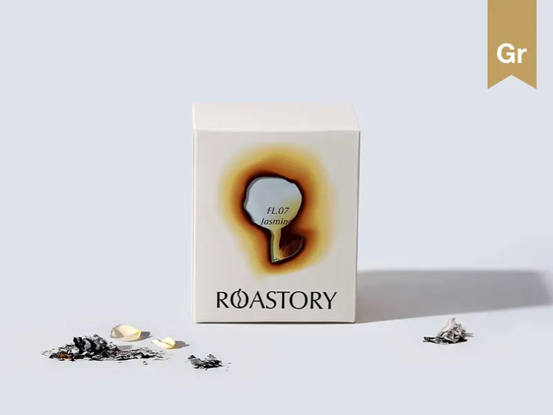
ROASTORY | Coffee Brand Identity & Packaging Design
A white coffee box uses one scorched amber focal mark, a compact label and scattered grounds, proving that a single tactile gesture can carry an otherwise minimal packaging system.
 Typography

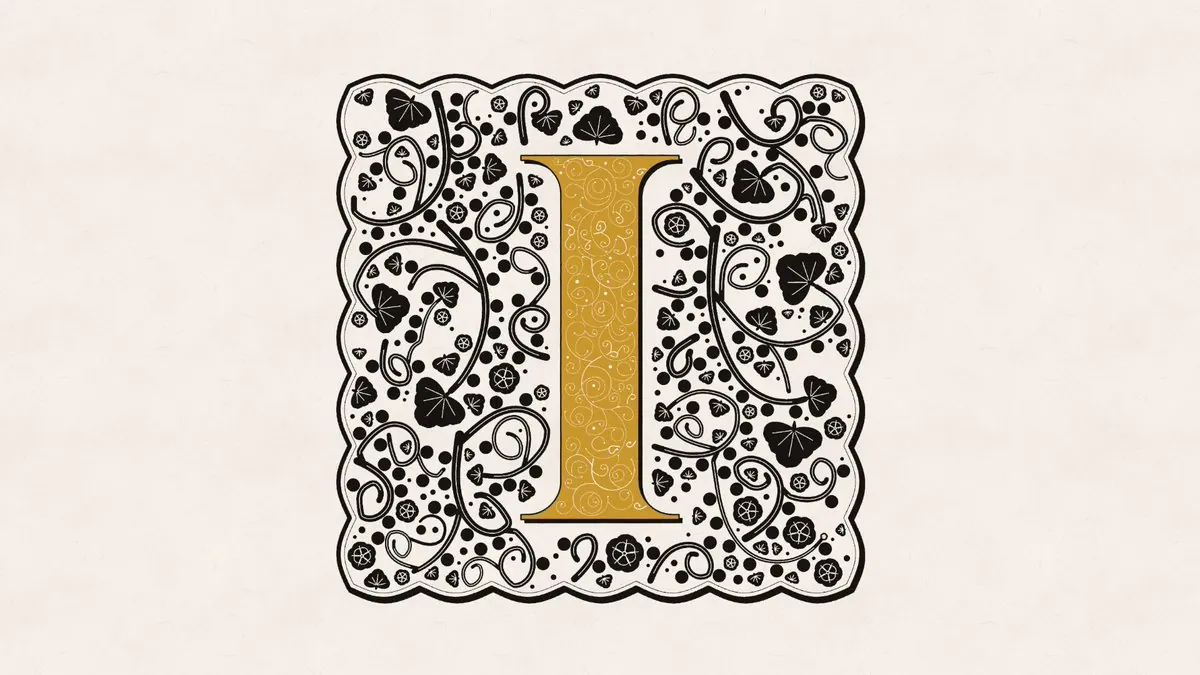
INITIĀLIS illuminated drop caps
A single gold initial is framed by dense black vines, leaves and dots, balancing illuminated-manuscript ornament with a restrained two-colour system and generous outer space.
 Designer Posts
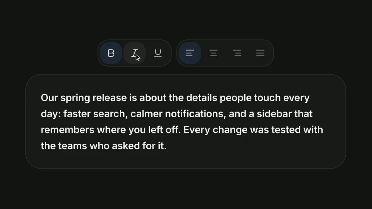
Spent way too long on a bold/italic toggle. Worth it?
Rounded formatting controls use blue selection rings against a near-black panel, while the generous text card below makes the bold-and-italic states easy to compare in context.
 Designer Posts
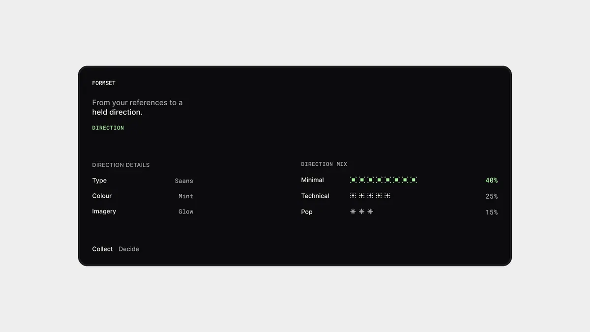
direction
A compact black direction card translates references into type, colour and imagery choices, then visualizes the mix with percentages and tiny bars so an abstract brief becomes measurable.