

November 3, 2026.
 Websites
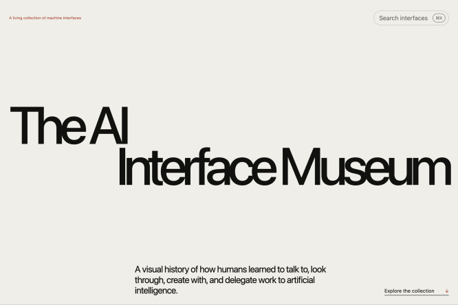
The AI Interface Museum
The warm off-white canvas uses an oversized staggered title, tiny red annotation and sparse edge controls to make a historical interface collection feel archival and contemporary.
 Websites
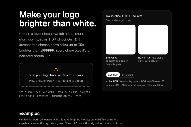
Make your logo brighter than white
A black utility page pairs a high-contrast upload area with side-by-side white swatches, turning a niche HDR logo test into a clear, self-explanatory workflow.
 Websites
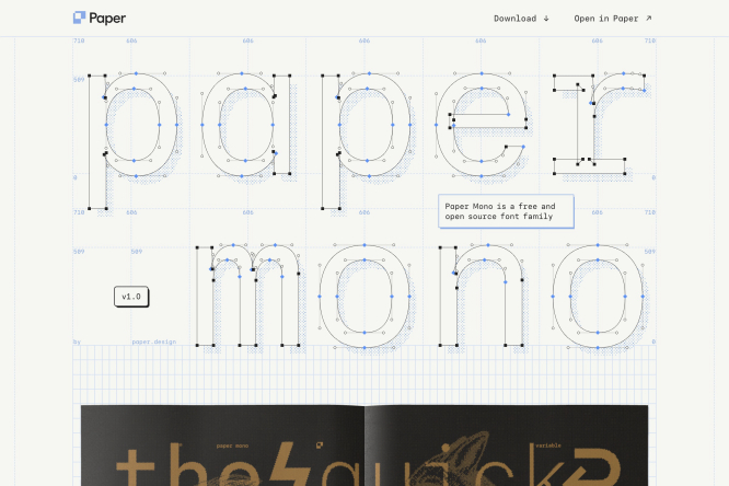
Paper Mono
Blue construction lines, Bézier points and measurements reveal how each monospaced letter is built, while the graph-paper grid makes the typeface’s open-source logic tangible.
 Portfolios
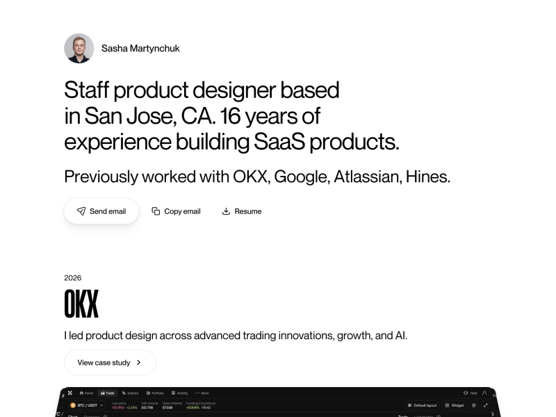
Sasha Martynchuk
Large biographical copy, a small circular portrait and compact contact actions establish credibility immediately, then lead directly into a restrained case-study list.
 Portfolios
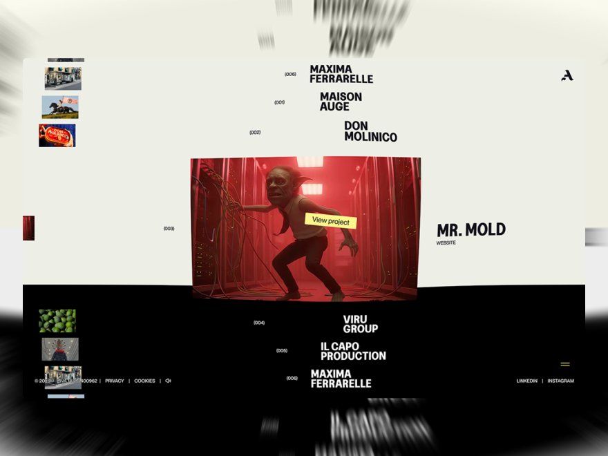
AUGE Experience
A central project image and oversized client names sit within a black-and-cream spatial grid, using blurred edge typography to make portfolio navigation feel kinetic.
 UI & Interaction
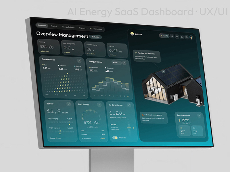
AI-Powered Energy SaaS Dashboard UX/UI Design
Dark teal KPI tiles, compact charts and a house-energy model organize a dense control dashboard, while muted aqua and yellow accents separate status from action.
 UI & Interaction
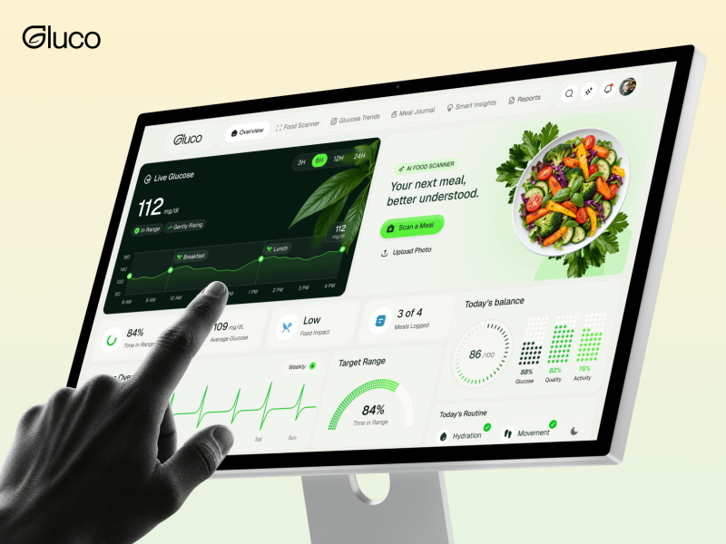
Gluco | Glucose & Diabetes Health Dashboard | UI/UX
The glucose value, next-meal guidance and daily balance occupy distinct zones, using dark green, white and bright lime to clarify health status and recommended action.
 Branding
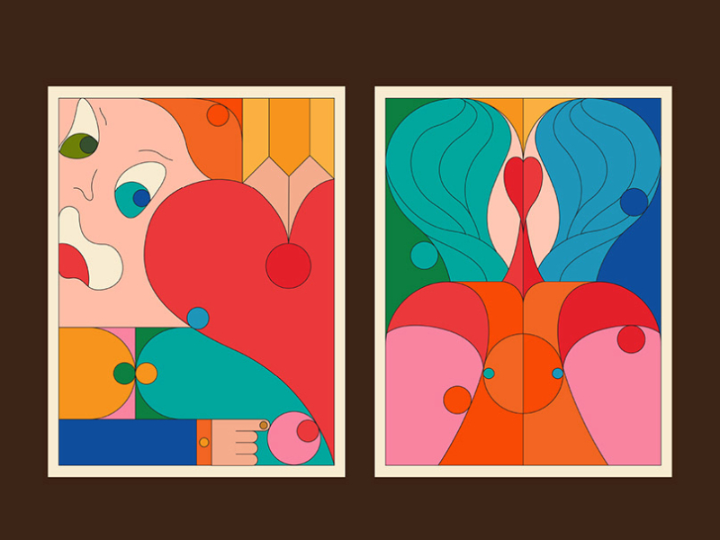
PosterLife 2026 v6
Two geometric posters share a red, peach, teal and blue palette, but vary their curves, faces and symmetry to show how a coherent system can still produce distinct compositions.
 Branding
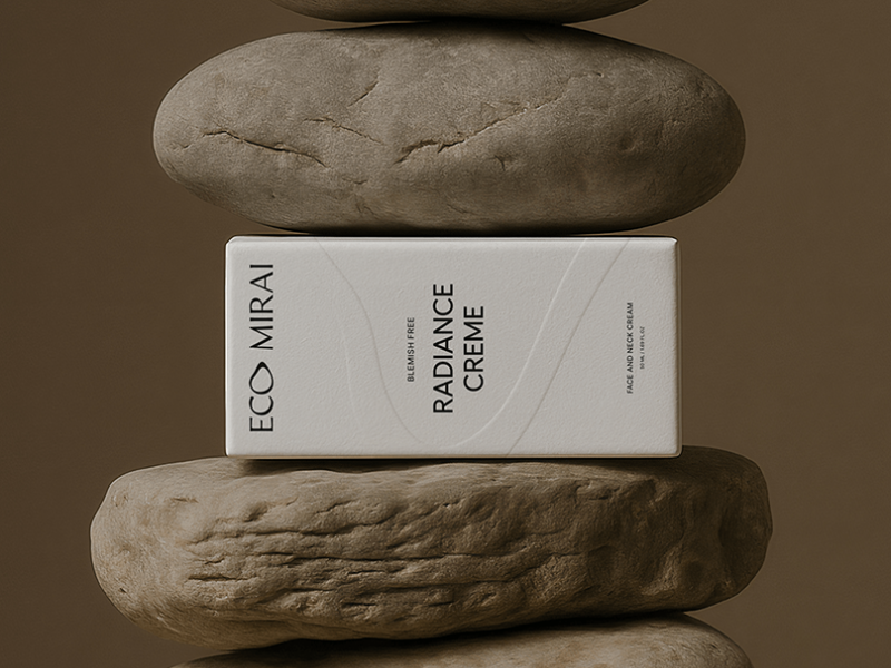
Eco Mirai | Skincare Brand Design & Art Direction
A clean white skincare box is pressed between rough earth-toned stones, creating a strong material contrast that connects clinical packaging with natural ingredients.
 Typography
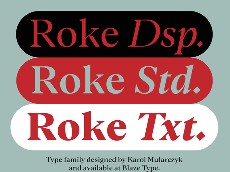
Roke
Three oversized pill-shaped specimens compare display, standard and text cuts, using red, cream, black and pale sage to make the family’s sharp serif character instantly legible.
 Designer Posts

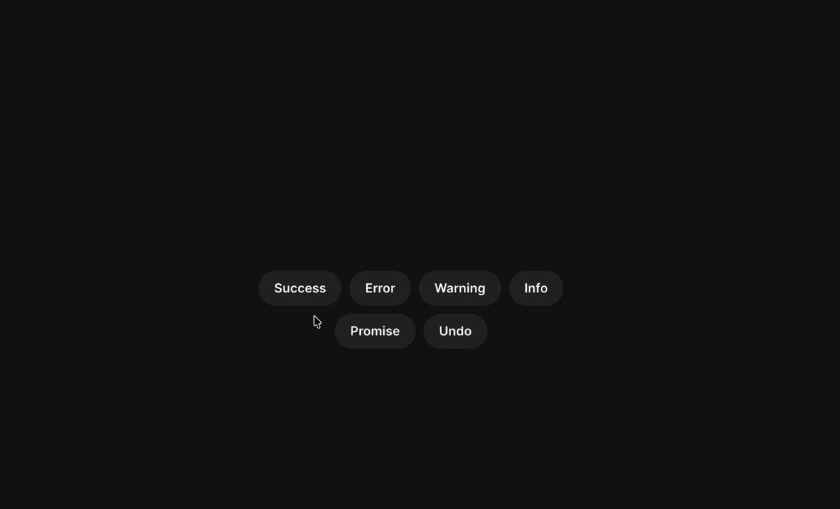
A toast notification with animated status icons
Compact status chips sit on a near-black canvas, using consistent pill geometry and subtle tonal shifts to make success, error, warning and undo states feel related.
 Designer Posts
Footer Section UI Animation
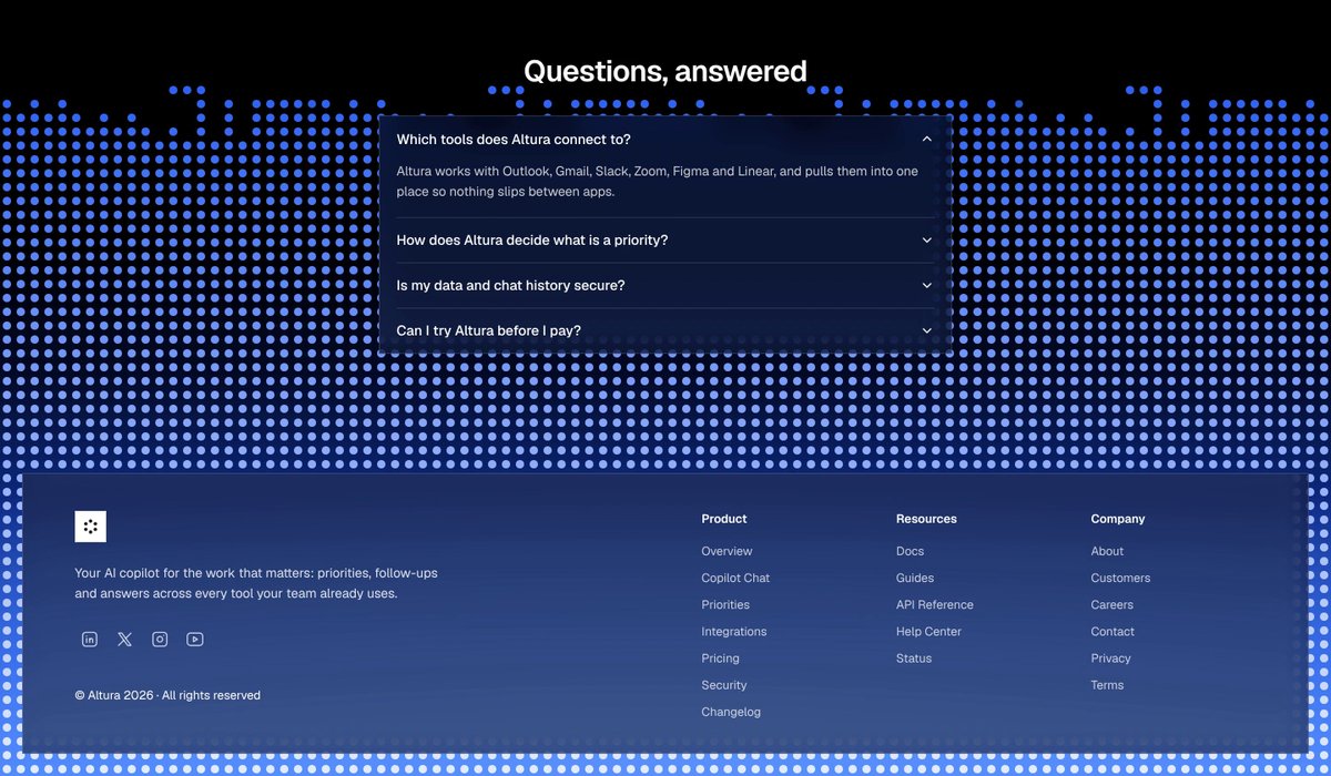
A dotted electric-blue field frames a translucent FAQ panel and structured footer links, making the final page section feel layered, responsive and visually memorable.