

October 26, 2026.
Source archive · curated October 30, 2026
 Portfolios
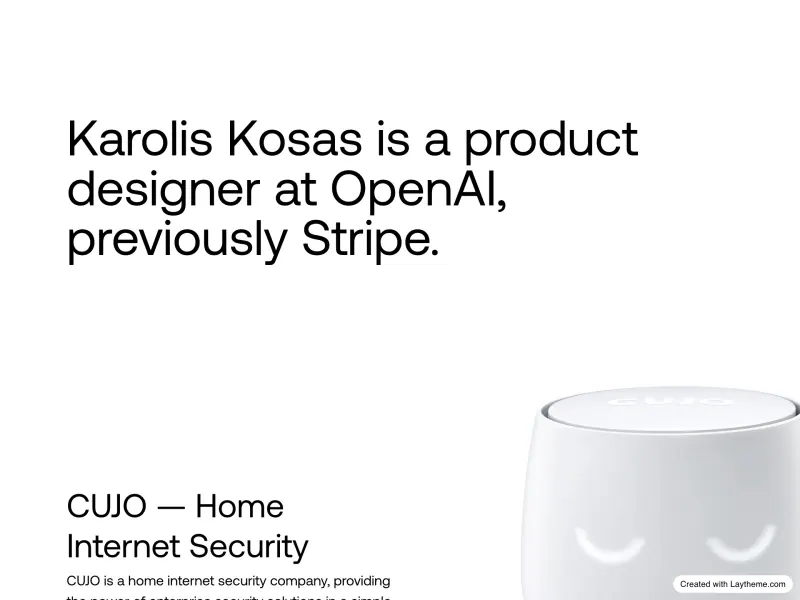
Karolis Kosas
A plain left-aligned introduction and a large cropped product image show how a portfolio can establish hierarchy with very few elements.
 Typography
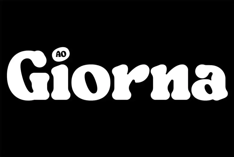
AO Giorna
Soft, weighty serif forms fill a black specimen page, making the rounded edges of the typeface the entire visual story.
 Branding

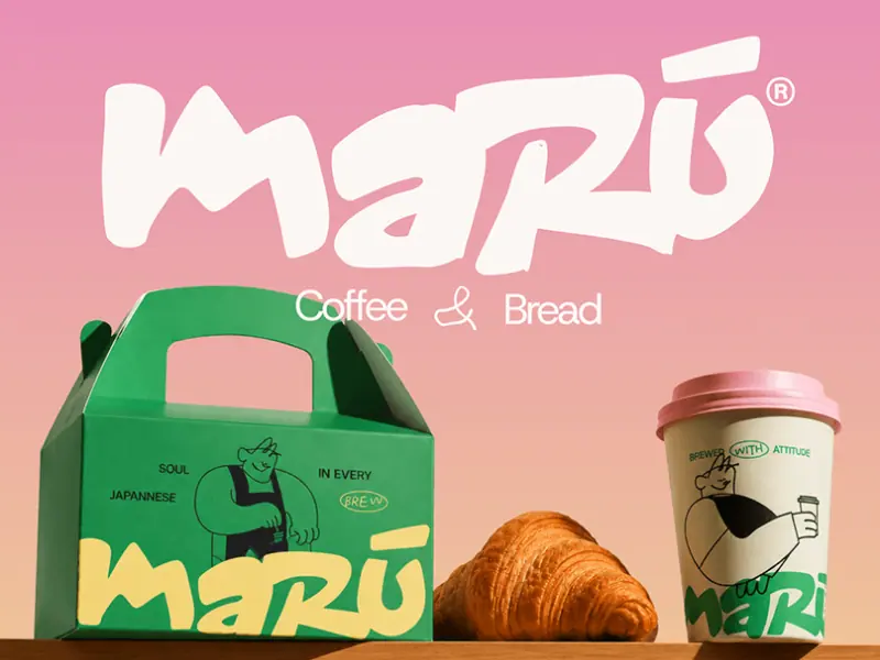
Maru Coffee & Bread
A loose white wordmark connects pink, green and yellow packaging, showing how a small color family can hold several materials together.
 Websites
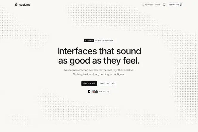
Cuelume.
A fine gray texture frames a small centered headline, adding atmosphere to a mostly white hero without overwhelming its content.
 Websites
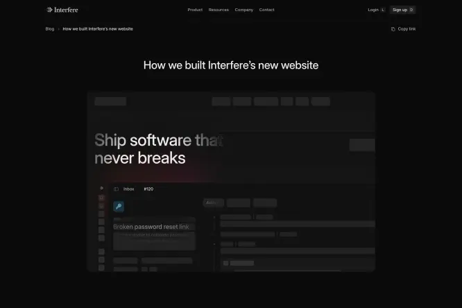
Building Interfere
A dark article layout places an embedded website preview beneath a concise heading, making the design process and its result easy to connect.
 Websites
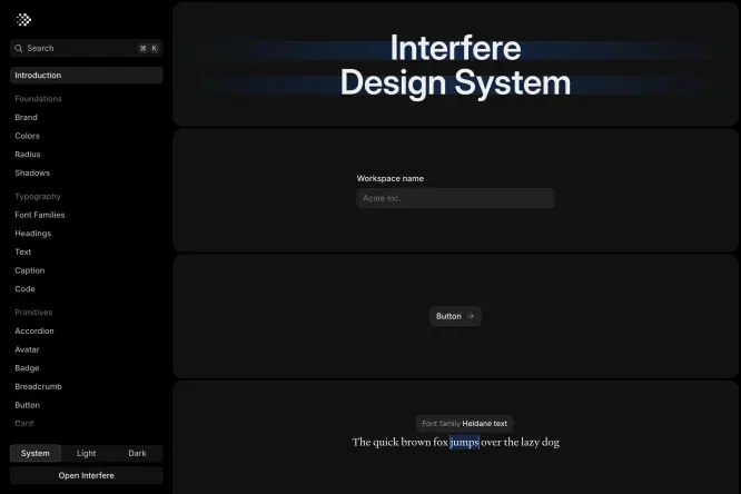
Interfere Design System
A persistent-looking left index, clear section boundaries and quiet typography organize a long dark documentation page into manageable parts.
 UI & Interaction
Financial clarity
Landscape imagery and lime accents connect the phone preview with a longer financial-product page, while white feature blocks create pauses below.
 UI & Interaction
Velox
A black laptop and fabric backdrop surround a warm orange interface glow, letting light and contrast draw attention to the central message.
 UI & Interaction
AI voice, localized
A large video still fills a monitor presentation, with a direct white headline laid over the image instead of adding another competing panel.
 UI & Interaction

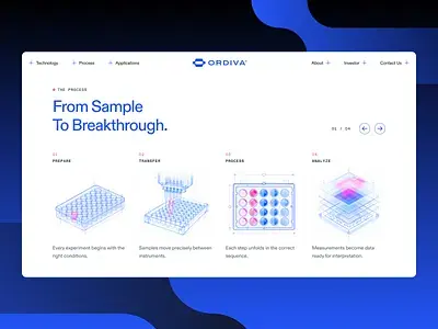
Ordiva automation
Four pale blue and pink equipment illustrations explain a technical sequence through repeated scale, spacing and short text underneath.
 UI & Interaction
Tiimo
Misty trees and soft green sections carry the same visual language from the hero into a longer product story built around interface examples.
 Designer Posts

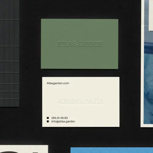
Olive stationery
An olive card and cream stationery use very quiet lettering, letting the contrast between paper colors and a dark backdrop define the identity.