

October 24, 2026.
Source archive · curated October 30, 2026
 Portfolios
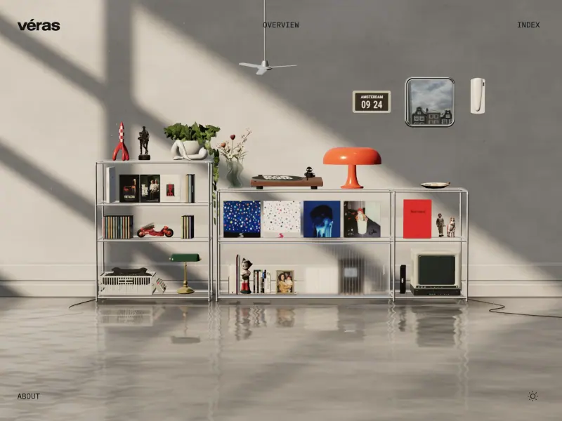
Véras Fawaz
A softly lit room and carefully arranged shelf objects turn a portfolio introduction into a scene, with navigation kept small around its edges.
 Typography
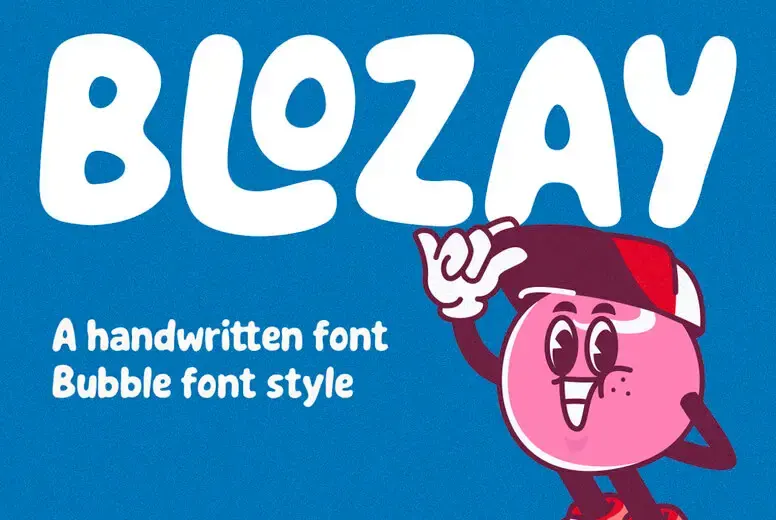
Blozay
Large, rounded white letters and a pink illustrated character make the blue specimen feel friendly before any smaller details are read.
 Branding

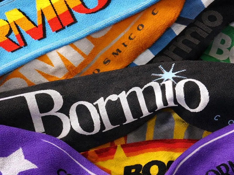
Cosmico Club
A close crop of colorful fabric lets contrasting type styles and repeated marks establish a lively identity through real materials.
 Websites
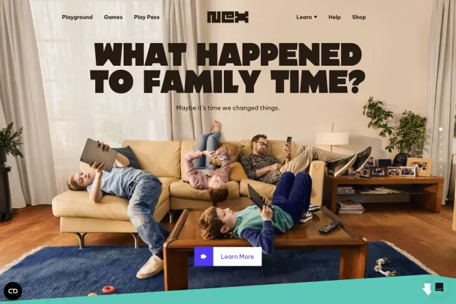
Nex Playground
A family photograph fills the hero beneath a chunky black headline, connecting a playful product with the setting where it will be used.
 Websites
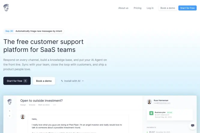
Fernand
A pale blue gradient gives a support-product page breathing room, while a visible interface panel grounds the simple headline in the actual product.
 Websites
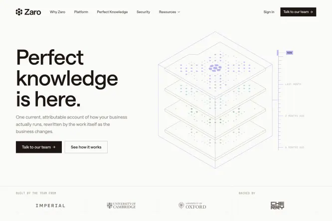
Zaro
A delicate, layered wireframe illustration balances the large headline, using a few blue details to suggest structure without filling the white canvas.
 UI & Interaction
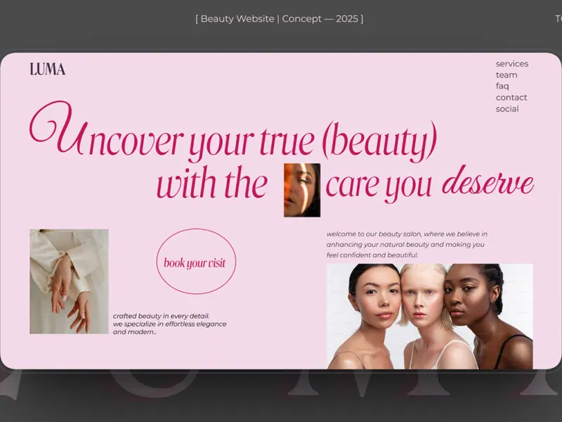
Luma Beauty
An italic display headline flows across a pale pink page, with differently sized beauty portraits providing clear visual anchors.
 UI & Interaction
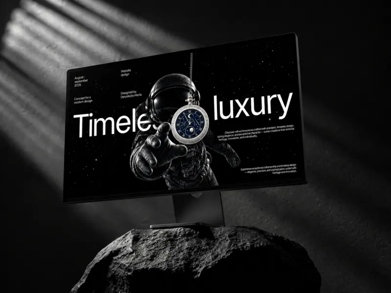
Timeless luxury
A dark monitor and a rocky pedestal frame the watch as a premium object, while a white headline keeps the otherwise black composition legible.
 UI & Interaction
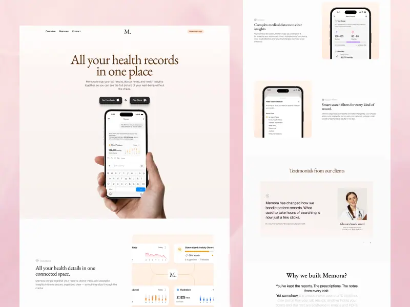
Health records
Soft pink page sections organize phone mockups and feature cards into a calm product story, with generous spacing around the central message.
 UI & Interaction

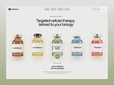
Cellular therapy
A row of bottles uses consistent scale and spacing to make their subtle label-color differences readable against a clinical white layout.
 UI & Interaction
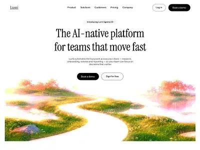
Lumi
A restrained serif headline sits above a soft, colorful landscape, with a compact pair of actions bridging the text and the visual.
 Designer Posts

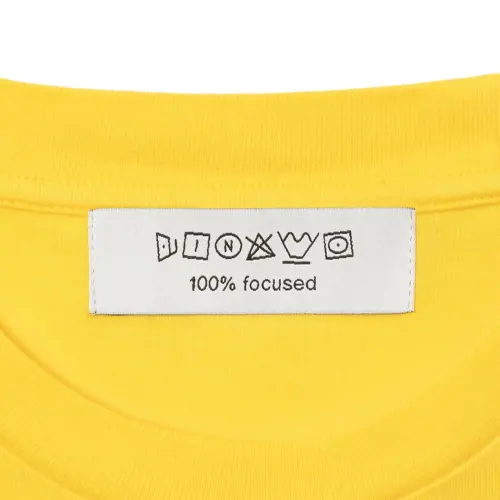
Dinamo label study
A small cream label stands out against bright yellow fabric, using unusual outlined letterforms as the identity’s main expressive detail.